01
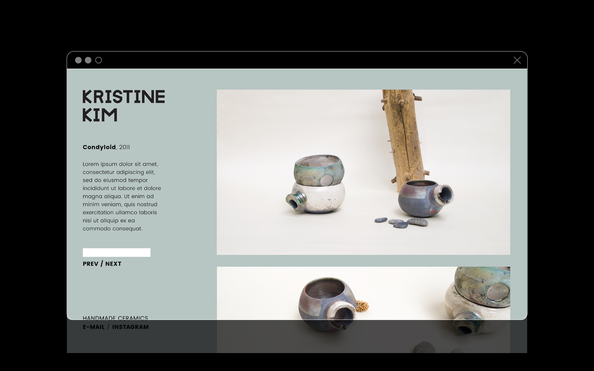
Kristine Kim Ceramics
BRANDING, STYLING & PHOTOGRAPHY

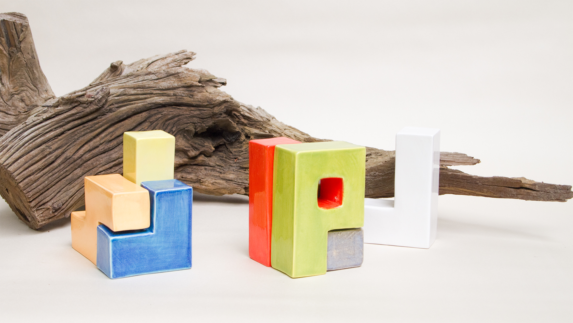
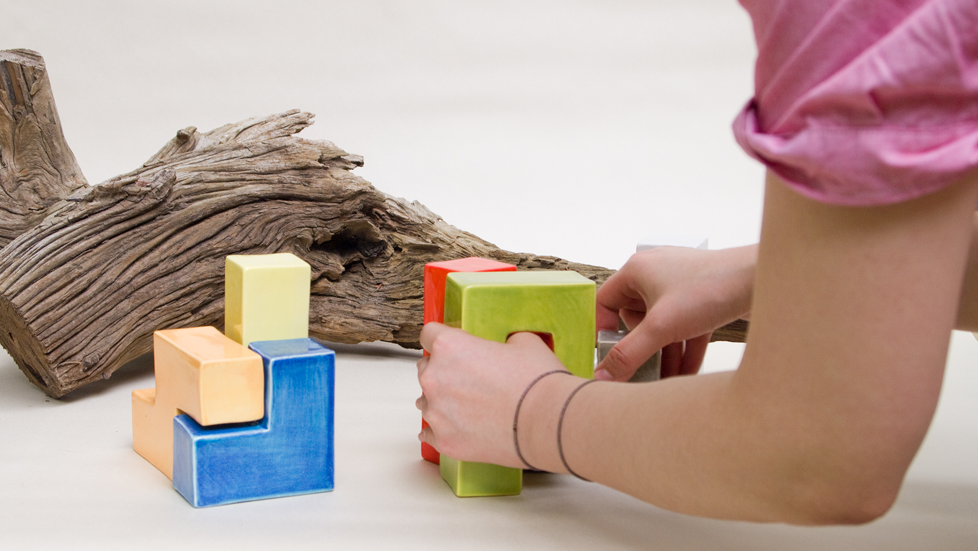
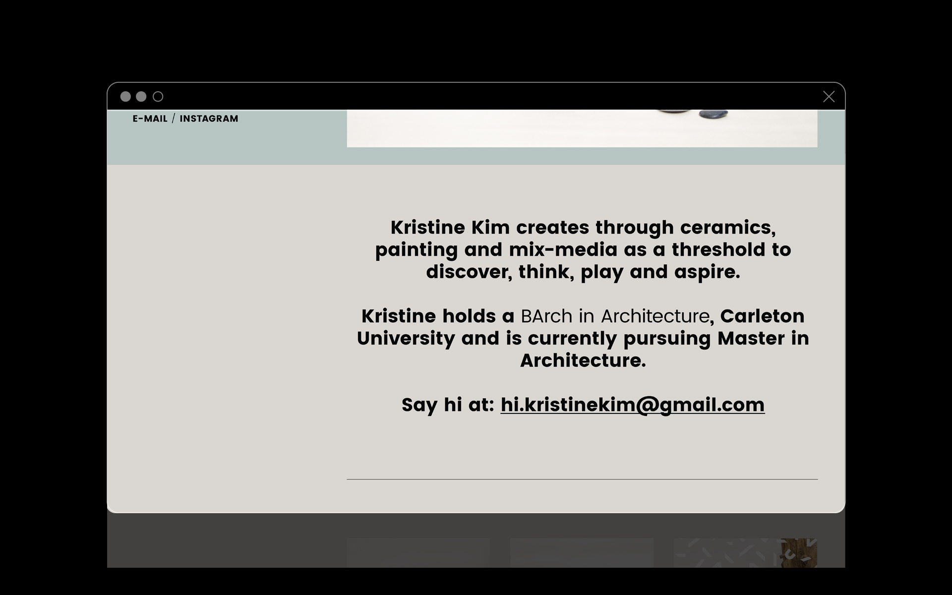
Kristine Kim is a Korean-Canadian architect and ceramist. To bring more awareness to her ceramic practice, I was approached to develop a branding that reflect her heritage and philosophy.
My approach started by examining the nature of ceramic itself: a handmade ceramic is sturdy, utilitarian and distinct; yet vastly fragile and temporary. This duality in character informed the visual treatment of the practice.
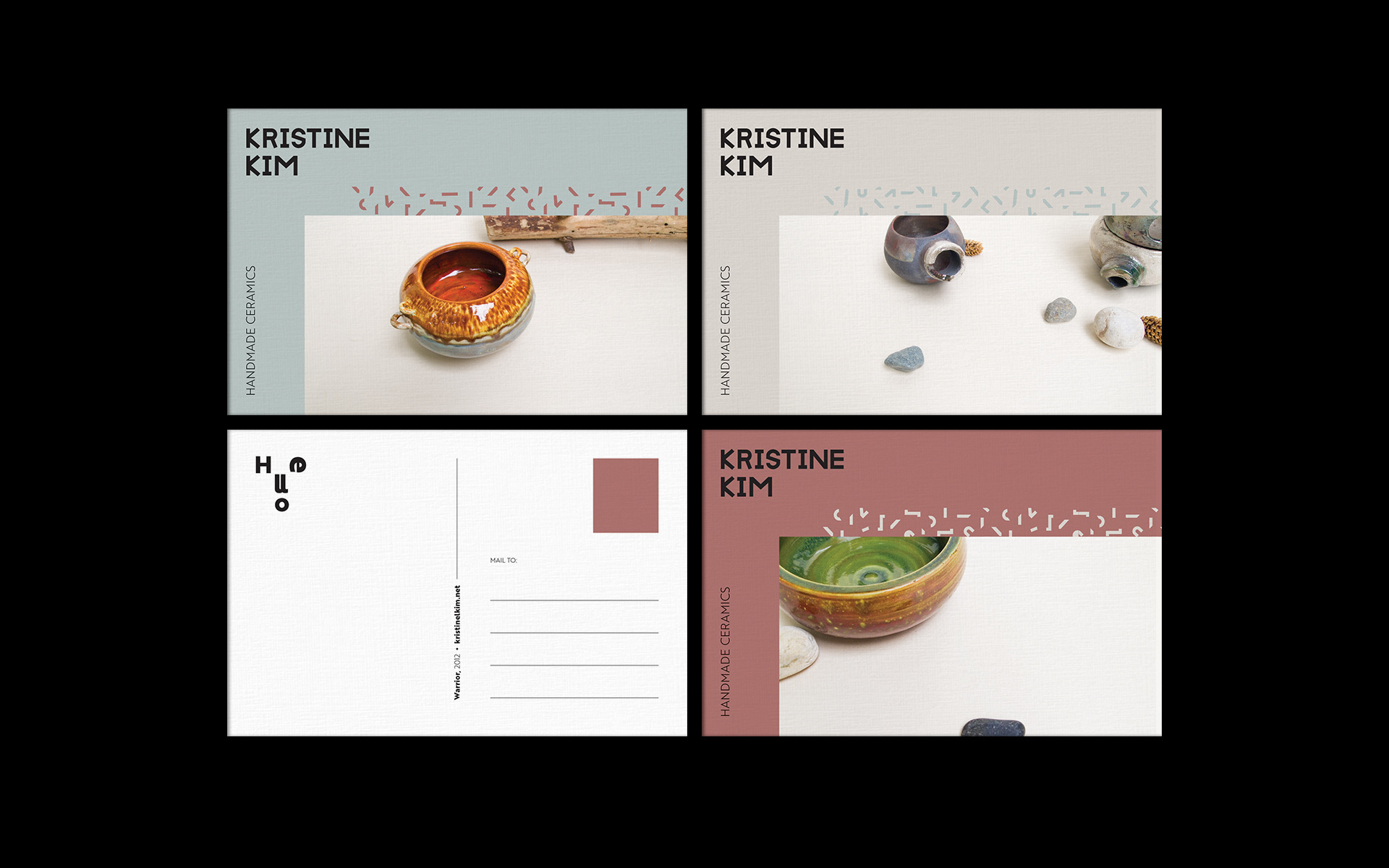
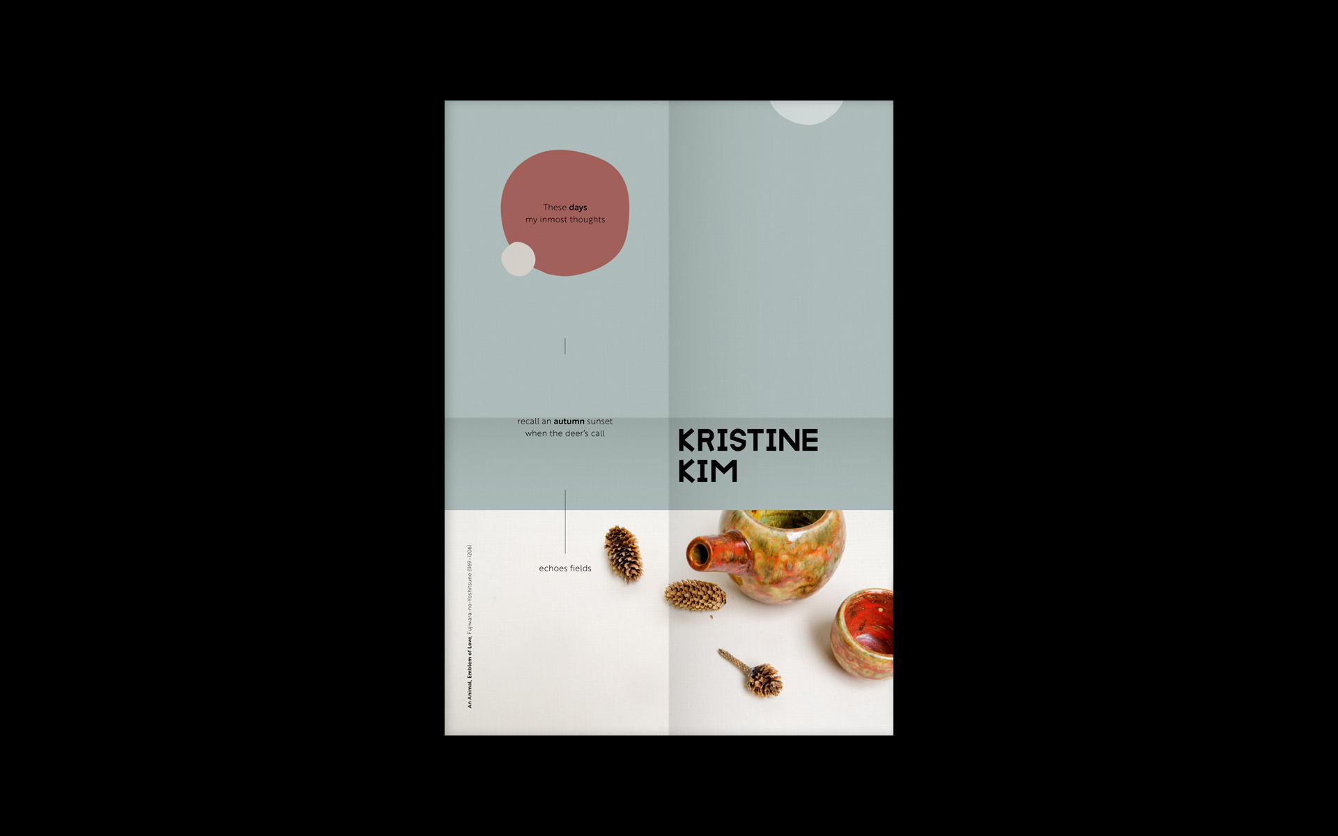
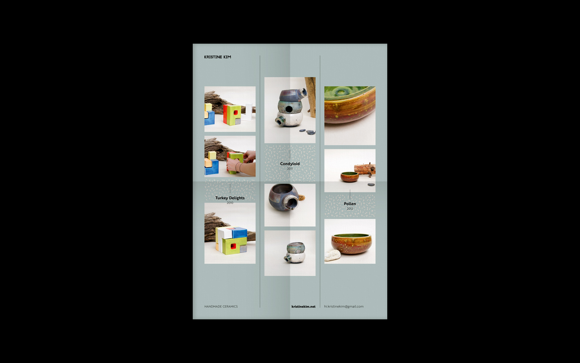
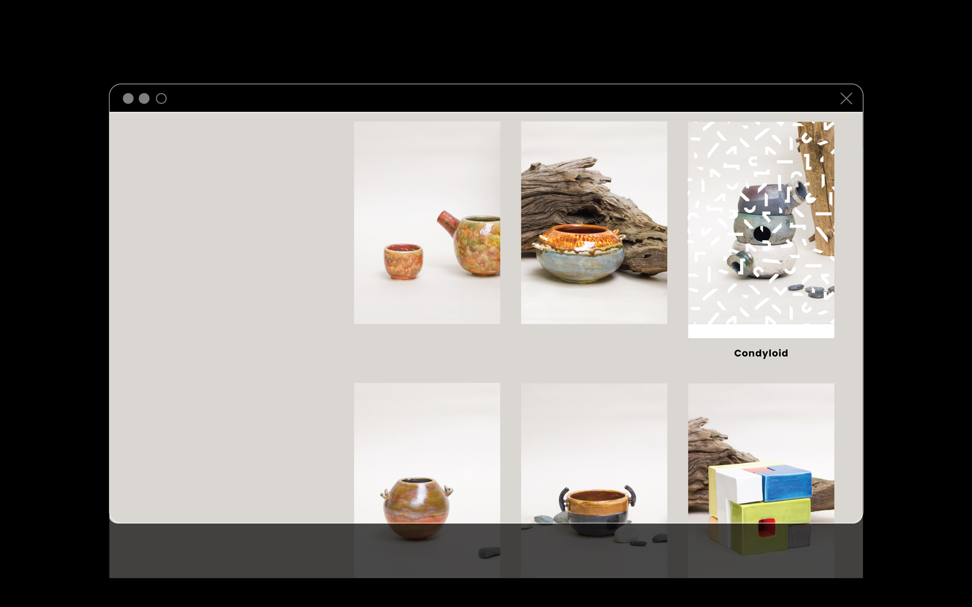
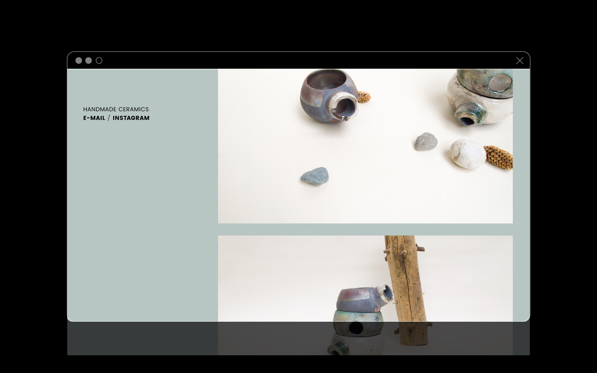
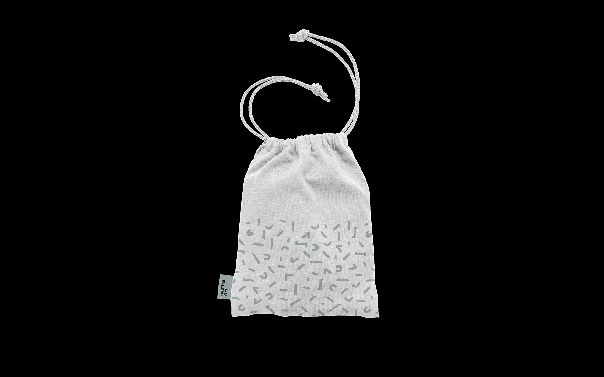
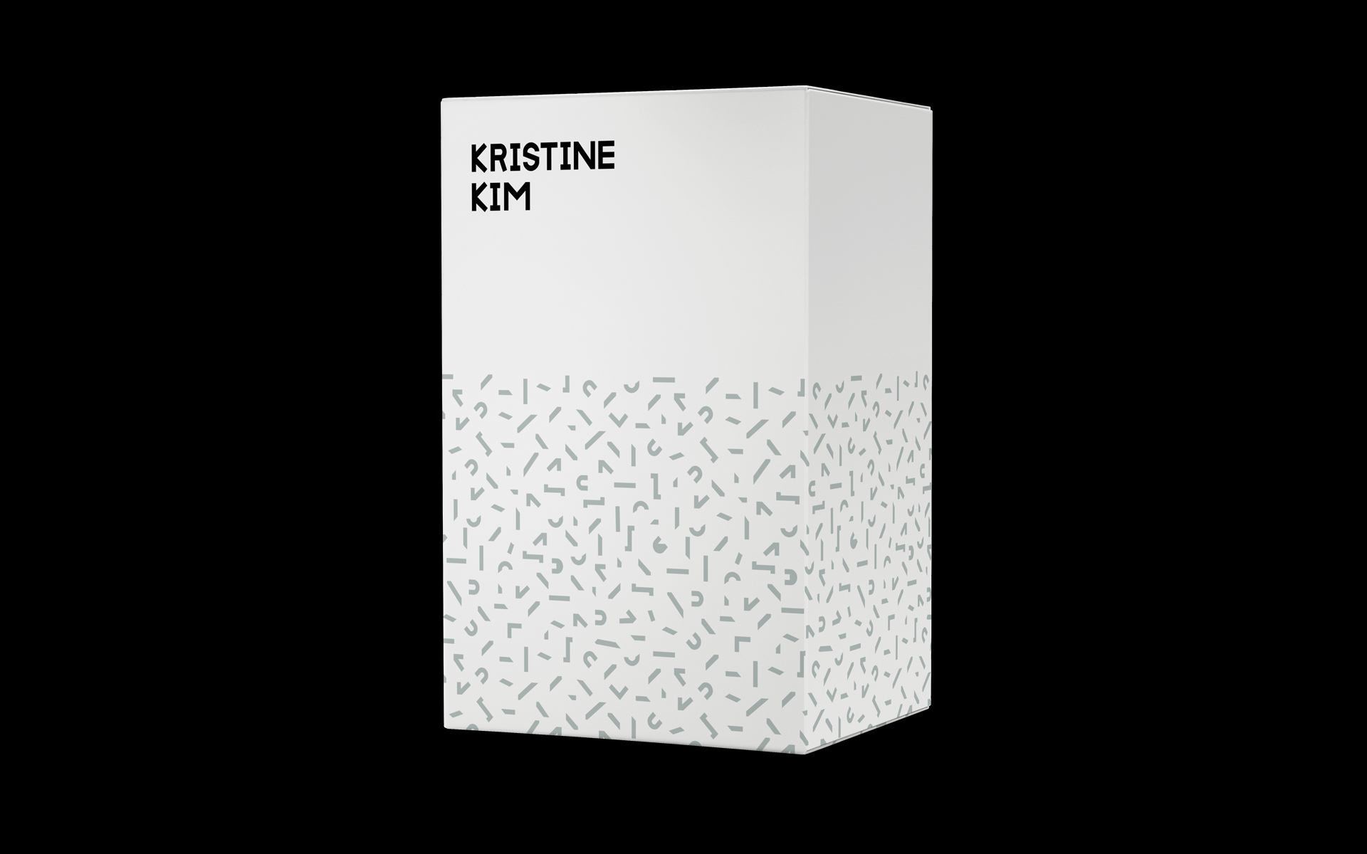
A sturdy wordmark was custom drawn and then 'shattered' to be revived as a supporting pattern.
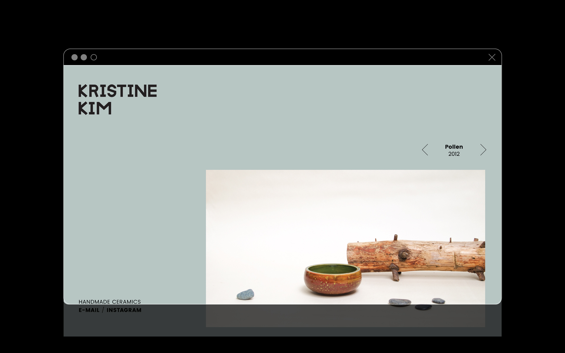
The primary colour is celadon, a glazing ubiquitous with East Asian ceramics, complemented by earthy tones of sand and terracotta.
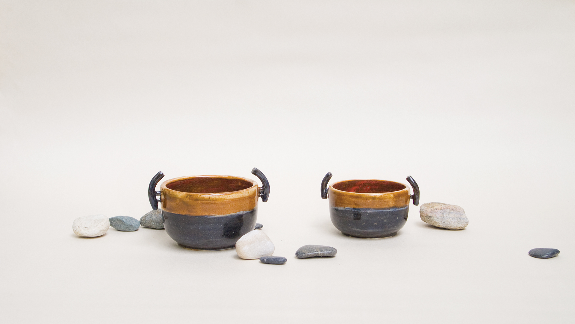
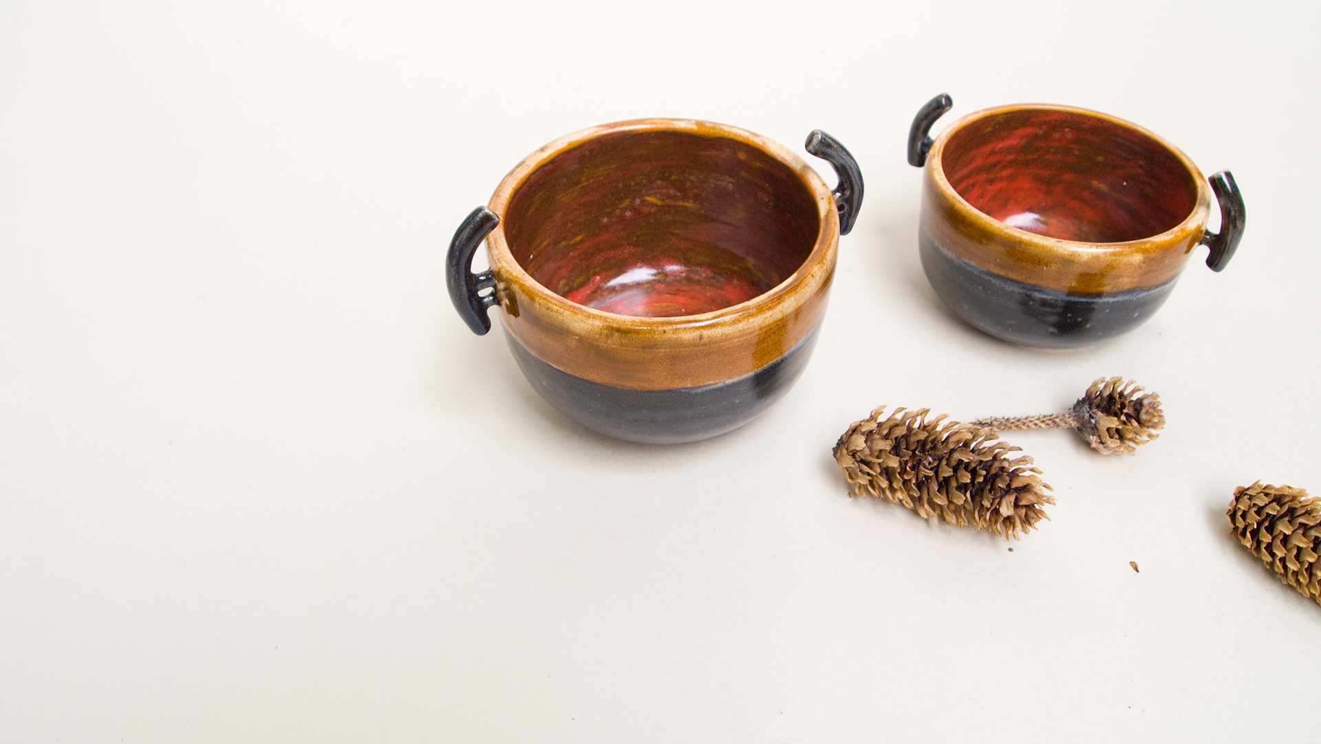
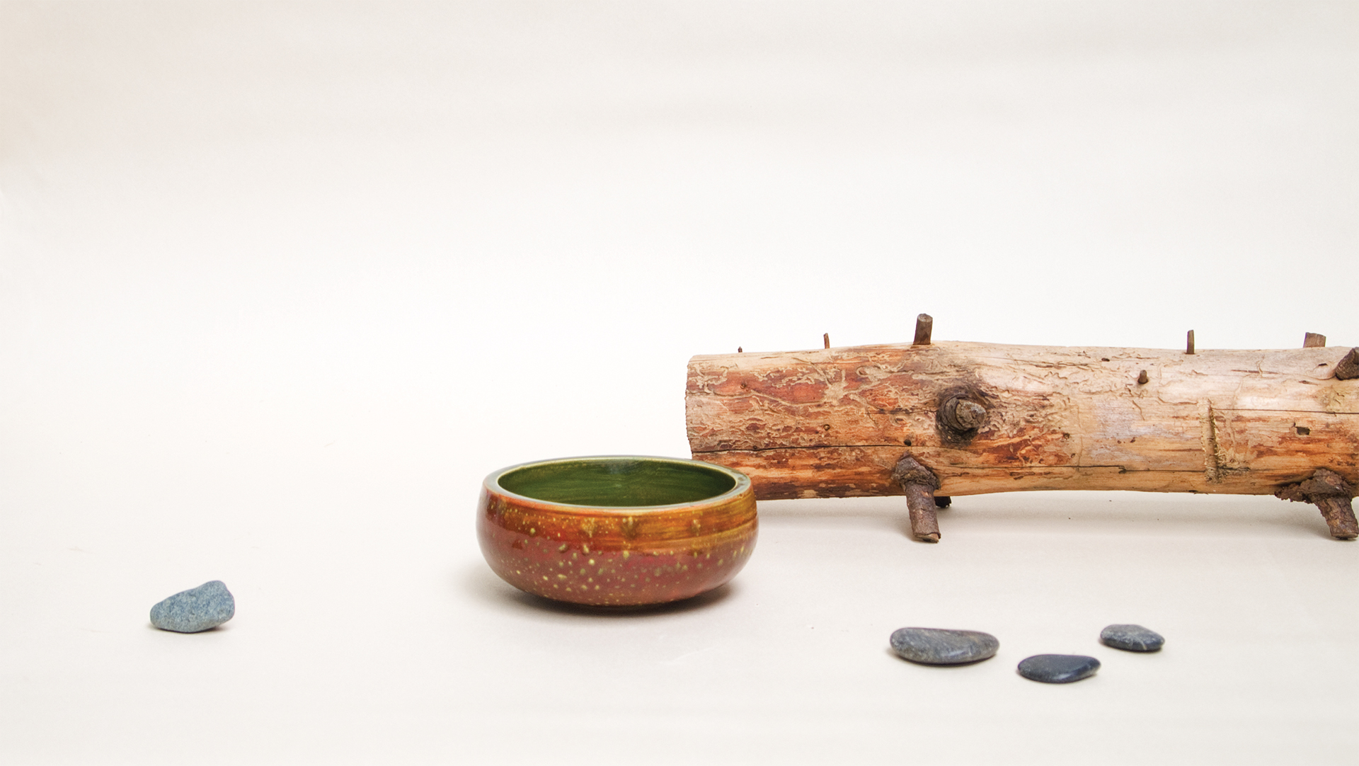
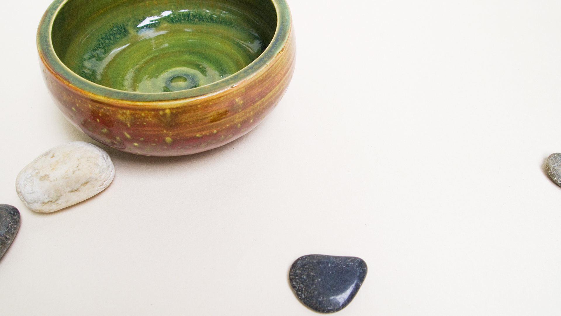
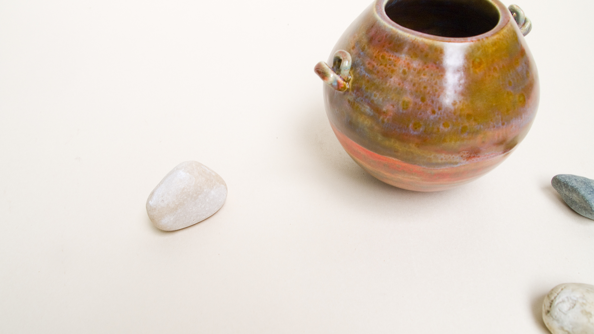
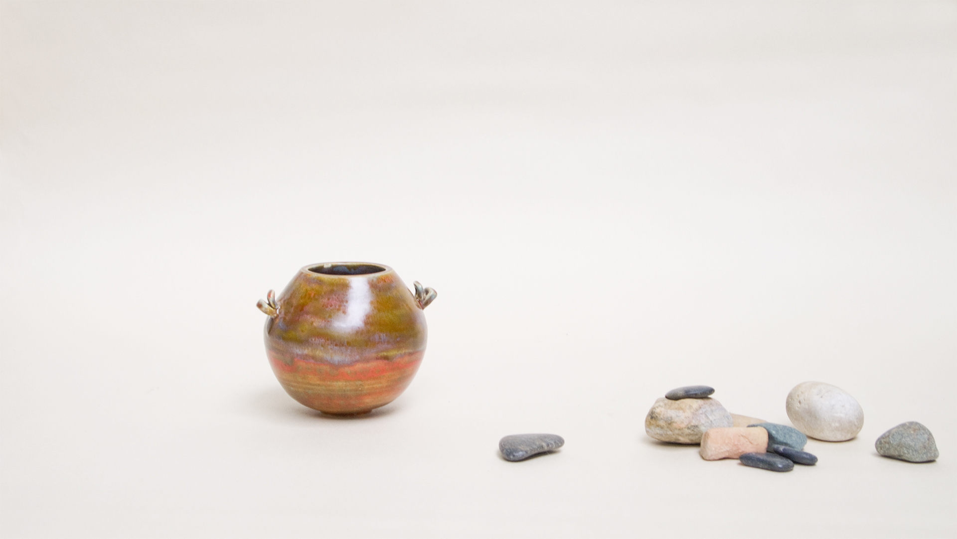
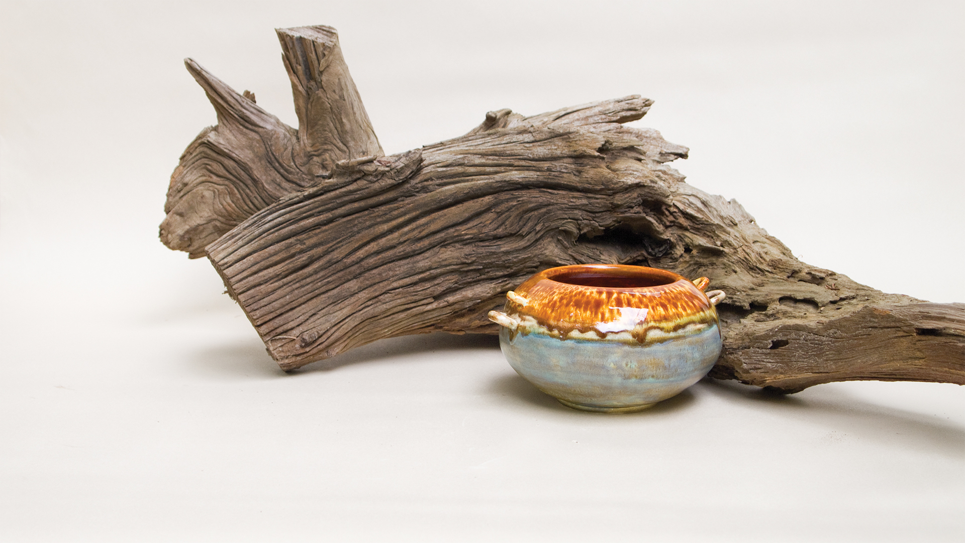
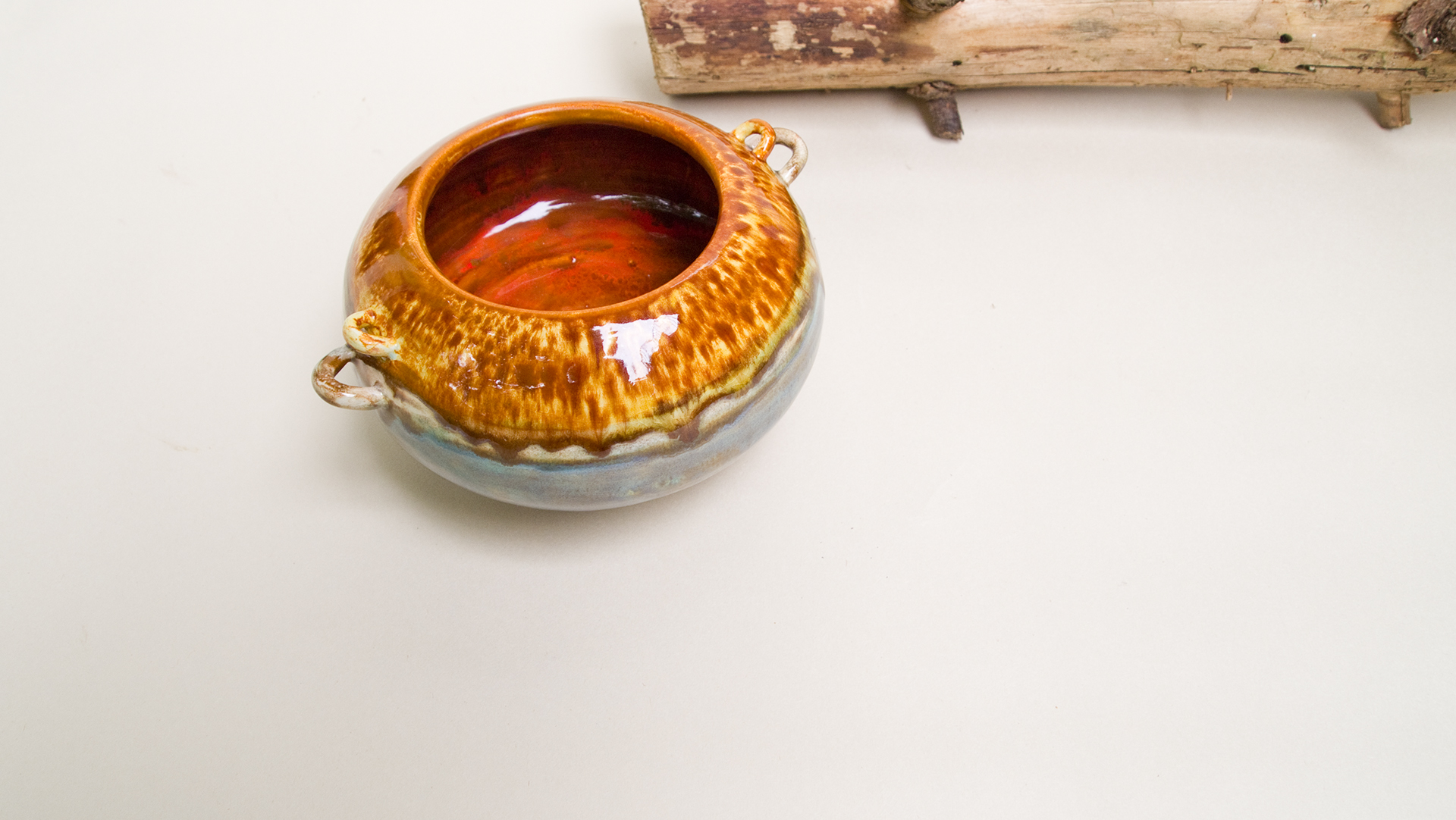
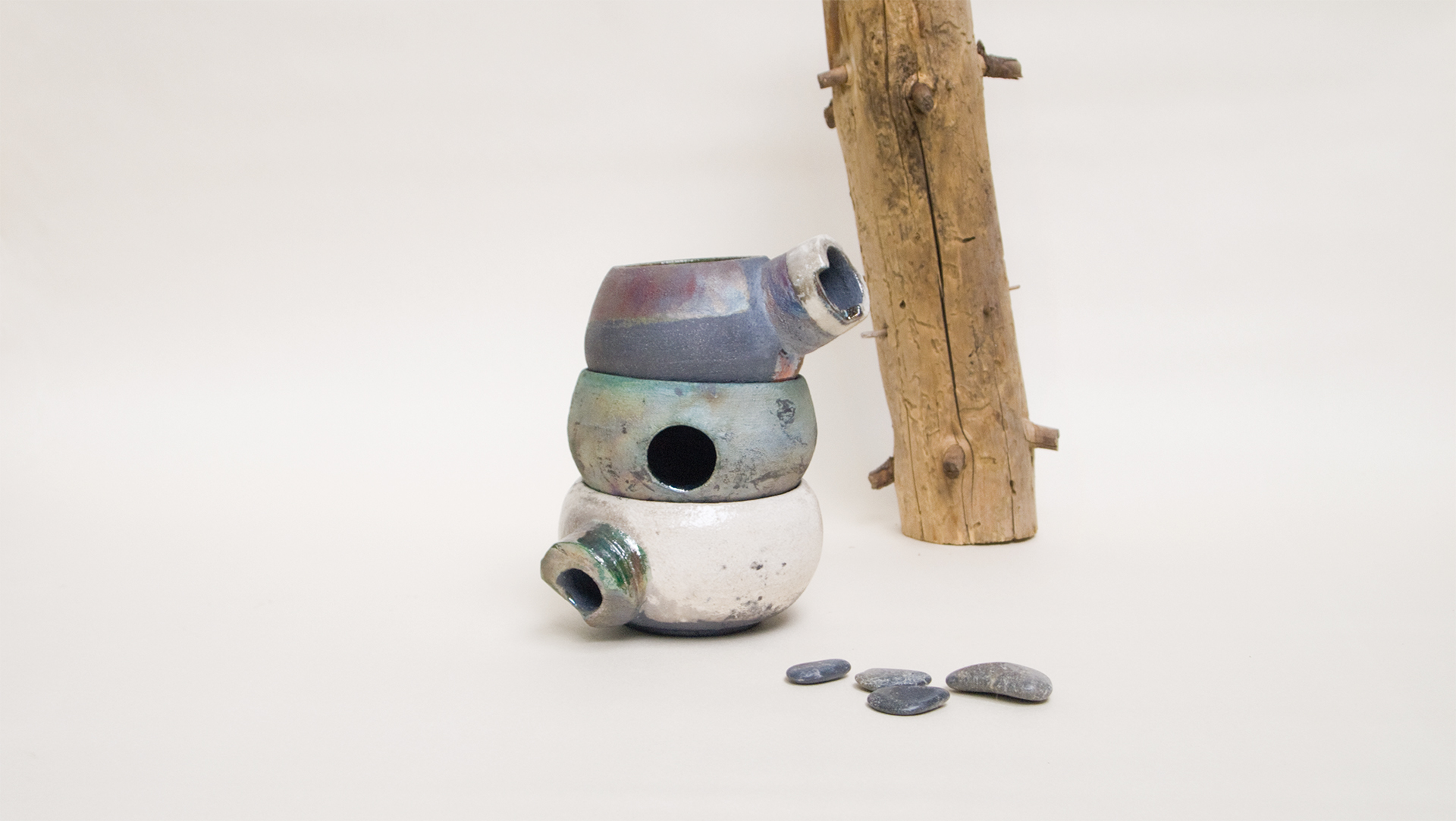
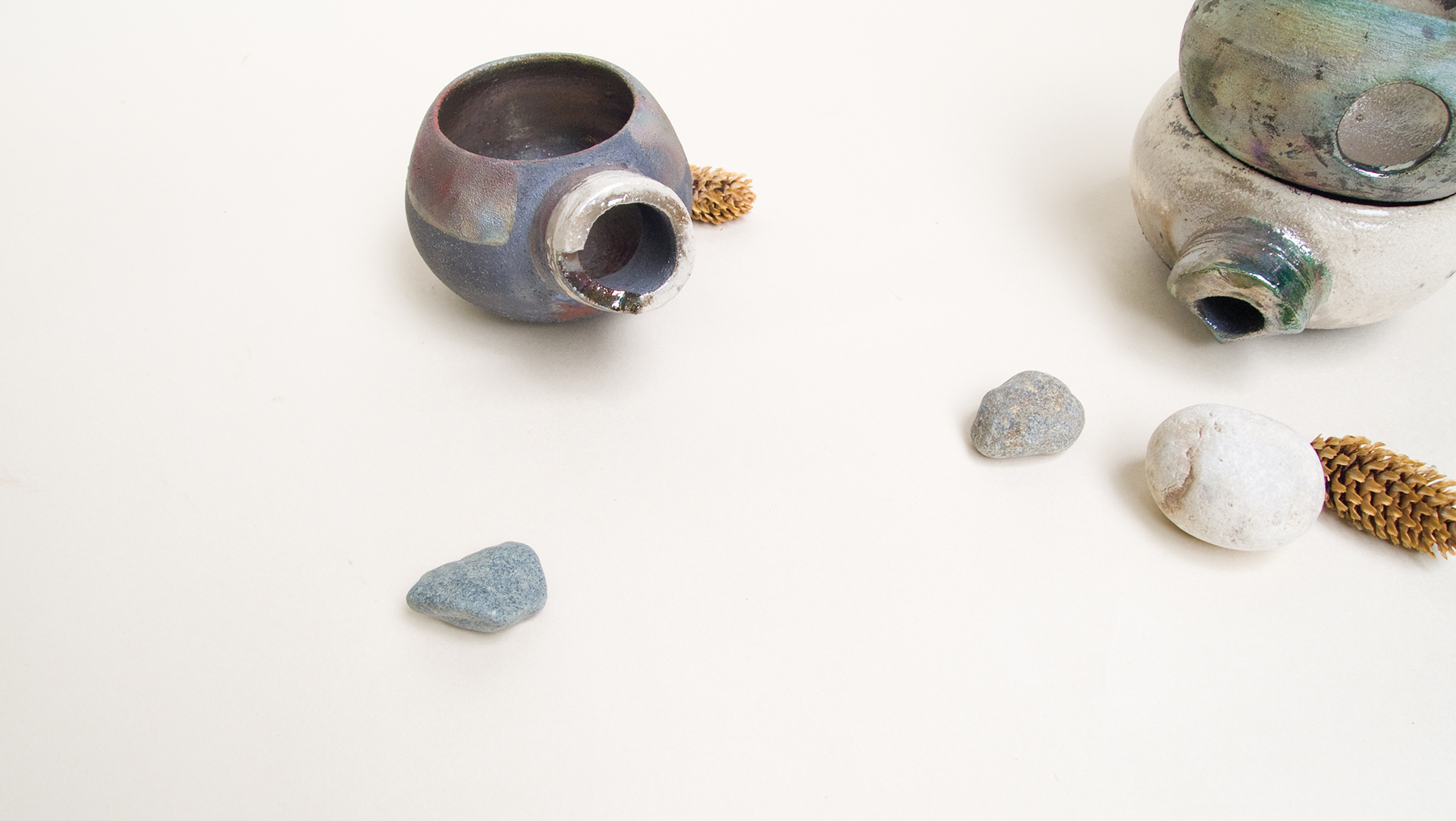
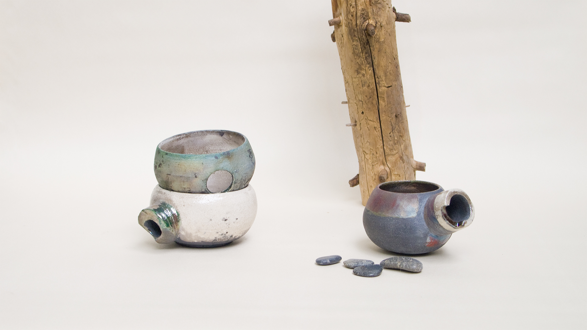
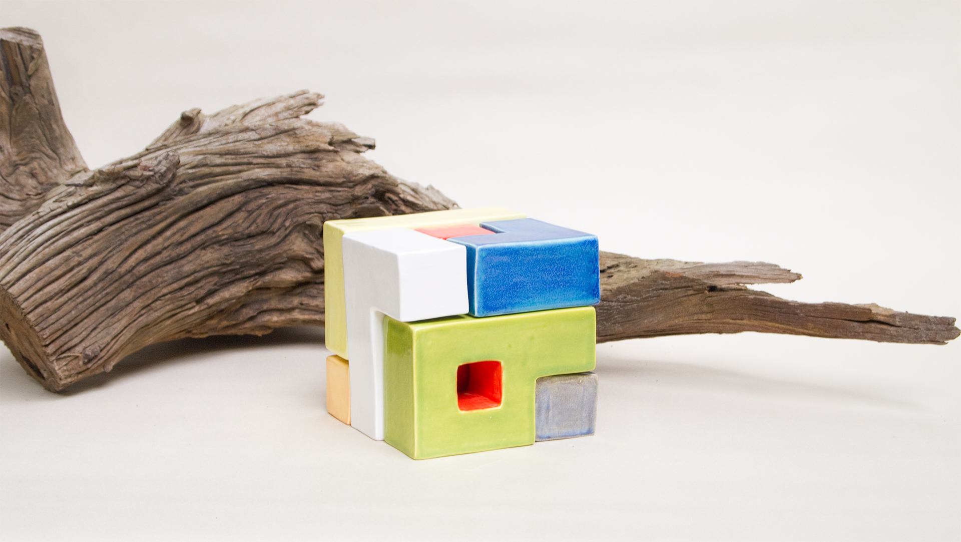
I also styled and photographed a series of images highlighting Kristine's ceramics paired with textural natural elements.