Website feature design
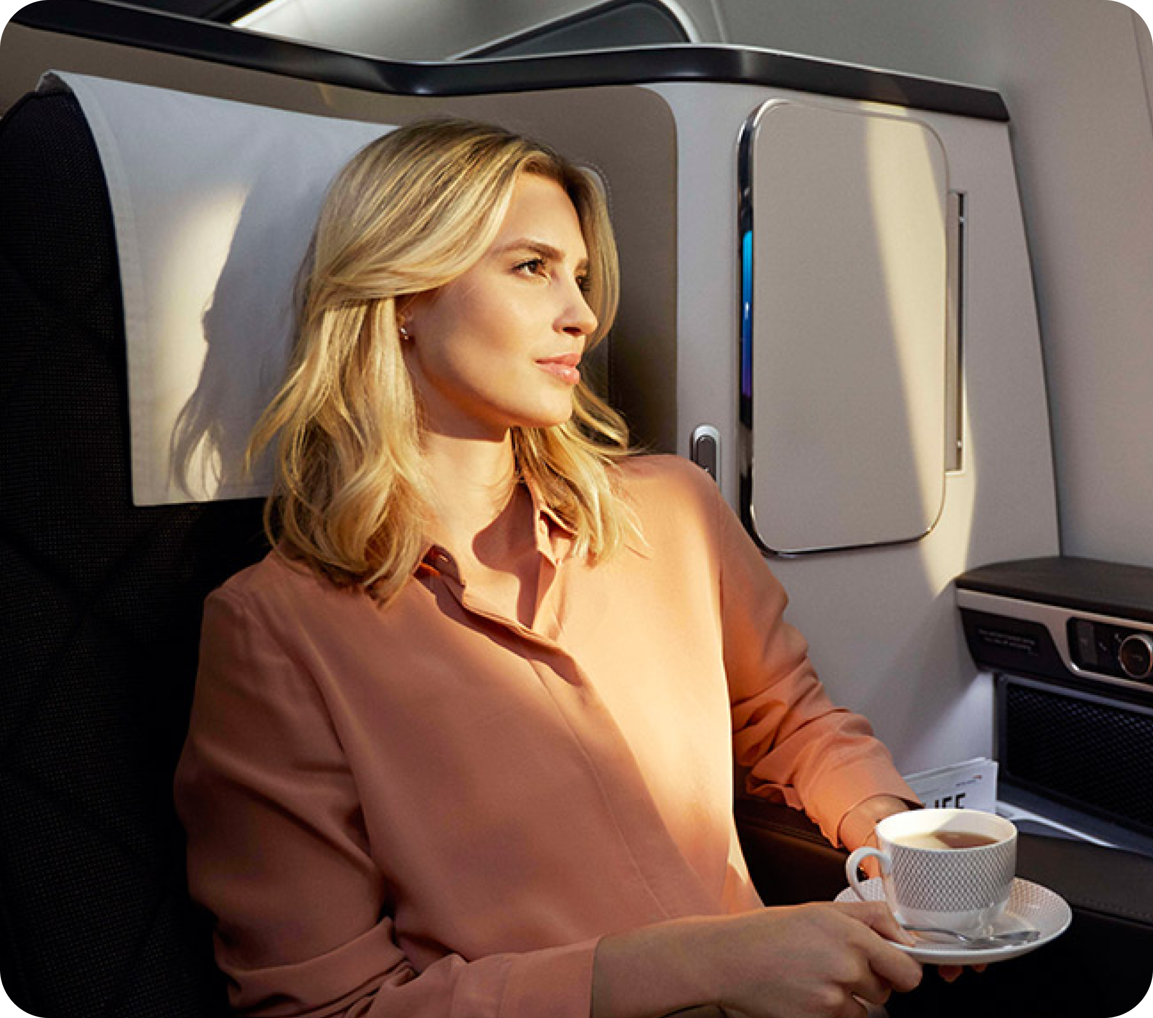
Positioning Premium Seats to Young Travellers
In a 24hr Hackathon, our team was tasked by British Airways (BA) to come up with possible solutions to position premium seats toward young leisure travellers.
Role
UX Researcher, UX & UI designer
Duration
24 hours
Project type
Academic
Tools
Figma, Adobe Photoshop & Illustrator
The Challenge
British Airways (BA) is looking for opportunities to increase the number of younger leisure travellers travelling on premium seats.
Our Approach
Our first step is to acknowledge the limited time we have and set up a realistic perimeter of what could be accomplished within the timeframe. We, as UX/UI Designers, took on the Project Manager role, while Data Scientists took the lead on recognising customer purchasing patterns, with Software Engineers bringing our solution to life.
Goals
Frame premium cabins as the better travel option to young leisure travellers.
Pathway to solution
Discover
Define
Design
Deliver
Team Members
Taylor Nguyen, Jonathan Margono, Hernan Huergo
UX/UI DESIGNERS
Ollie Leach, Rory Freeman
DATA SCIENTISTS
Yulia Trubacheva, Adam Gedge
SOFTWARE ENGINEERS
Discover
The Challenge
How to position premium cabins so that they become an attractive preferred mode of travel for young leisure travellers.
We also identify our target users’ age group as 20 to 35-year-olds.
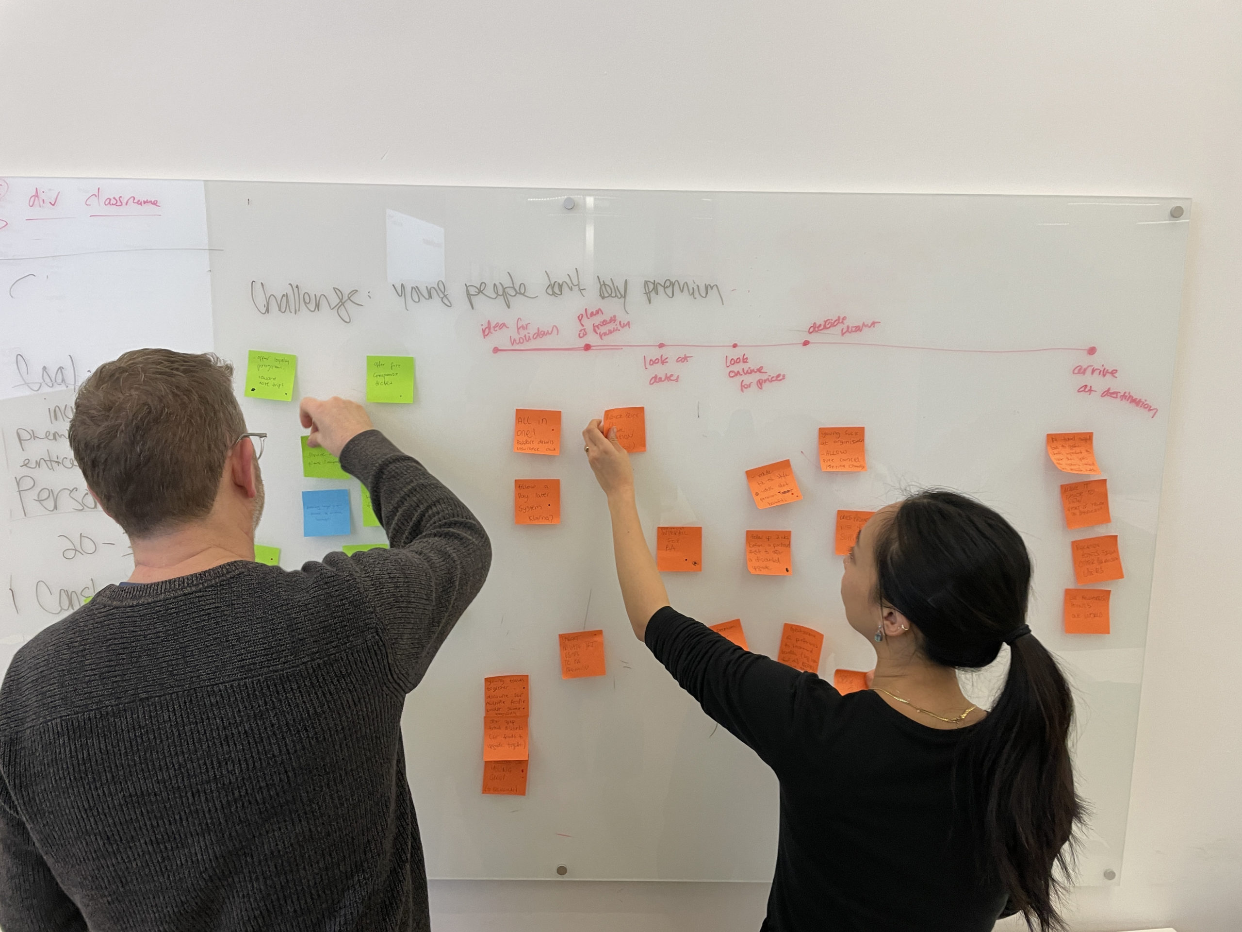
We immediately brainstormed as a team to come up with a set of assumptions. In parallel, Data Scientists looked at customers purchasing patterns to efficiently identify MVP opportunities.
We discuss with Software Engineers to discuss what would be possible and feasible to deliver within our time frame.
BA has provided us with a few problem spaces to work on, given the size of the challenge and the time we have for a solution, our team chose to explore the following problem space.
How do we ...

Find new customers

Encourage existing customers to buy a higher-class cabin
Our Preliminary Assumptions

High-end comfort isn't an appeal to young travellers, especially on short haul flights.

Young travellers aren't aware of premium seats, as they're not visibly accessible when searching for tickets.

Premium seats are currently heavily marketed to an older target audience.
Guided by The Data
Following authoring assumptions, our team of Data Scientists were able to identify patterns in our target users’ purchasing behaviour that subsequently resulted in our recommendations.
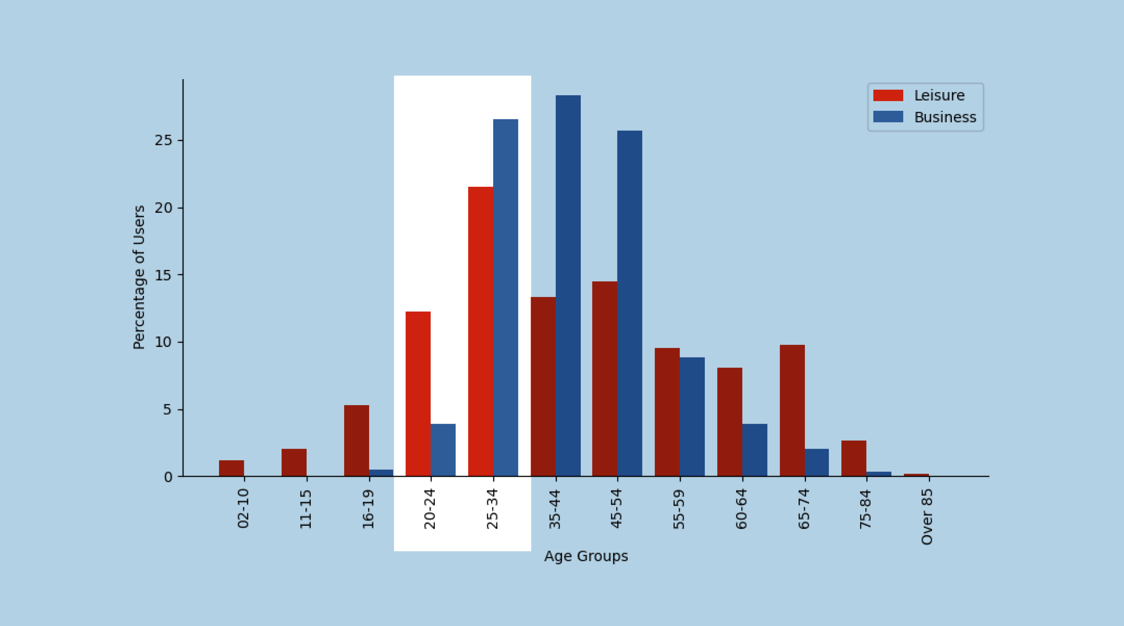

Young people take a disproportionately large number of leisure flights.
Source: kaggle.com
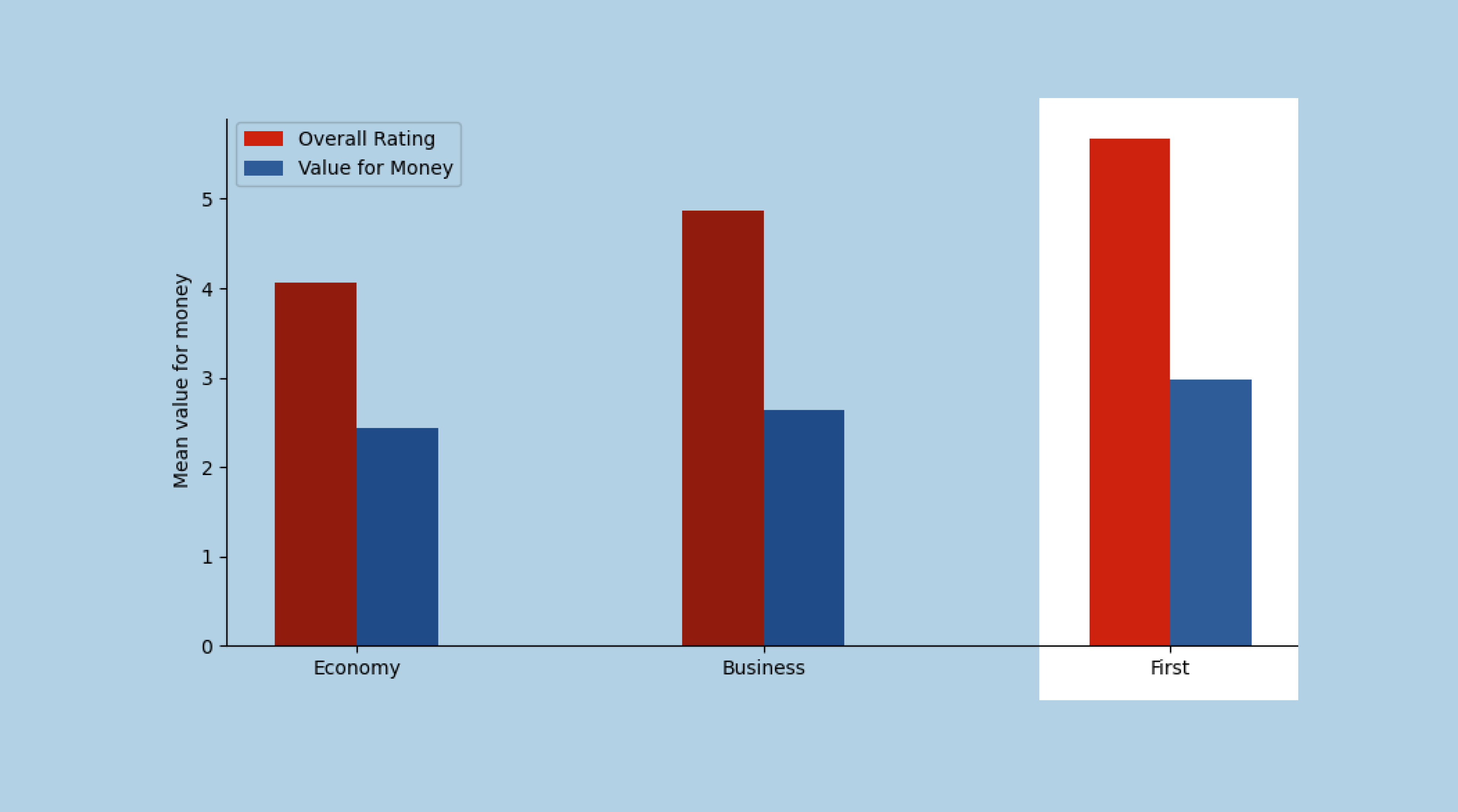

First class tickets were deemed the best value for money.
Source: kaggle.com
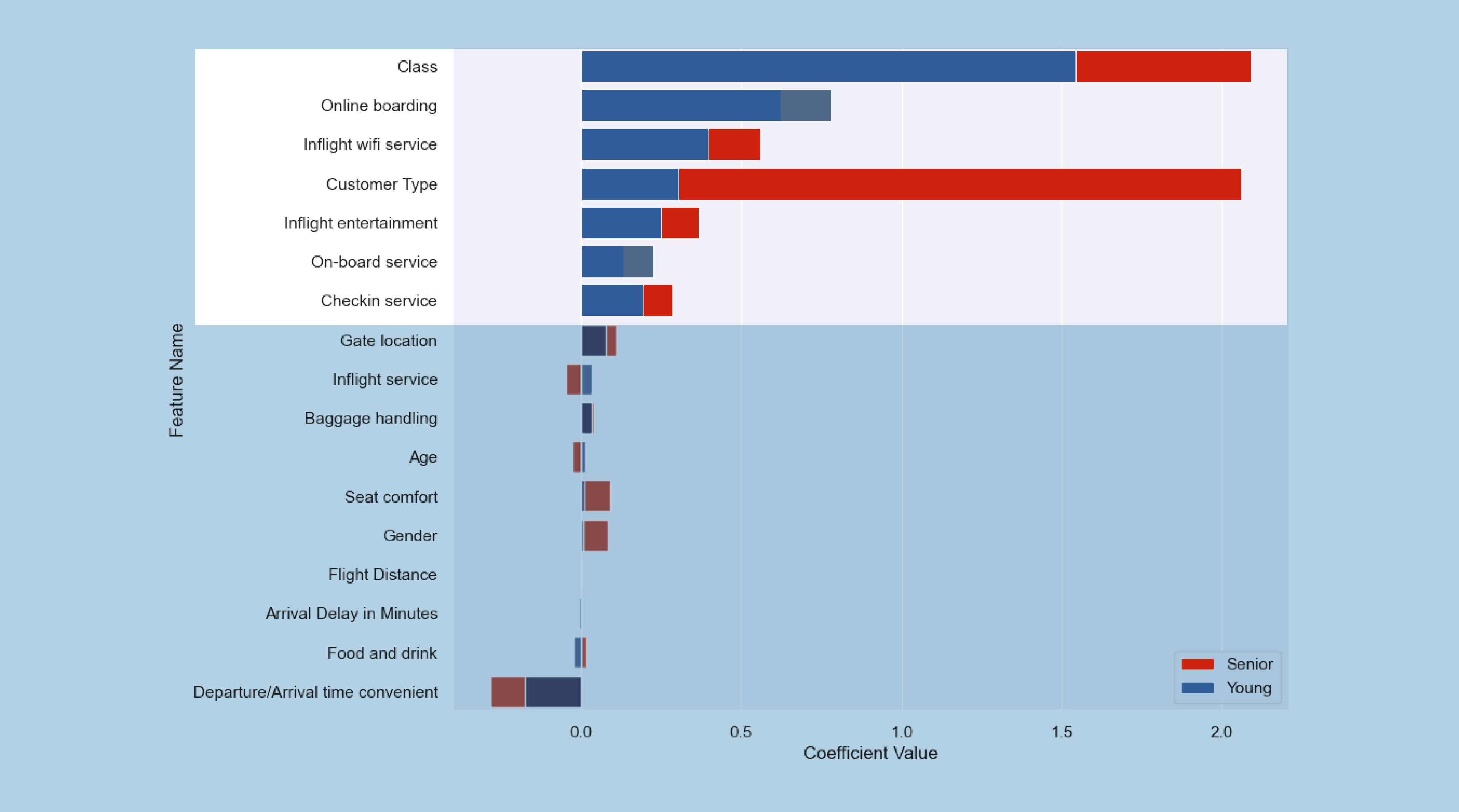

Young customers value a smooth online boarding process.
Source: kaggle.com
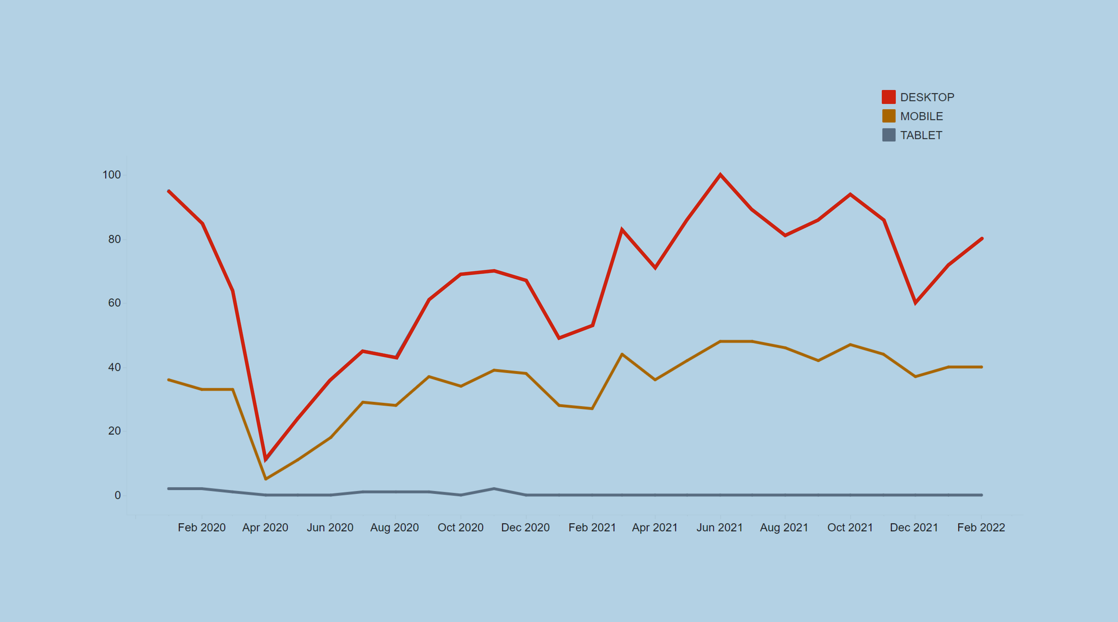

We recommend desktop booking system.
Source: kaggle.com
Define
Upon learning the data, we were able to validate our preliminary assumptions and select a focus area.
Using the ‘How Might We’ statement briefed to us as a guide, we ultimately decided the best area to focus on is how to highlight the overall value of flying on premium seats. There are several ways to do this, which we identify further below.
How might we increase the proportion of premium seats purchased by leisure younger customers (20–35) in 2023?
Who are Our Users?
To help us deliver an actionable product, we created a proto-persona of June Harris that highlights our users’ frustration when it comes to booking a flight for a long-haul holidays.

Design
Identifying Opportunity
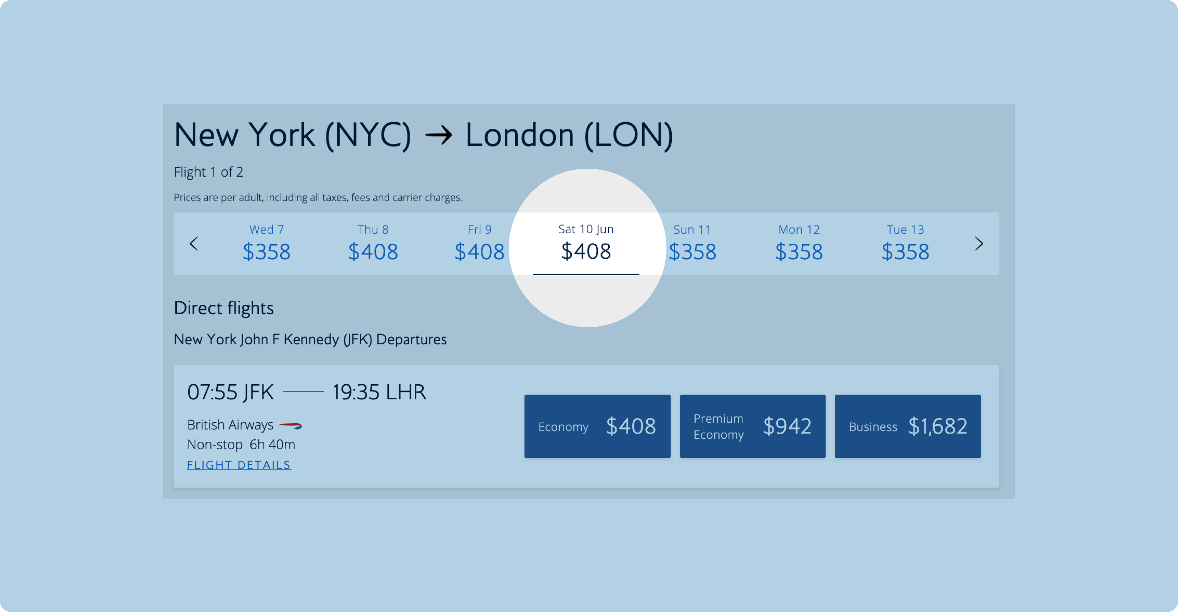
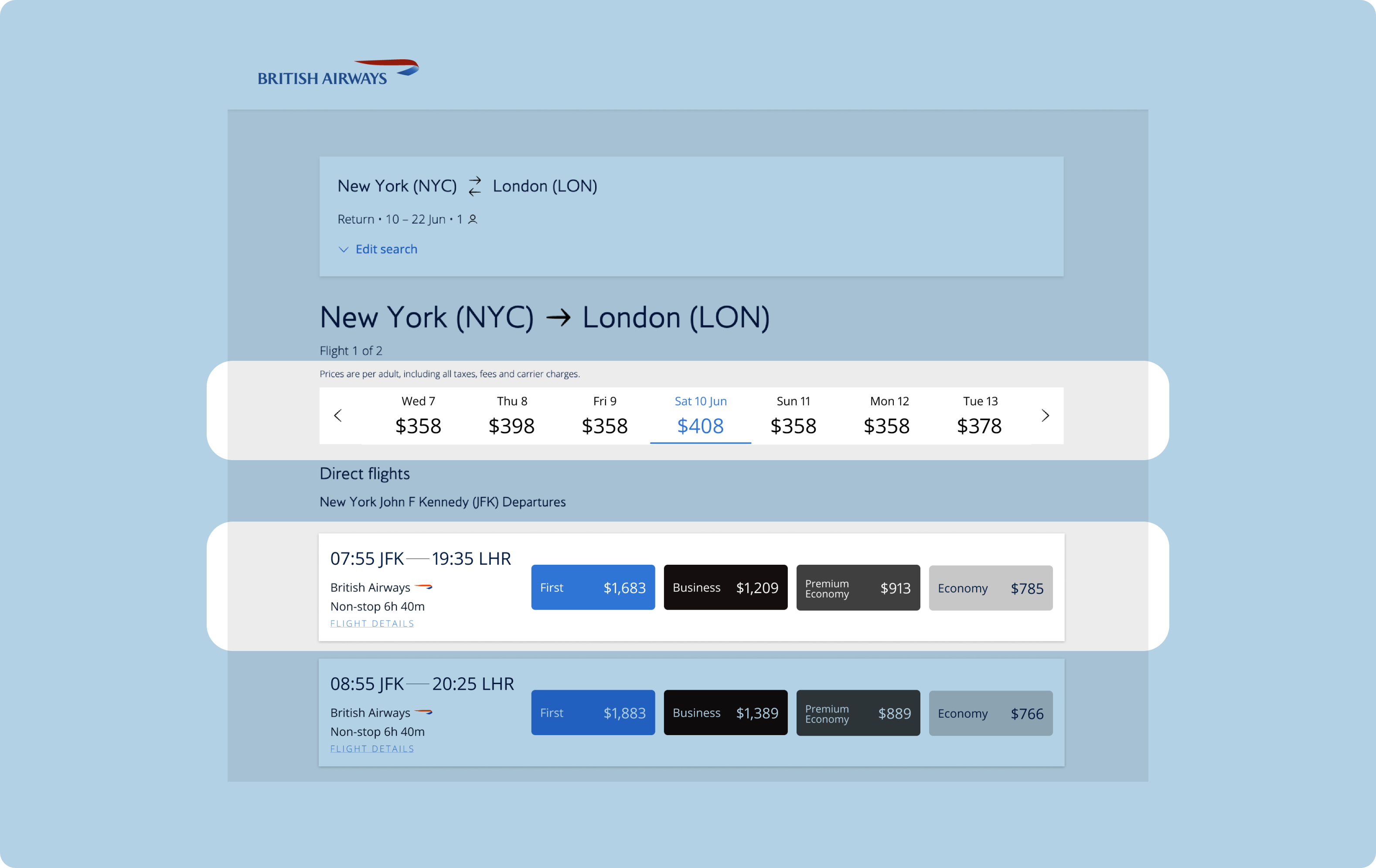
We had a look at what a typical booking journey for June might be and came up with the following timeline. From there, we dissected visual prompts that we see on BA’s booking webpage.
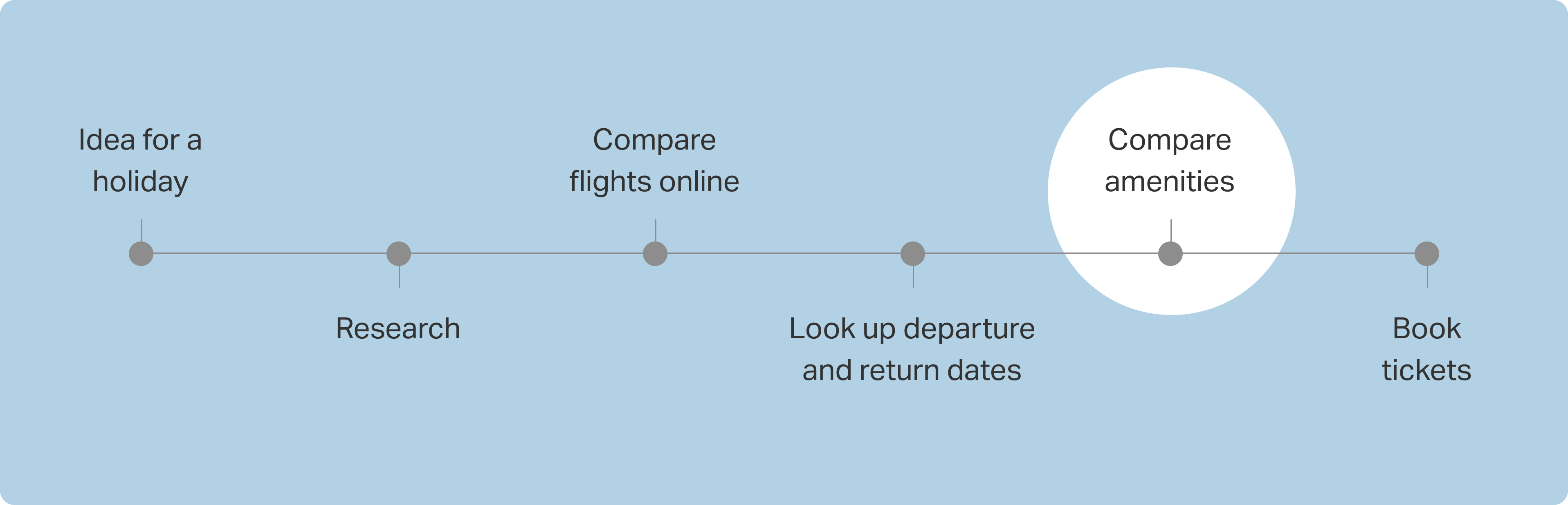
Our Observation
After identifying a key moment from the timeline that happens on BA booking page (comparing amenities), we further dissect BA current visual vocabulary that could help us take advantage of this particular decision-making moment.
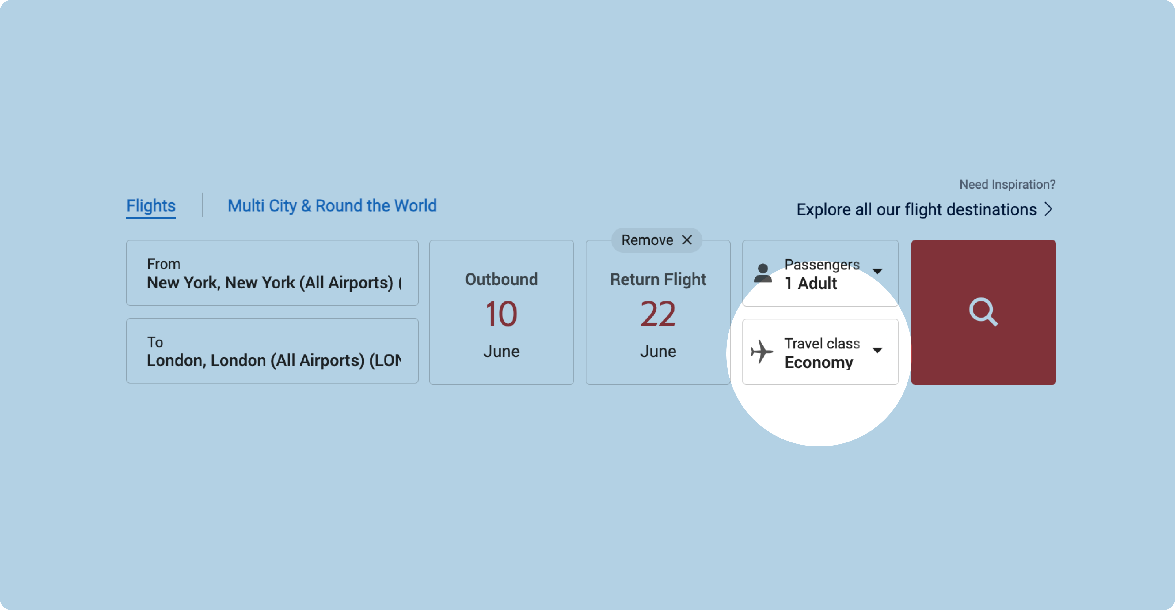
01.
Currently, the default class on offer is Economy. We believe introducing users to the best-for-value travel class right at the beginning of travel planning is a good place to reframe travellers’ expectations and showcase premium seats.
02.
We then looked at how we could bring more contrast to selected dates, for accessibility reason, in highlighting the user’s current selection.
At the moment, all highlighting colours are too similar in value.
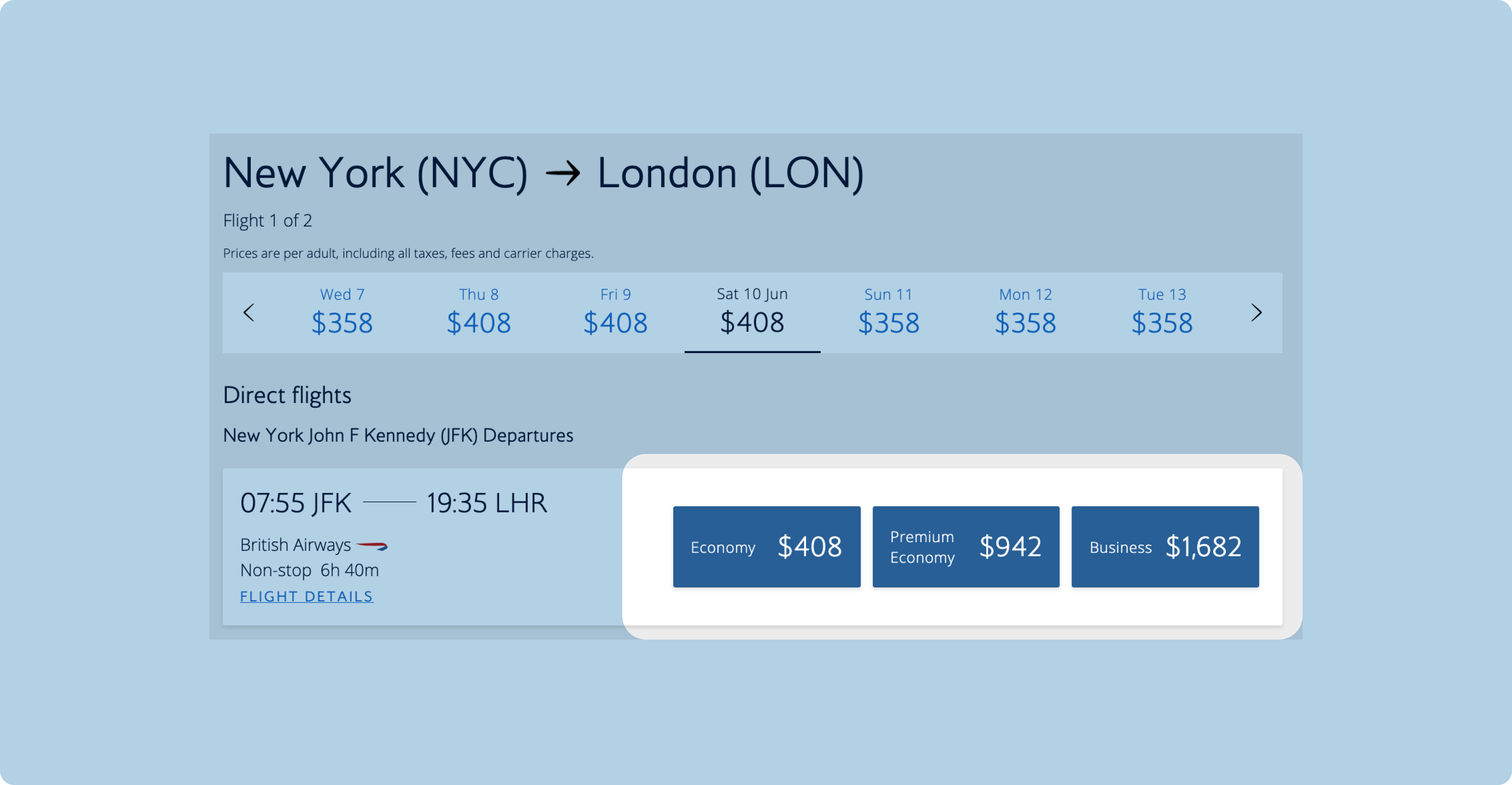
03.
Furthermore, we noticed that the difference in seat options were not noticeable at-a-glance due to the same colour used across seat options.
04.
The absence of colour contrast continues on the user’s selection journey, with little details on amenities entailed to each seat option. There’s also a lack of option to see more amenities on user’s end.
Deliver
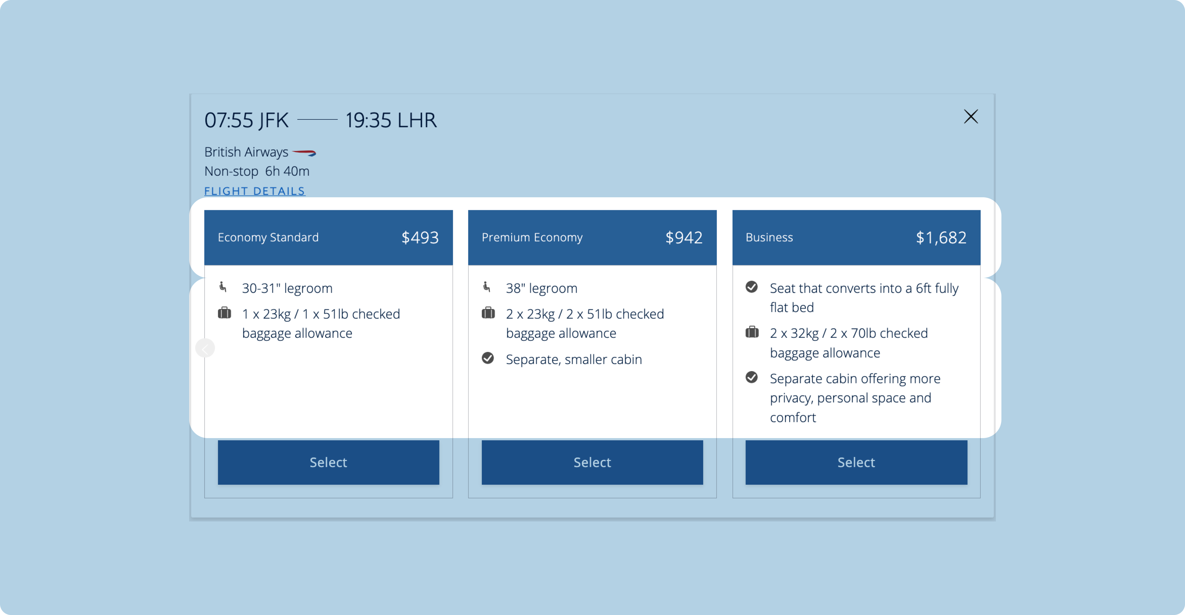
Our Proposed Solution
Building on our observations, we proposed a few meaningful interactions on the booking journey.
01. Colour hierarchy
Using colour hierarchy to highlight the difference in classes, including to showcase premium seats, makes awareness more accessible to the user.
Placing premium seat as the first option implies it is the preferred and default choice for the user.
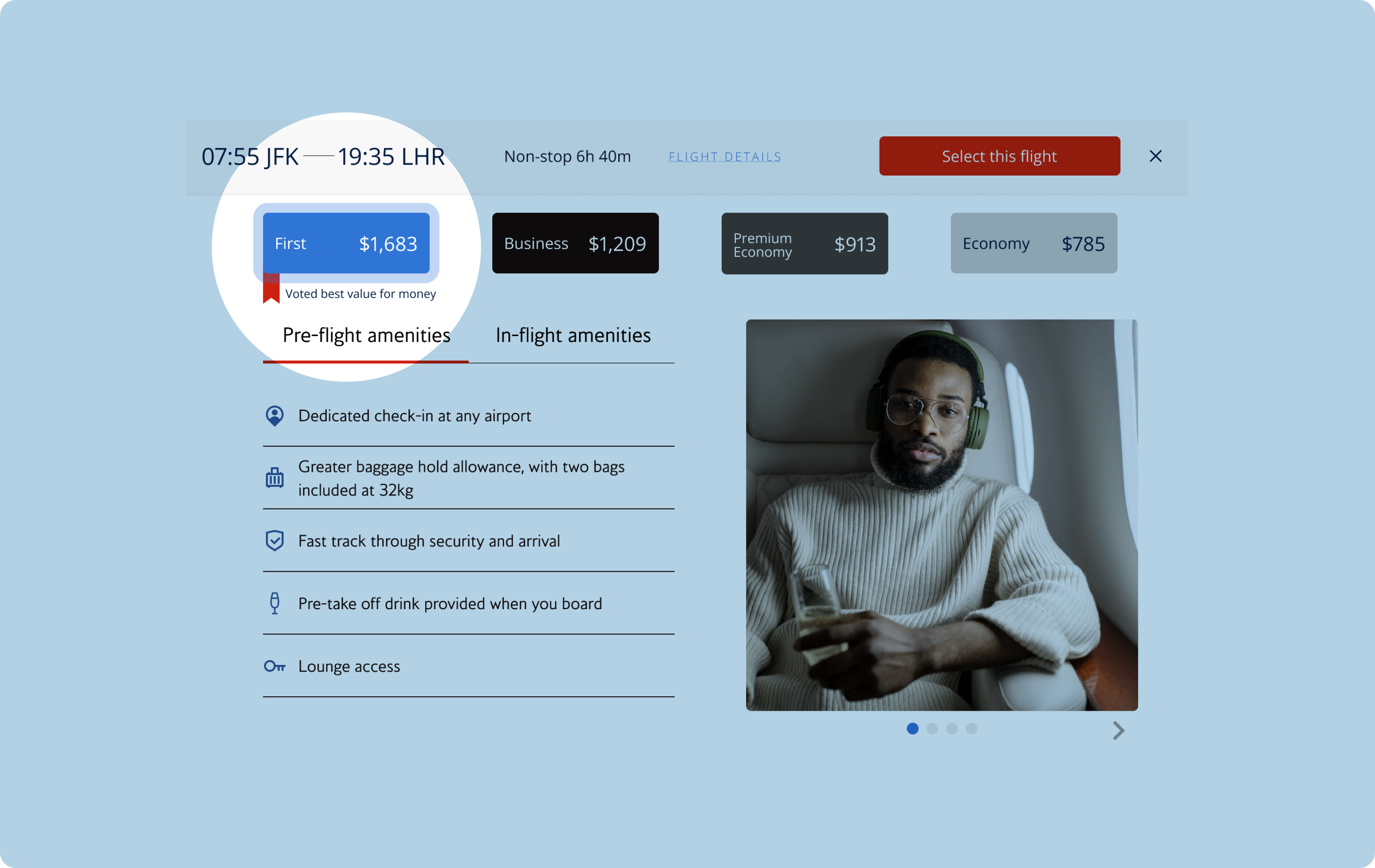
02. Highlighting ‘Best for Value’
The option for premium seat is highlighted with a banner that clearly indicates fellow travellers’ choice of travel.
The modal window also includes a clear list of amenities and a carousel of first class experience so that users can better decide what amenities would contribute to a better travelling experience for them.
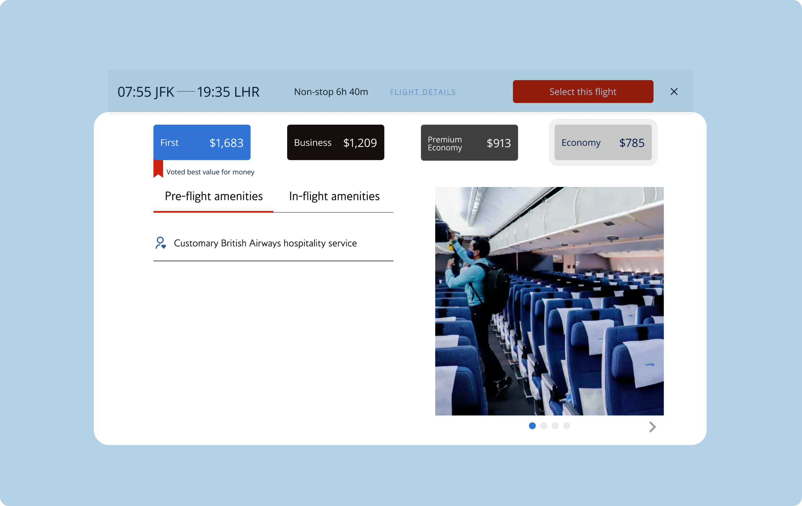
03. Amenities highlights for other classes
We also propose highlighting included amenities for each seat classes so that users can visually compare the difference.
For this exercise, we have included the Economy class to highlight the difference in offers.
Presenting Our Prototype
At the end of the hackathon, we presented our proposed solutions to a panel of British Airways’ Product Design team.
To try out our proposed prototype, please click on the link below.

Future Considerations
We would like to complete functionality of all buttons and add more animation before running the redesigned pages through usability testing and iterate accordingly to feedback we receive.
After implementing the design changes, we would also like to compare user click rate on first class after redesign to validate our design changes.
As we only focussed on desktop pages to accommodate the majority of where users usually book their tickets, it's imperative that we have a look at how the pages are performing on other platforms such as tablets and mobile phones to create a fluid and immersive journey to the users.
Key Learnings
During the design process, we had a look at colour contrast and content hierarchy as a mean to make the pages accessible. However, given more time outside the hackathon, we would like to explore how to better make the page more accessible, especially on other platforms (eg: mobile).
I treasure working with my classmates from other field of study (Data Science and Software Engineers). It has personally helped myself opened up different vocabulary and to welcome different point of views when creating assumptions and shaping our answer to the brief.
Receiving feedback from British Airways team was very valuable and provided me with powerful insights and a glimpse of how a Product Design team would operate in real life — from what areas we’re lacking and how to improve them, to how a specific role in the team has given us feedback.