Mobile App, Marketing Website
Designing an age-friendly banking app
Alon Banking is an intuitive and empathetic banking app tailored for seniors to ensure their financial independence digitally.
Role
UX Researcher, UX & UI designer
Duration
8 weeks
Project type
Academic
Tools
Figma, Adobe Photoshop & Illustrator
The Challenge
Identify gaps and opportunities to replicate an in-person banking experience in the digital landscape, where seniors can feel safe to independently continue their financial affairs.
My Approach
Through Secondary research, I will form assumptions that will guide me on my Primary research. This will consist of user interviews, Affinity Mapping and usability testing. I will seek to understand senior's frustrations and how to relieve them when it comes to online banking.
Goals
Design an app to empower seniors to use and navigate digital banking landscape for the long-term.
Pathway to solution
Discover
Define
Design
Deliver
Discover
The Challenge
With the recent increased effort by financial institutions for digital transformation, a large segment of society has seemingly been forgotten.
Despite Americans age 50-plus—worth over $9 trillion in 2018 and projected to grow through 2050—senior citizens have struggled to move their financial needs into the digital realm.
To understand the hesitation, I first researched the cause and discovered that seniors, much like younger people, are diverse in their digital experience and willingness to trust the digital space, especially when it comes to their finances. This is despite 81% of customers 60 to 69 own a smartphone, as do 62% of customers older than 70. 94% use their device every day.
According to a recent study by the Finance Foundation, the top reason that 86% of seniors don’t use online banking services was lack of human connection and unwilling reliance on machines, along with fear of making mistakes and frauds.
Authoring Assumptions
Assumption 01
Senior citizens stay away from digital devices because they require a steep learning curve
Assumption 02
Senior citizens prefer to visit bank branches to have someone to talk to
Assumption 03
Senior citizens prefer cash over e-transfer for tactility
Assumption 04
Senior citizens find it hard to navigate the digital world
Assumption 05
Senior citizens are wary of security aspect of online technology
Assumption 06
Senior citizens see themselves as easy target for online scams
Hypothesis
I believe Senior citizens don’t find digital banking platforms age-friendly.
I will know I’m right when I see the following feedback from my interview: At least 3 out of 4 of my interviewees feel left behind by their banking institution.
Understanding the Users
To understand and validate my assumptions, I conducted user interviews with four of my target audience with the following criteria.

Be at least of the age of 60

Own at least one banking account

Use at least one digital device

Have made a banking transaction in the last 3 months

Have an active social life

Interested in world news
Participant Profiles
Margaret
72-year-old housewife
Margaret lives with his husband in a small town outside of London. She used to be a carer and is now the main financial organiser in her household.
Margaret values her local bank branch manager, as she knows her by name and feels like her concerns are listened to because of it.
Salomon
69-year-old retiree
Salomon recently moved to Wiltshire with his wife. He now spends his days walking in nature or playing quiz games at his local pub with his wife.
Salomon believes online banking is not as secure as it could be.
Sandra
69-year-old retiree
Sandra enjoys observing the latest trends in fashion and home decor. Although retired, she still answers when her former employer calls to keep herself busy.
Sandra uses her mobile banking app regularly and finds it easy to transfer monies to her family and friends.
Ansel
71-year-old retiree
Ansel enjoys taking a walk with his wife and dog. He’s often on Facebook Marketplace to sell some household items that his family no longer needs.
Ansel likes having printed bank statements so that he could match his spendings with the printed receipts.
Reflections
Some reflections as a result of my interview that I found valuable:
Seniors are diverse in their experience and how willing they are to embrace new technology.
Seniors are adept with mobile devices, but when they are met with a dead end or a broken online journey, they become discouraged.
Seniors thoroughly value a human connection as they equate the experience as being respected.
Employing Affinity Mapping
After conducting interviews, I then further distilled the interviews further using Affinity Mapping for insights.
The following three insights emerged as the result of Affinity Mapping exercise.
01
Online banking harbours a feeling of vulnerability
“Online banking, are still perceived by seniors as vulnerable to outside threats and they are keeping vigilant as ever.”
“I think it’s safer to send a cheque to tax agency” (Margaret)
“I always check off receipts against a bank statement.” (Ansel)
“I check my account regularly for suspicious activity” (Salomon)
“Once you make a mistake on a machine, there’s no going back” (Margaret)
02
Online banking journeys aren’t tailored to each users
“Many seniors are finding online banking experience impersonal with computer system, instead of a human being, looking after their banking needs.”
“I find bank employees are more helpful in person. I get a proper answer to a question, and I can read their body language” (Ansel)
“Another bank I used to bank with kept coming up with extra steps to bank” (Margaret)
“My bank branch knows me and there’s no reason to change bank” (Margaret)
“When my husband had a health scare, I needed access to joint account” (Sandra)
03
Surface-level convenience of online banking
“Most seniors recognise the convenience of online banking, but some stop short of fully utilising their banking app on their mobile”
“I always check off receipts against a bank statement.” (Ansel)
“I don’t like online account because family member can be nosy” (Margaret)
“I have been with my bank for 56 years, purely convenience" (Salomon)
“I bank because money has to be in the bank account that I have access to, to pay for things like meals out or shopping” (Sandra)
Define
Out of the three insights that have emerged, insight number 02: ‘Online banking journeys aren’t tailored to each users’ presents the most opportunity for solutions.
This insight directly addresses seniors' preference of dealing with human rather than machine and offers plenty of different solutions. The majority of seniors view interaction with machines as mistake-laden without empathetic feedback from a human being. This is further distilled with a 'How Might We' statement.
How might we help seniors feel more comfortable in an online banking environment so that they continue to use it for the long-term?
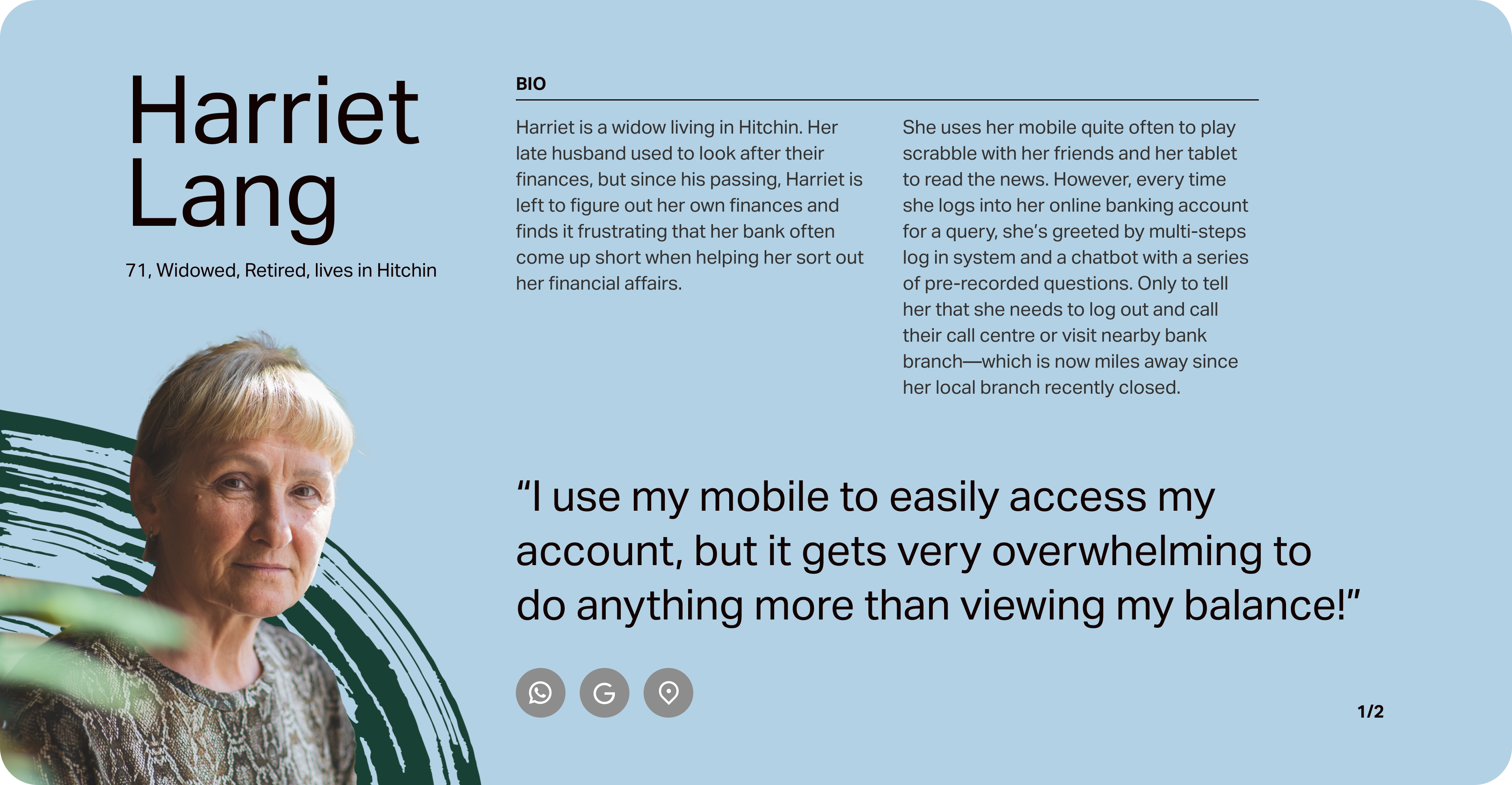
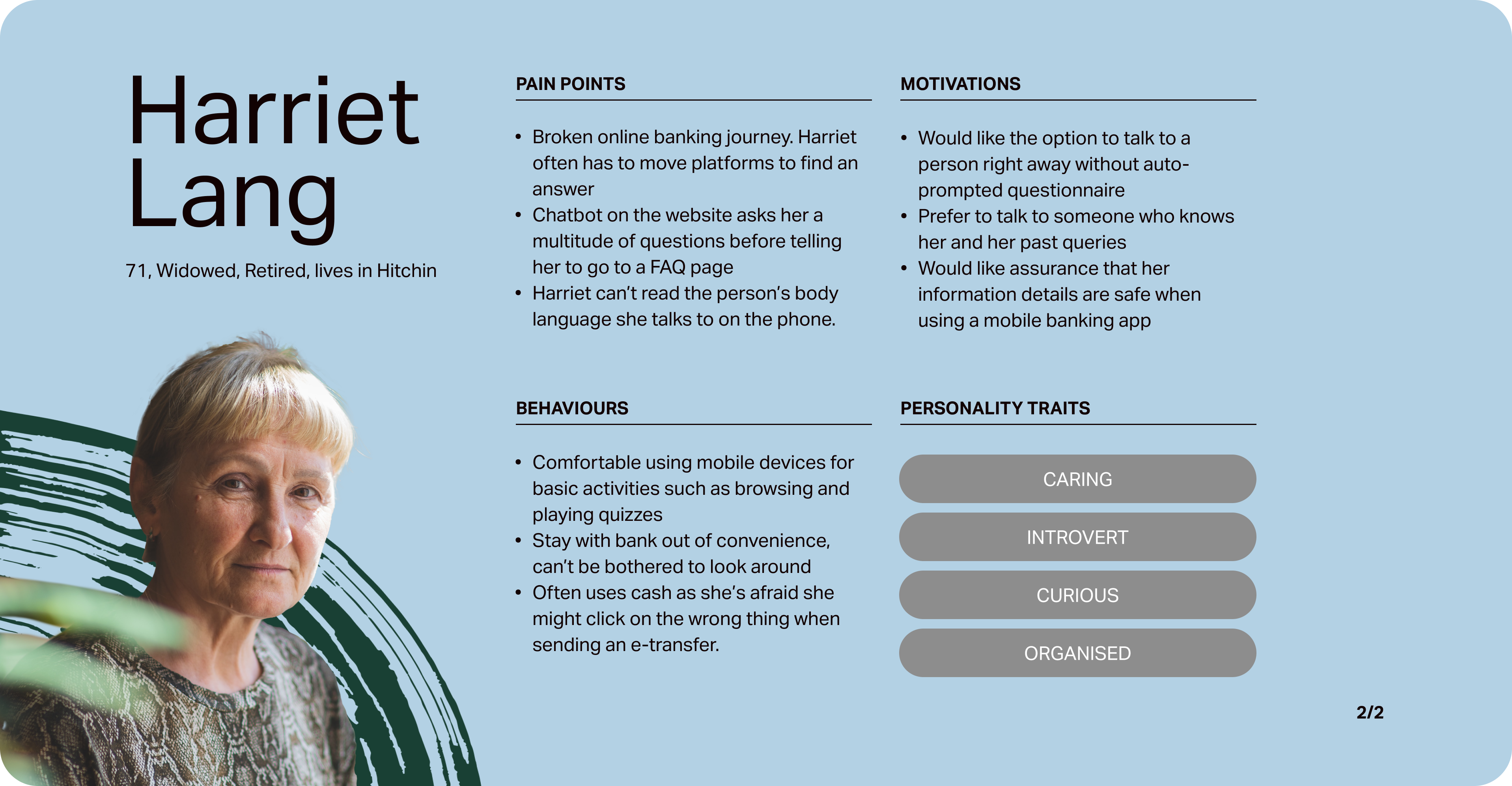
Who are Our Users?
To help better focus my solution, I will first need to define the users with the help of a persona. Harriet Lang as a persona guides me in every design decision I make with her pain points, motivations and behaviours.
Identifying Opportunity
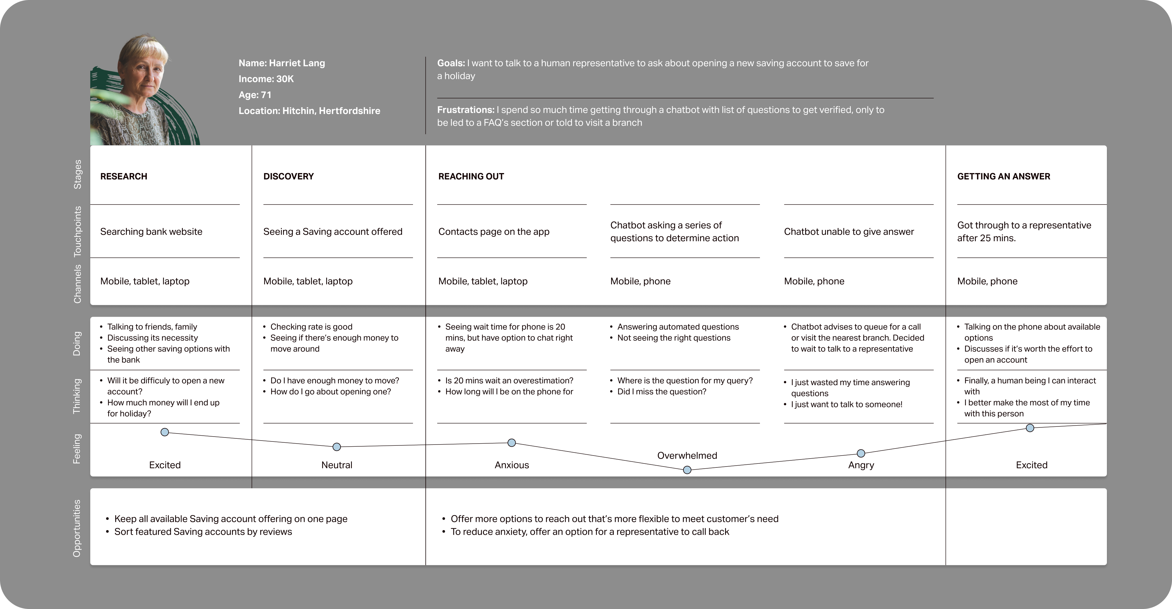
To help gain deeper empathy and identify areas of opportunity with my persona, I try to map her current experience in search for answer to a query.
Design
Refining the Objective
To accomplish my main objective of how to replicate an in-person experience in a digital platform so that senior users feel comfortable in an online banking environment.
I started with exploring User Stories, followed by establishing Epics before creating a task flow. After which, I will start exploring what the physical UI of the app will look like.
My Discovery Path

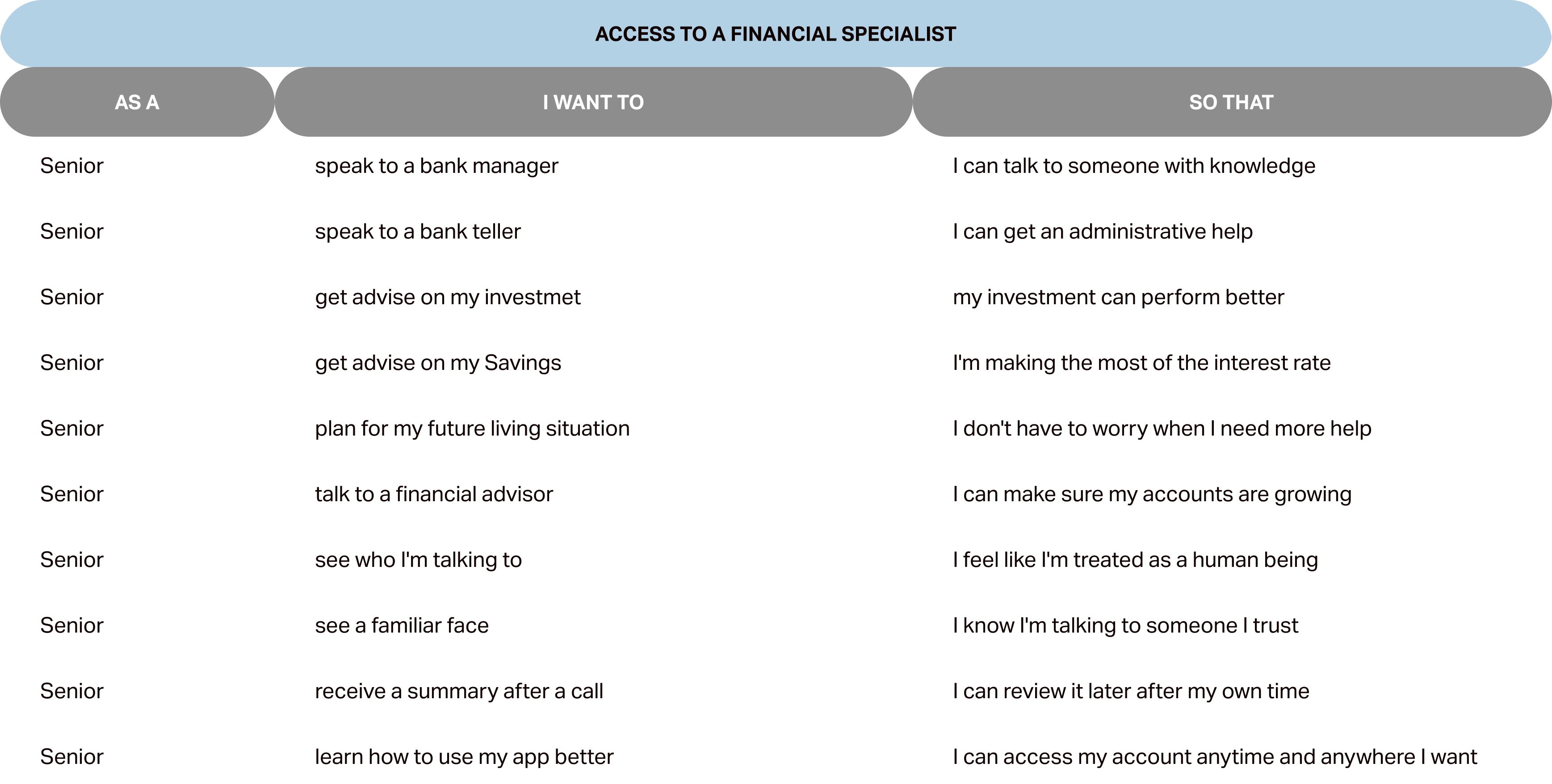
Establish User Stories & Epics

Establish Task Flow

Exploratory & Solution Sketches

Prototype

User Testing
Task Selection
To identify my main task, I consider Harriet Lang's needs as a persona.
I created a set of 40 user stories under 4 epics in order to help me define the main feature of my product. The following epic is chosen to create my Minimum Viable Product, as it addresses my 'How Might We' statement.
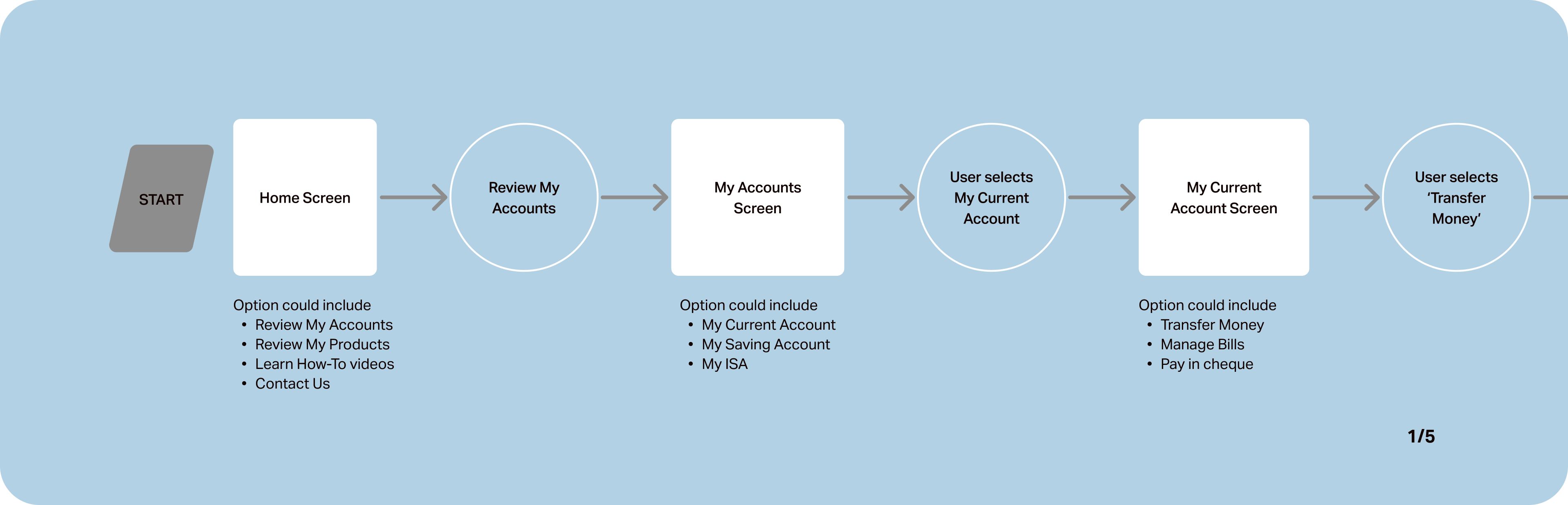
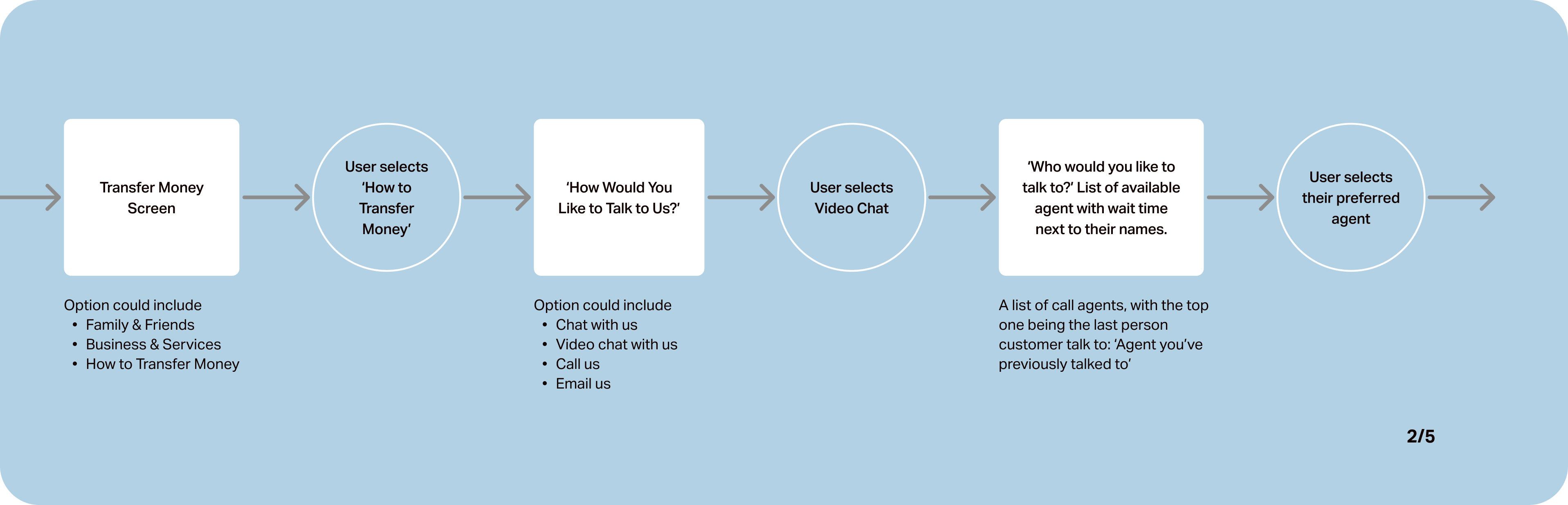
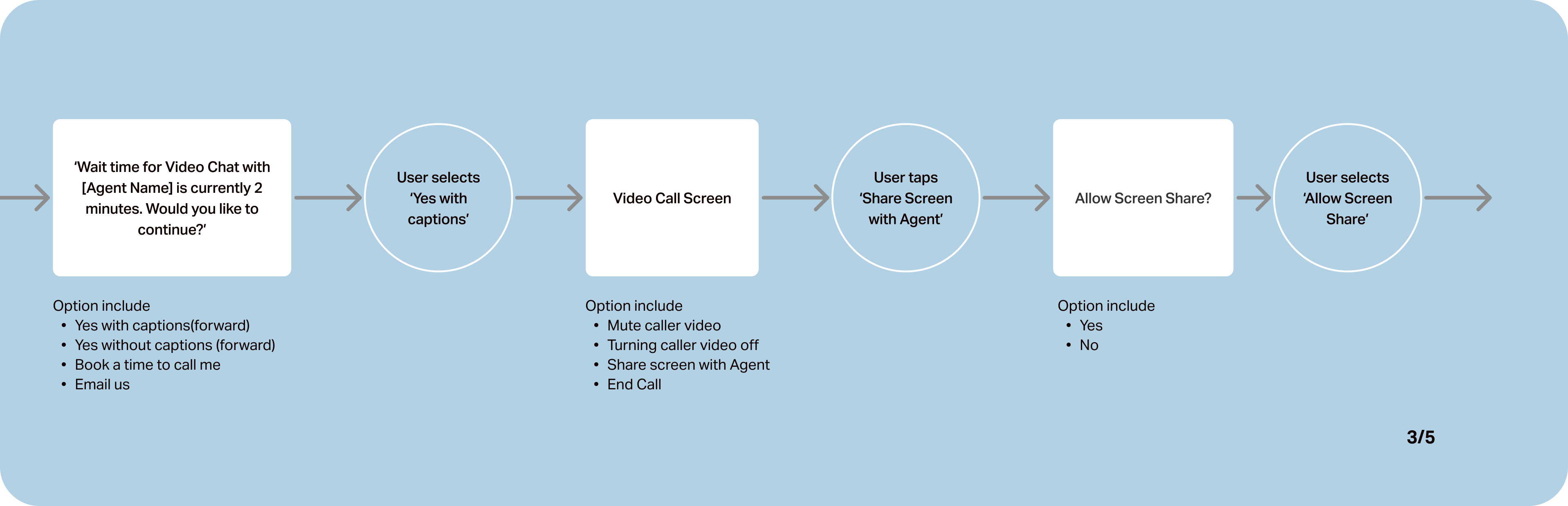
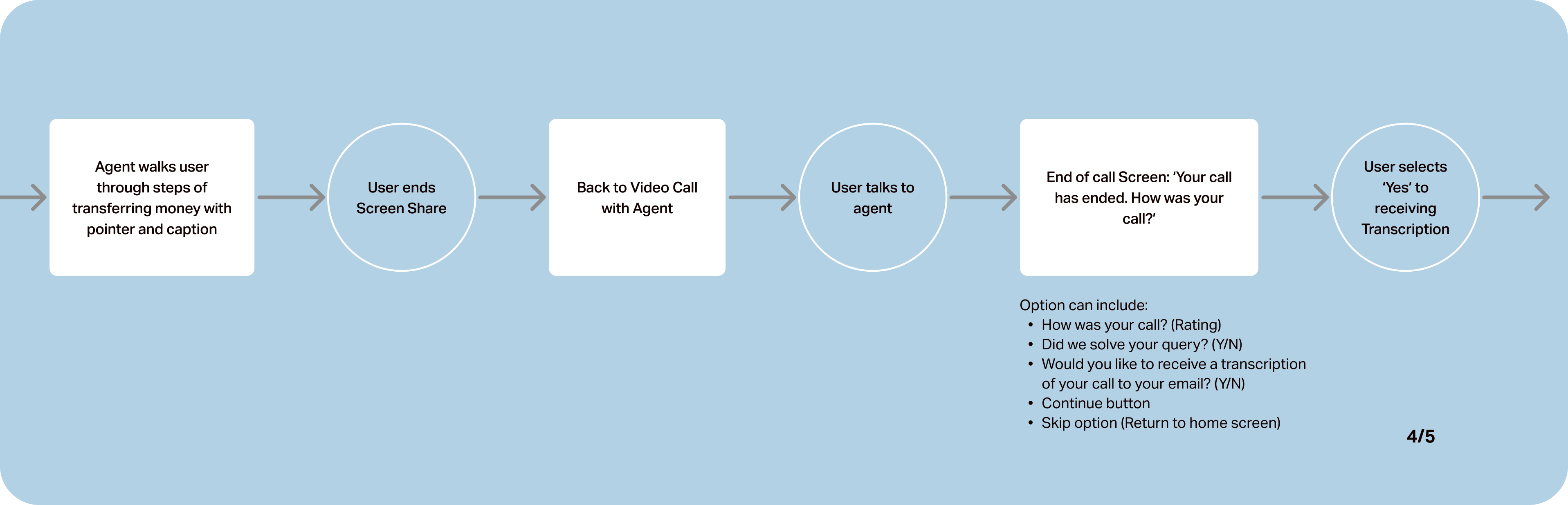
Creating a Task Flow
With this task flow, I aim to show how Harriet would seek and receive help, replicating an in-person experience digitally.
In this user scenario, Harriet, as my user persona, is looking for help to pay a plumber that recently completed a job for her. She's reached out to an agent to remind her how to pay her plumber digitally.
Ideation Process
To jumpstart my visual process, I began with exploratory sketches with pen and paper, to roughly map where I think each feature and CTAs could live on the screen.
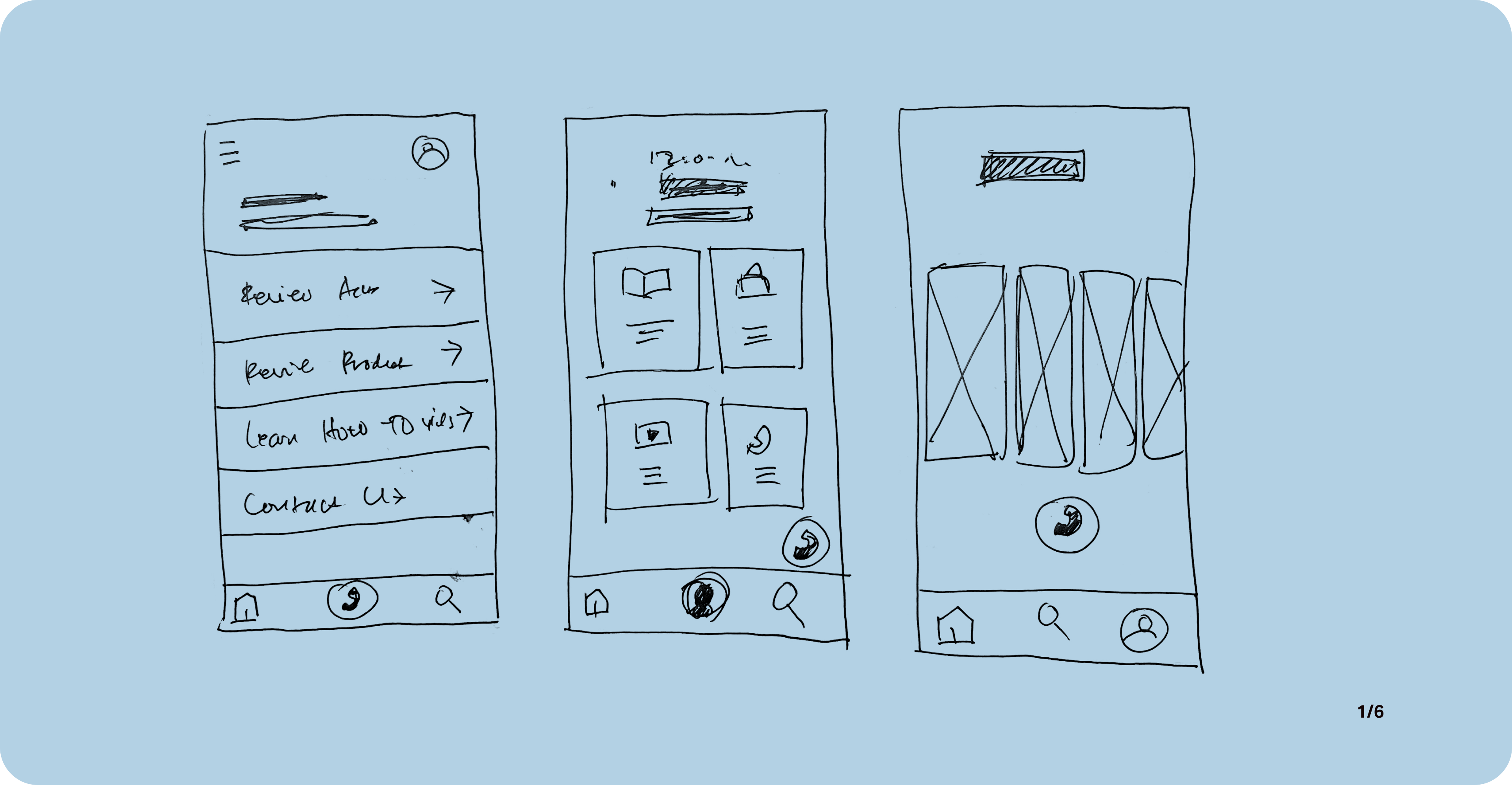
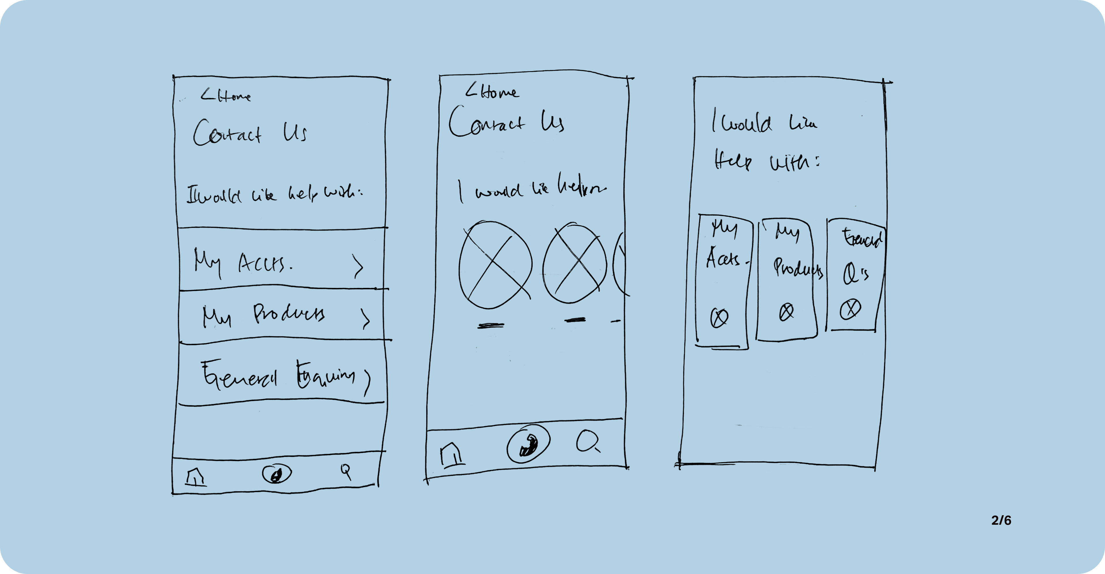
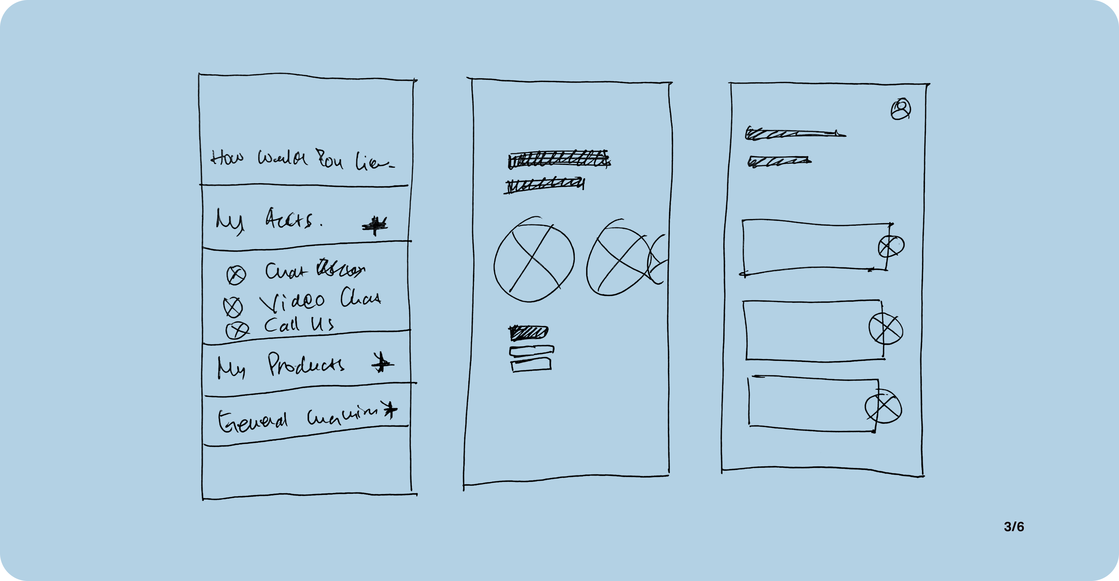
Concept Selection
Taking into consideration the ‘How Might We’ statement and user persona's number one need, I hone the sketches into solution sketches below.
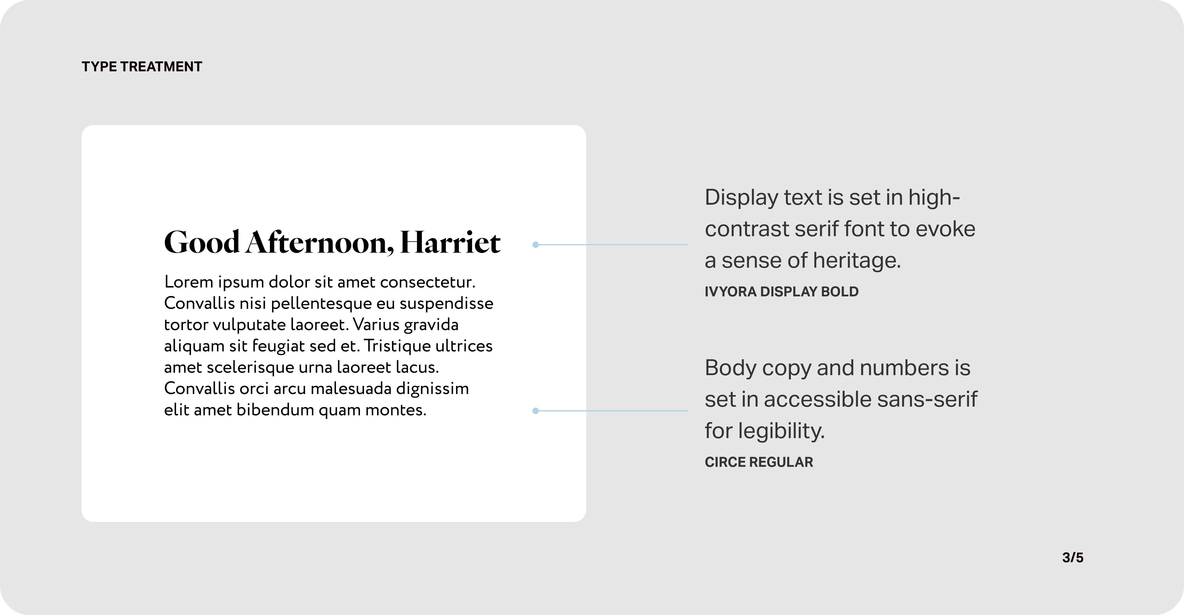
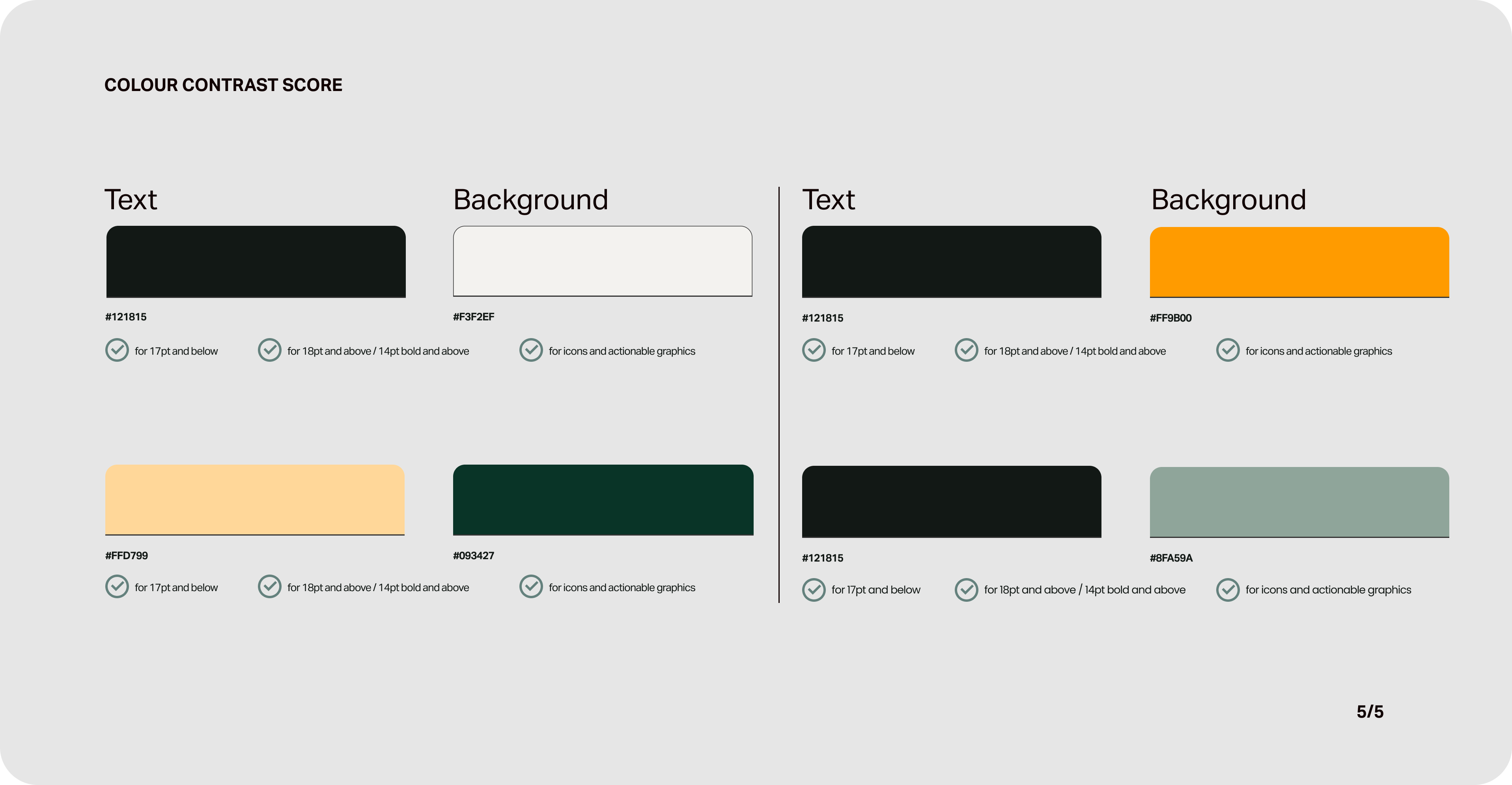
They're the ones that would allow me to replicate a high degree of real-life interaction in the digital environment. I also took into account the accessibility and legibility to cater to my users, employing bold and high-contrast fonts and buttons.
Developing Mid-fi Prototype
After finalising the initial sketches, I moved on to build a mid-fi prototype to give me a better understanding of how each element will work together.
Usability Testing
Using the mid-fi prototype, I seek to validate my design choices through user testing my target users. In my opinion, this process has been the most enlightening and enjoyable in the process so far.
I value users’ feedback and learn how they perceive things differently based on their own experience and from my own assumptions.
I ran two rounds of usability testing with five users each round, resulting in the following highlights.
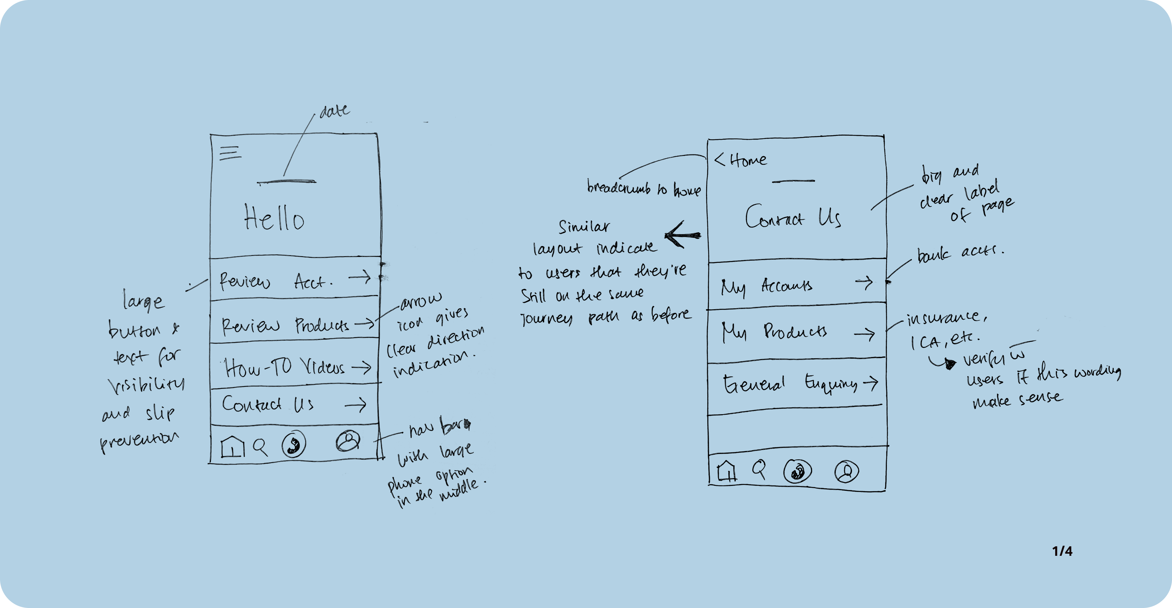
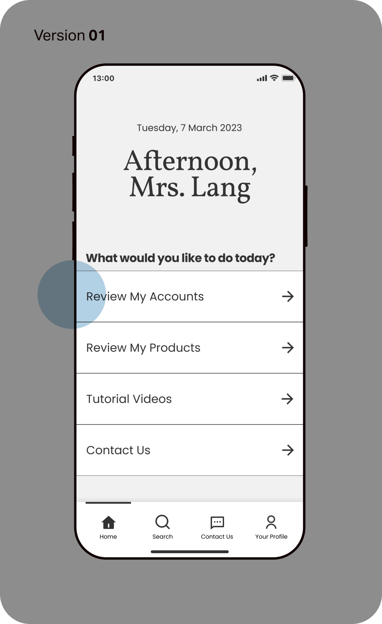
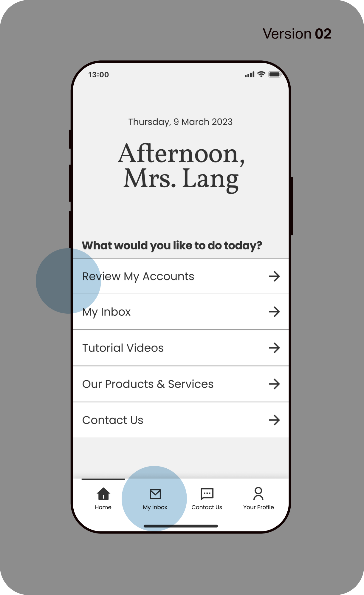
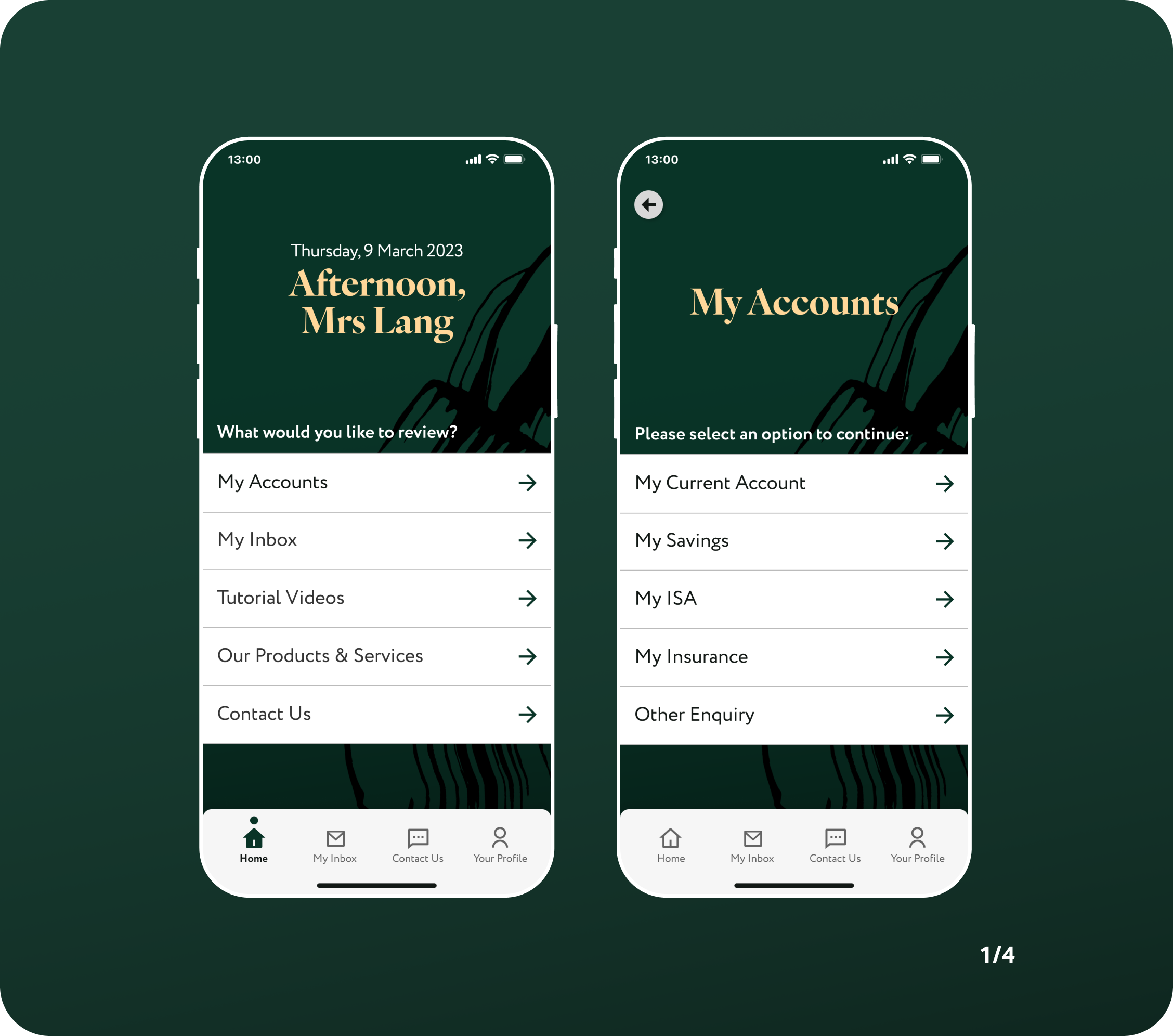
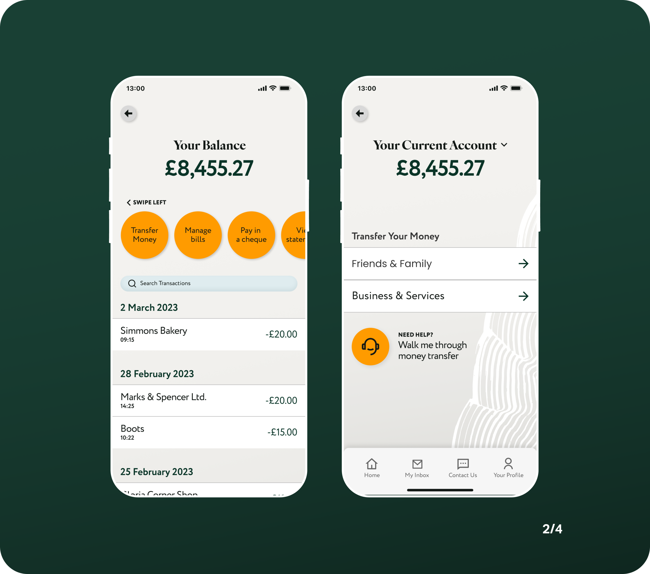
01. Home Screen
Users indicated that the wording used on home screen menu was too vague and require a lot of mental association to learn what they are.
This is not only counter-intuiitive, but will also only benefit existing users who frequent the app often.
Furthermore, the hierarchy of information needed to be more logical in terms of user priority for logging into their account.
Users also reported that the 'Search' function in the navbar is unclear and unsure what they would search for this early on their journey. This has since been replaced with 'Inbox' for easy access.
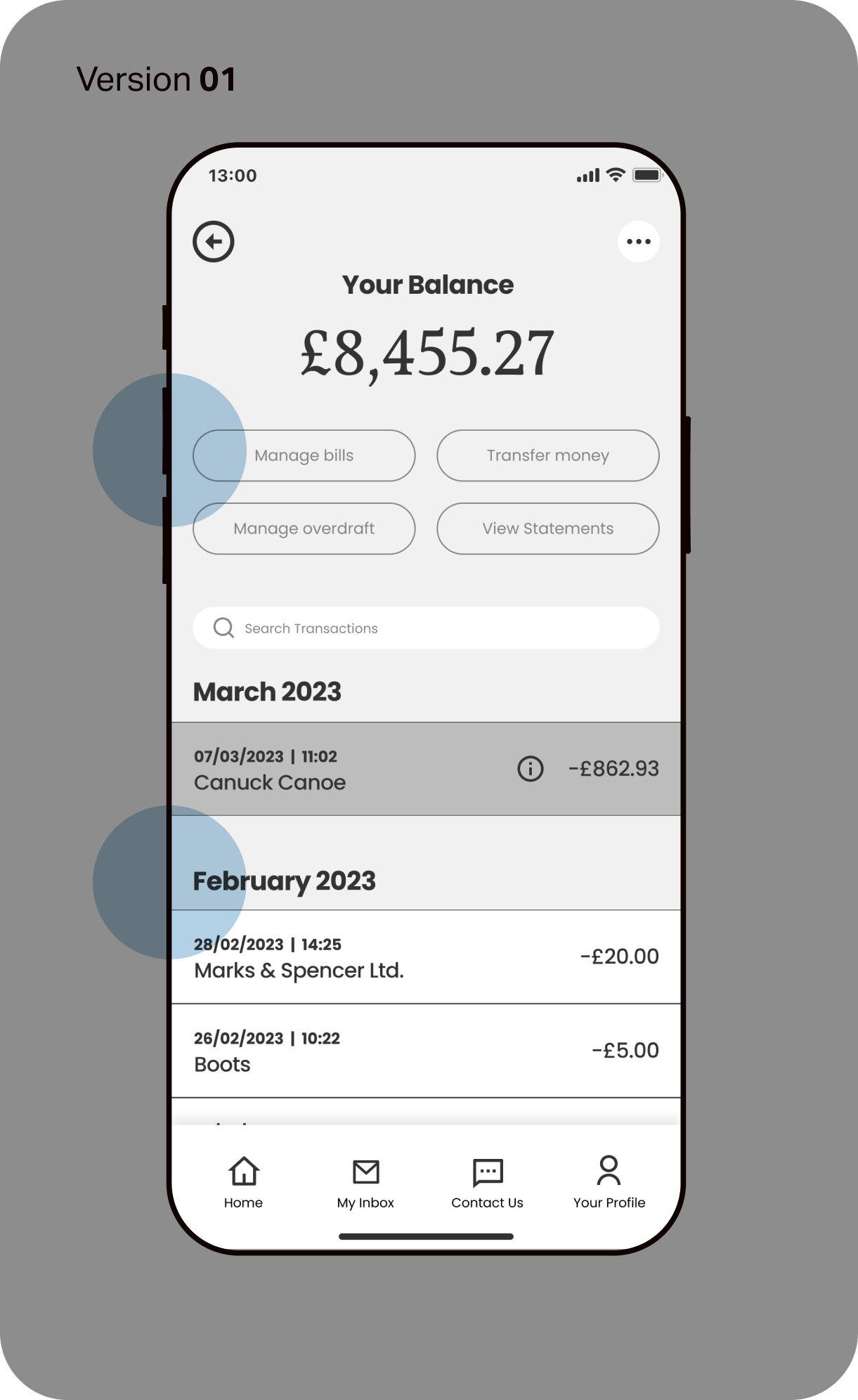
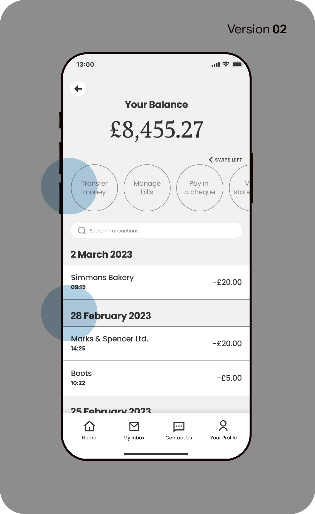
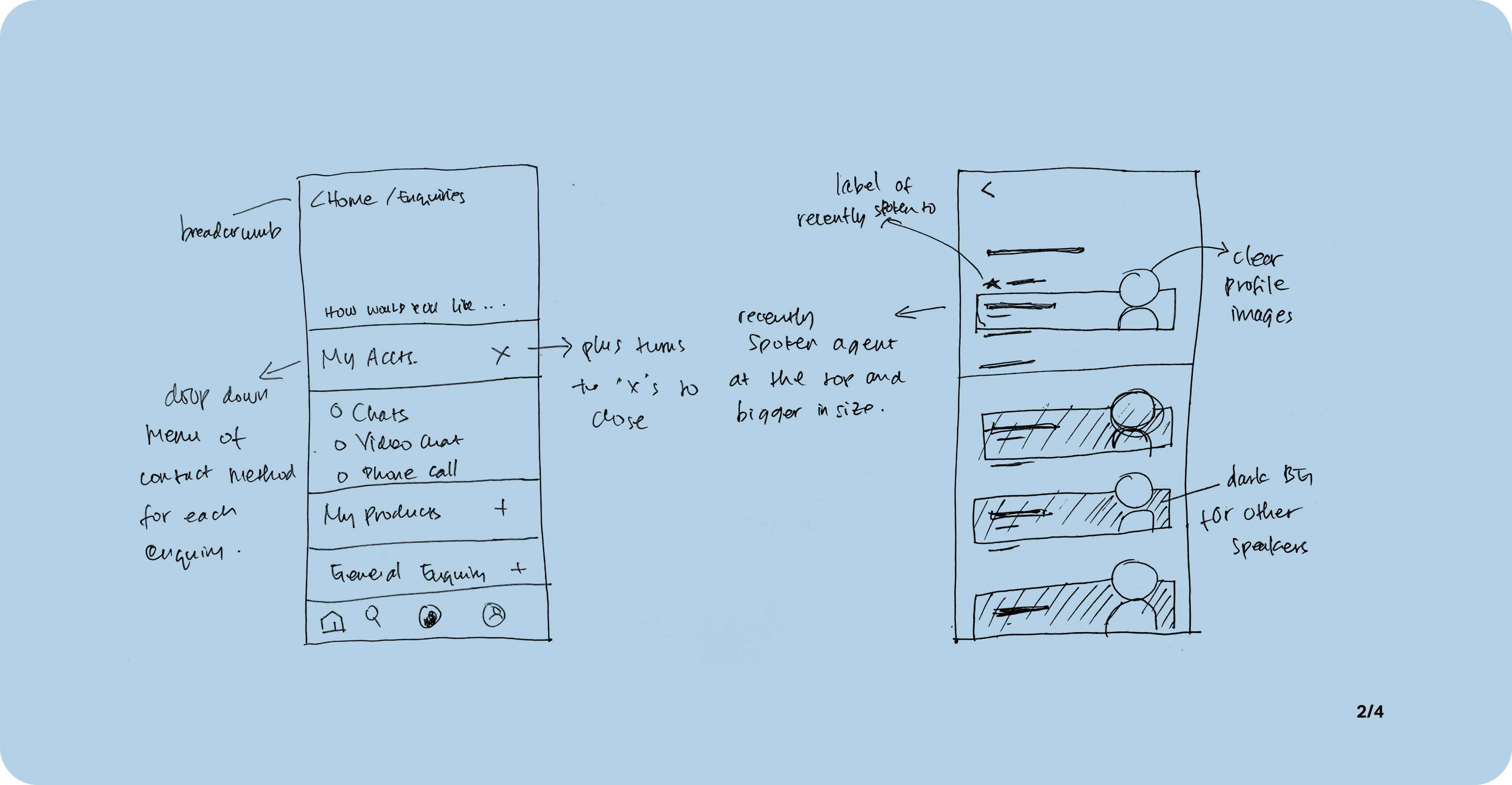
02. Account Screen
Users have noted that activity chips at the top of the screen are too small and too close to each other, making them prone to slips.
In the same vein of accessibility, transaction details have also been sorted by dates instead of month for a straight-forward review.
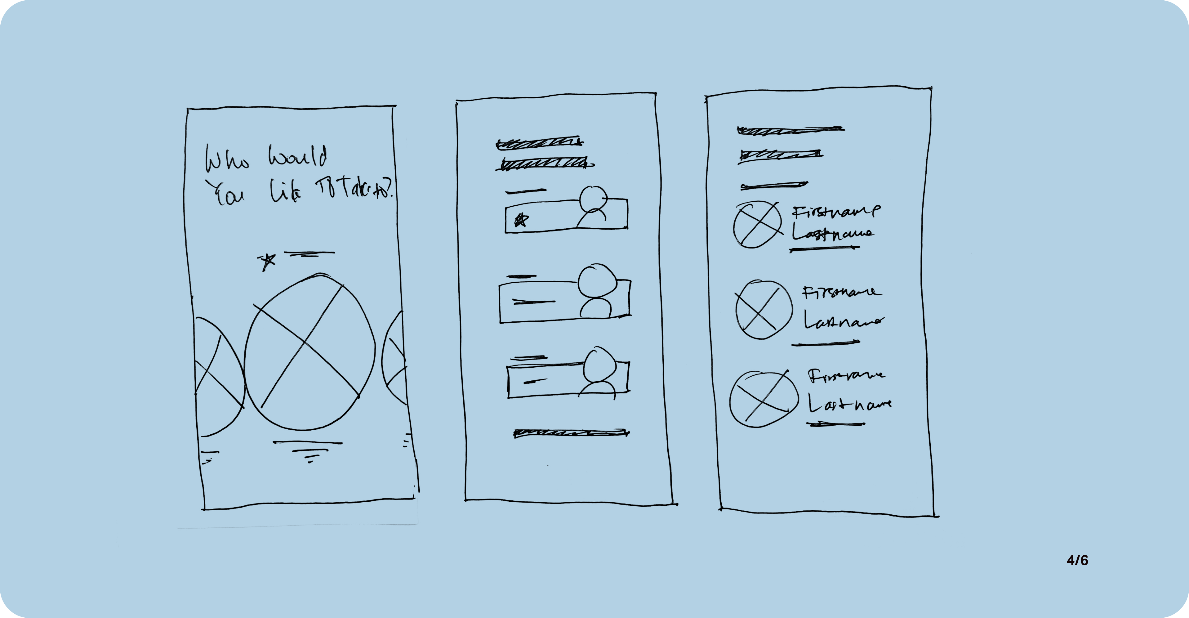
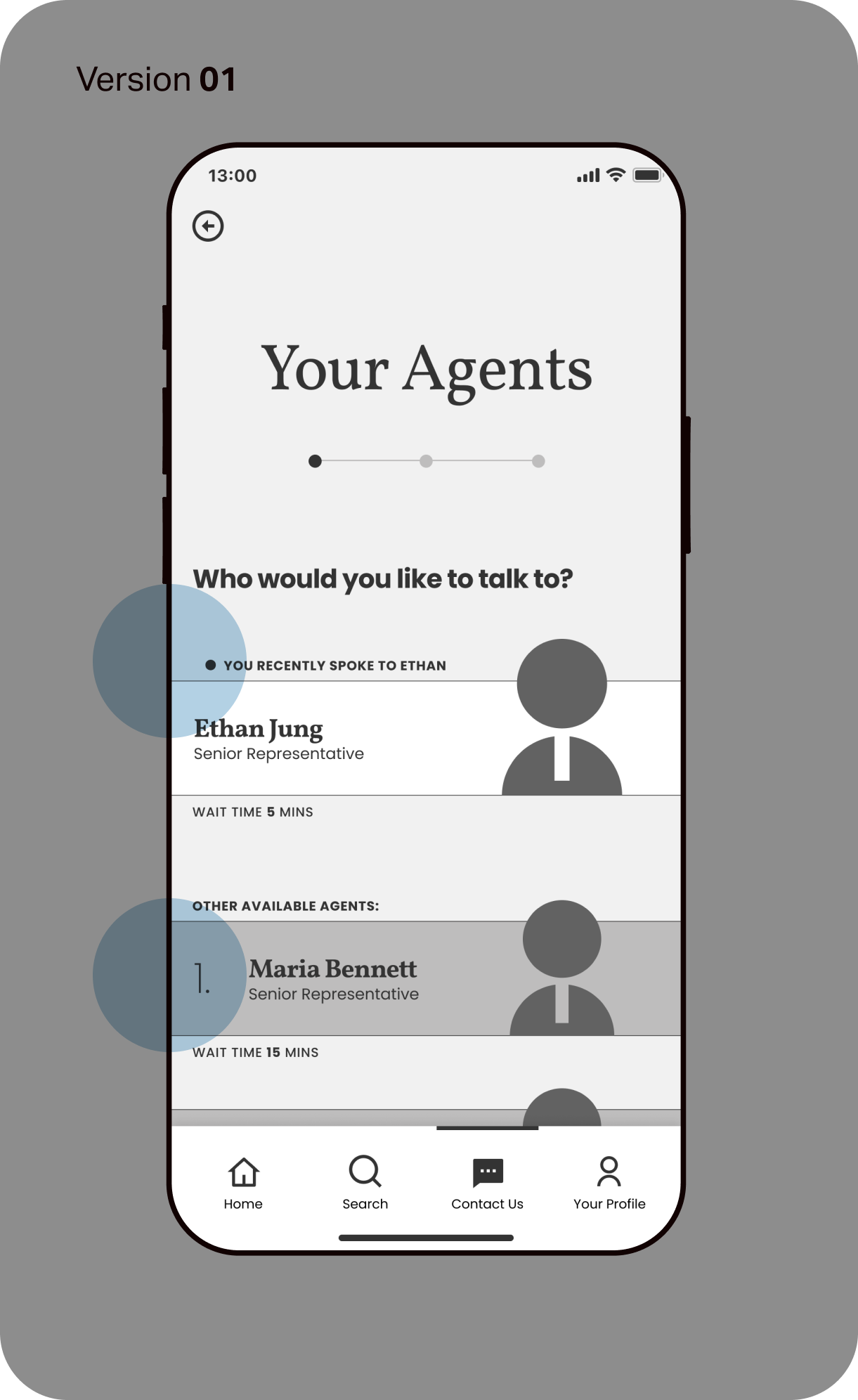
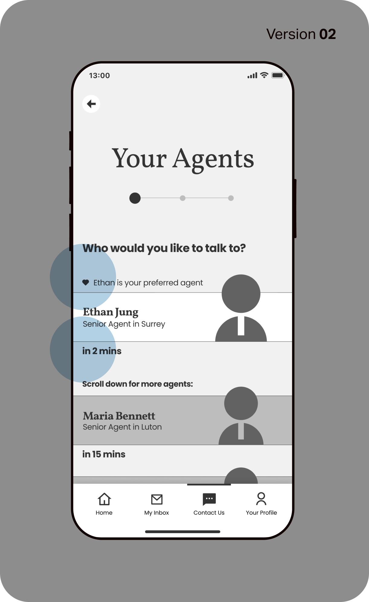
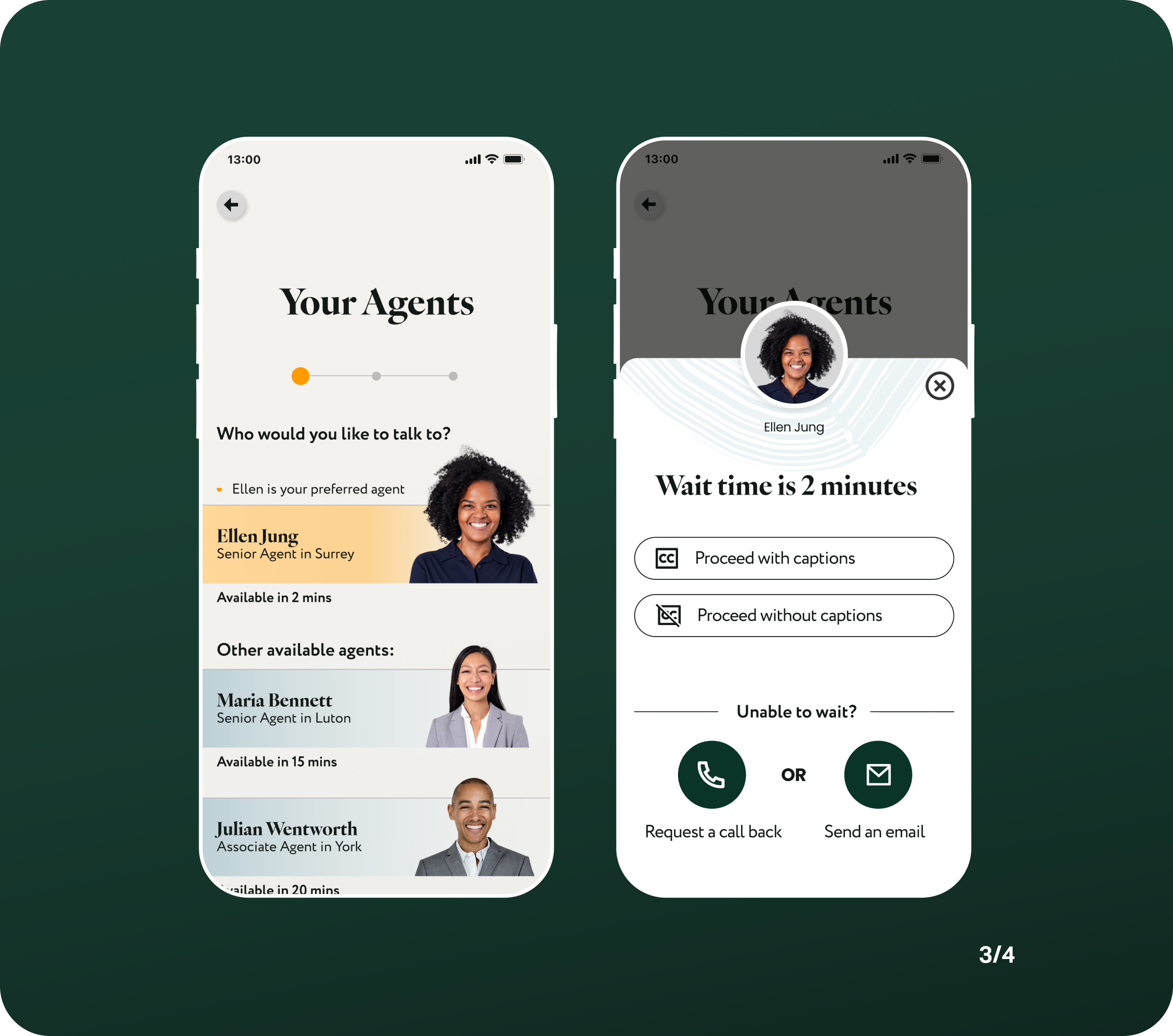
03. Agent Selection Screen
During user testing, one user remarked that the 'last interacted' agent, doesn't always translate to a good interaction, and she may prefer to speak to a different agent.
This update has been reflected in the wording that now clearly labelled a 'preferred agent'. Further down the journey, the user will have the option to save (or remove) an agent as their preferred point of contact.
I have also removed the listing number for other available agents, as some users confused this as 'ranking'.
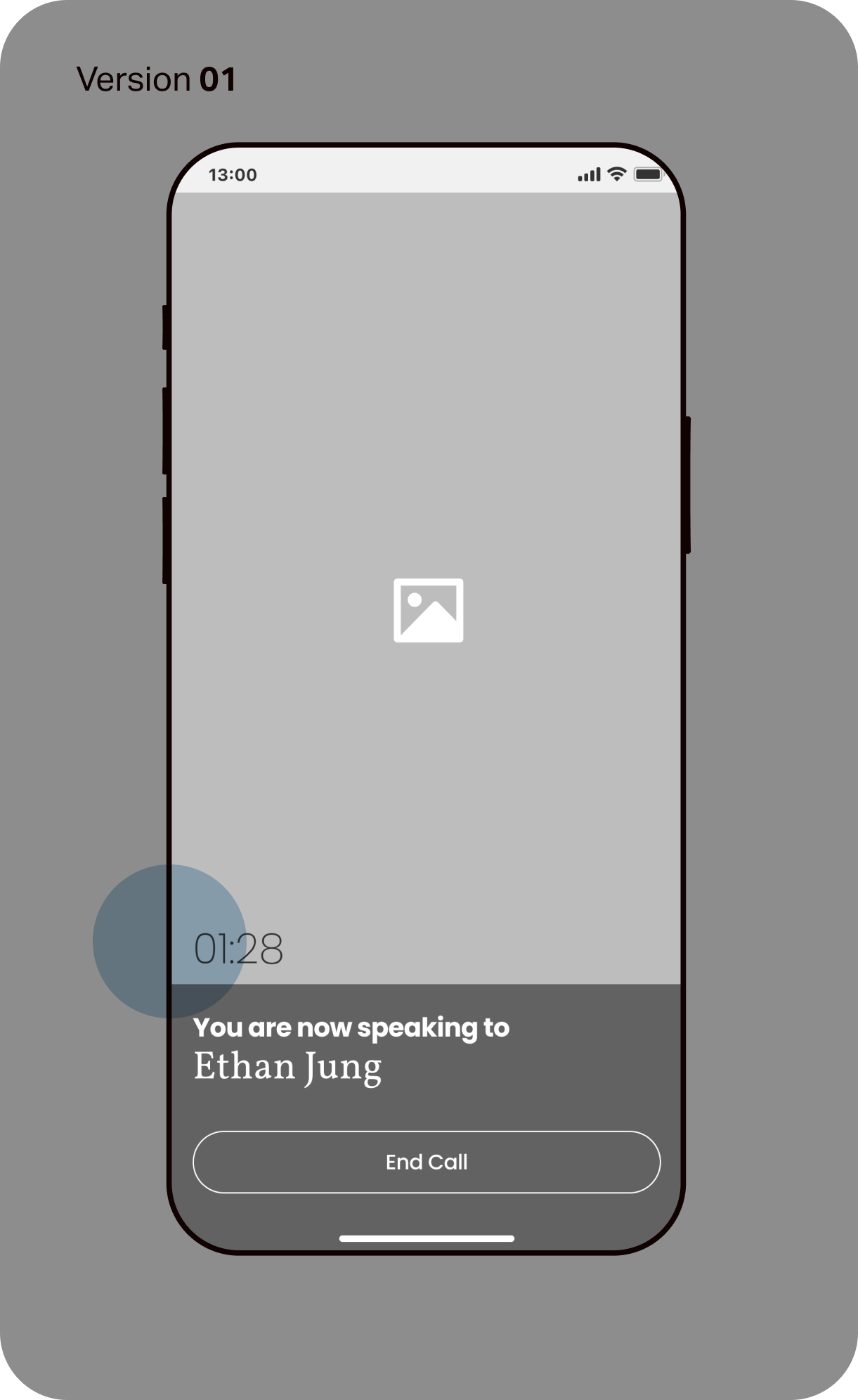
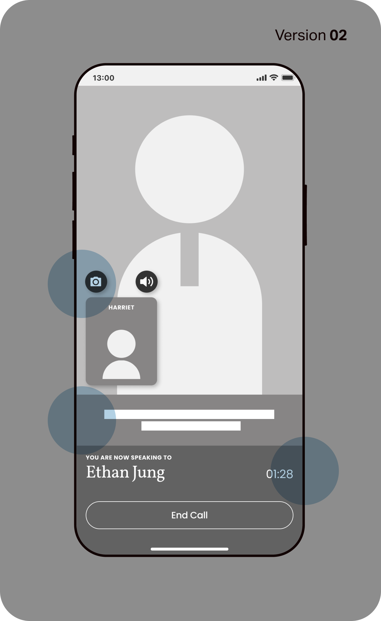
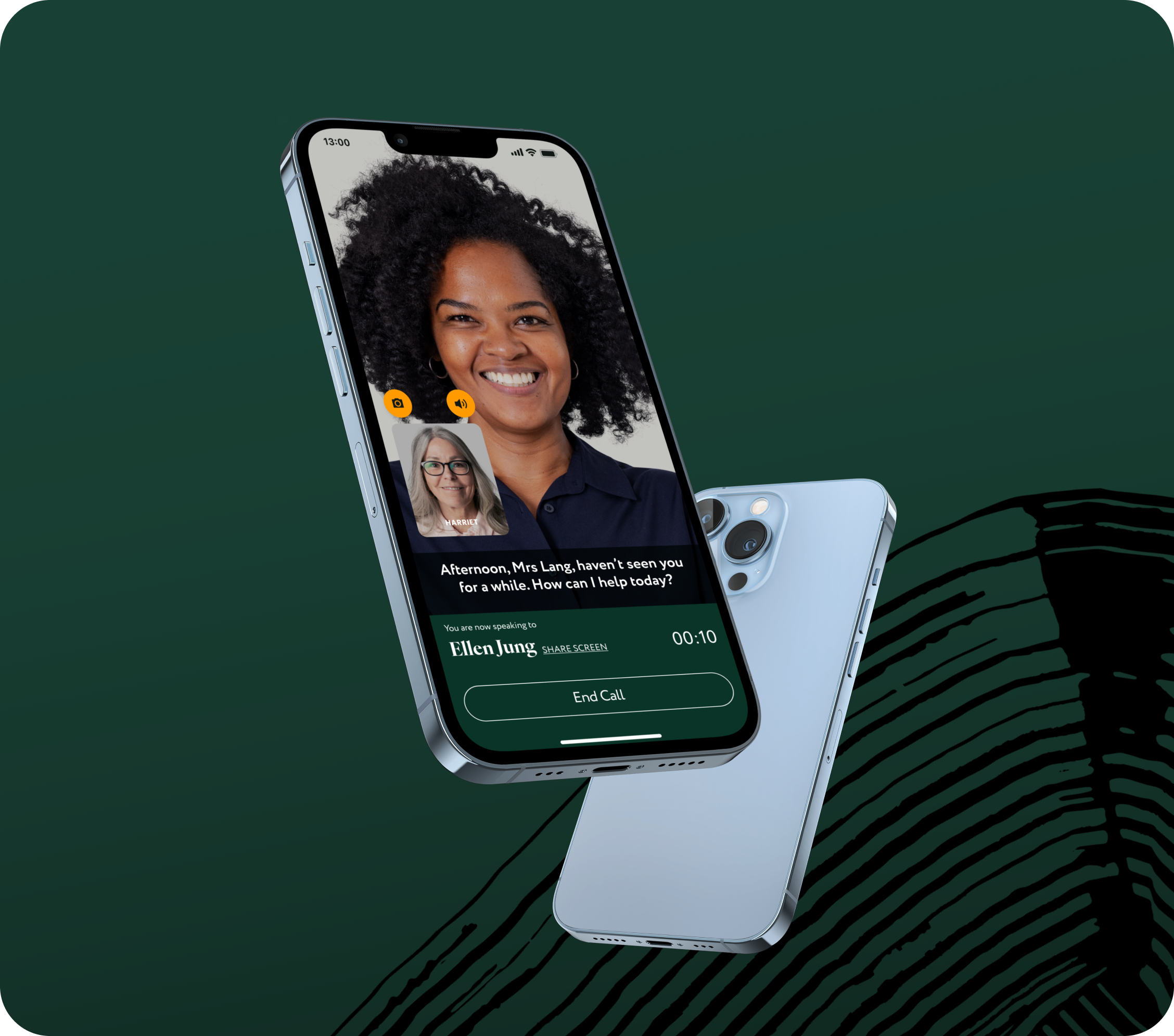
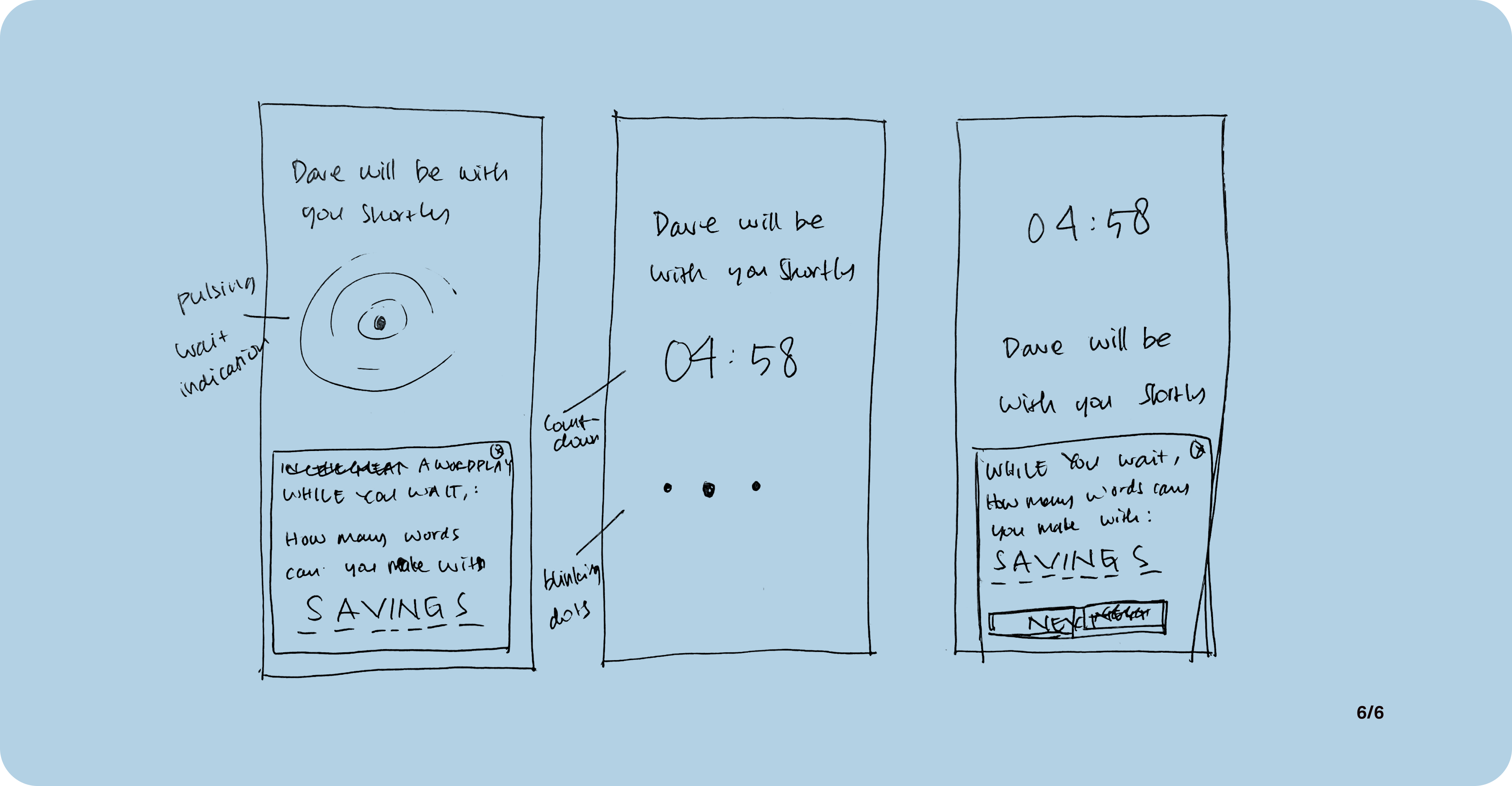
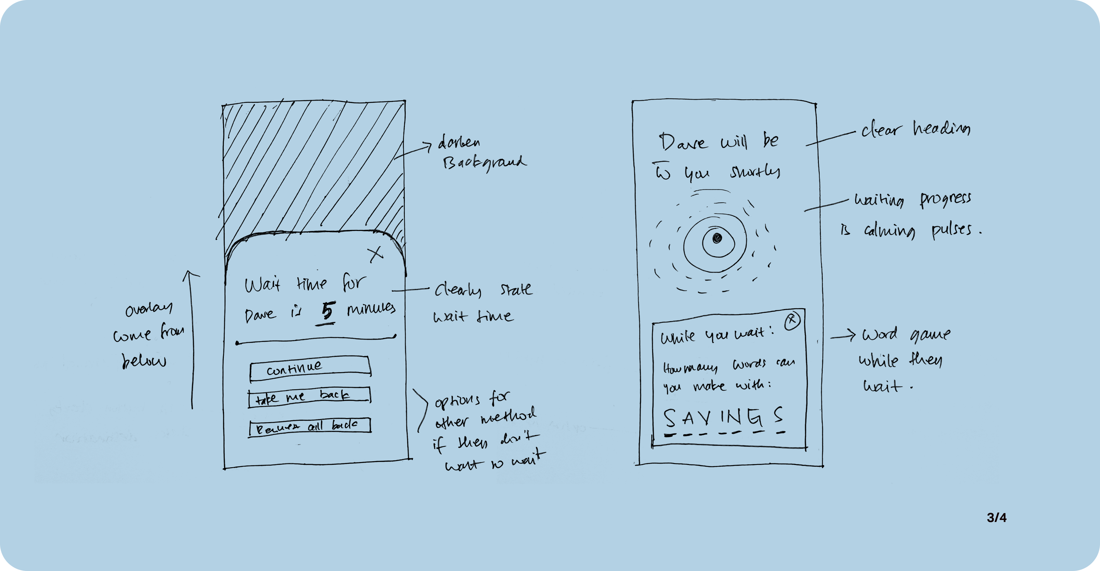
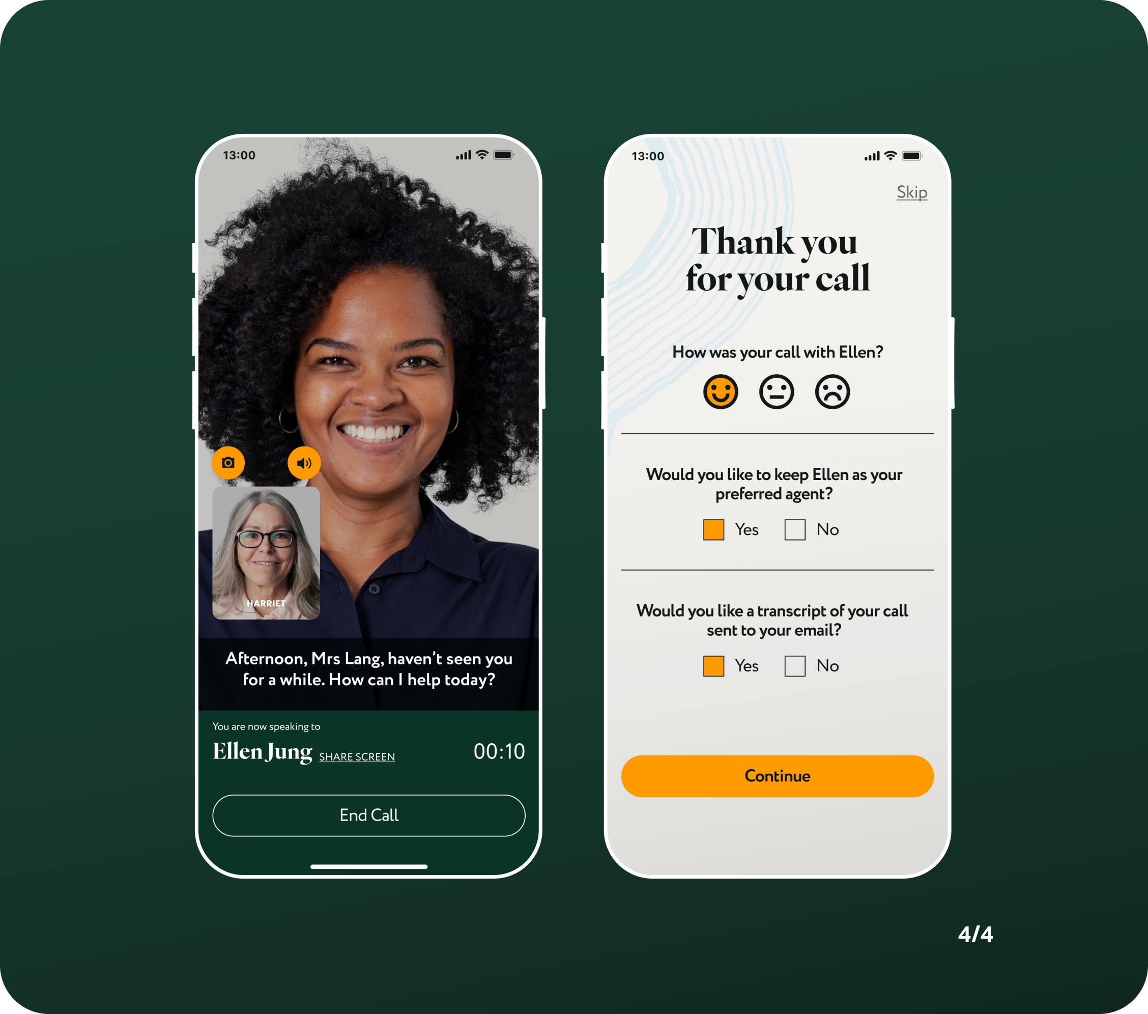
04. Video Call Screen
A few updates on the video call screen includes moving the time-lapse countdown to a smaller corner and closer to the agent's name so that it won't be confused as current time.
A couple of users have also requested a closed-captioning feature to accommodate their hearing impairment or harder to understand accents.
A small window with their own profile is now available with the option to turn on/off camera and sound.
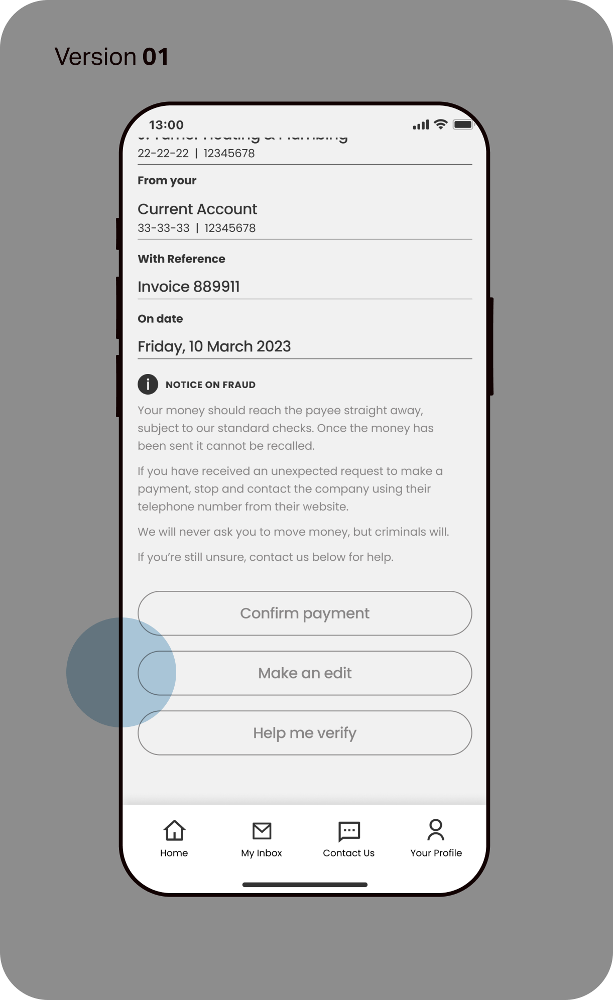
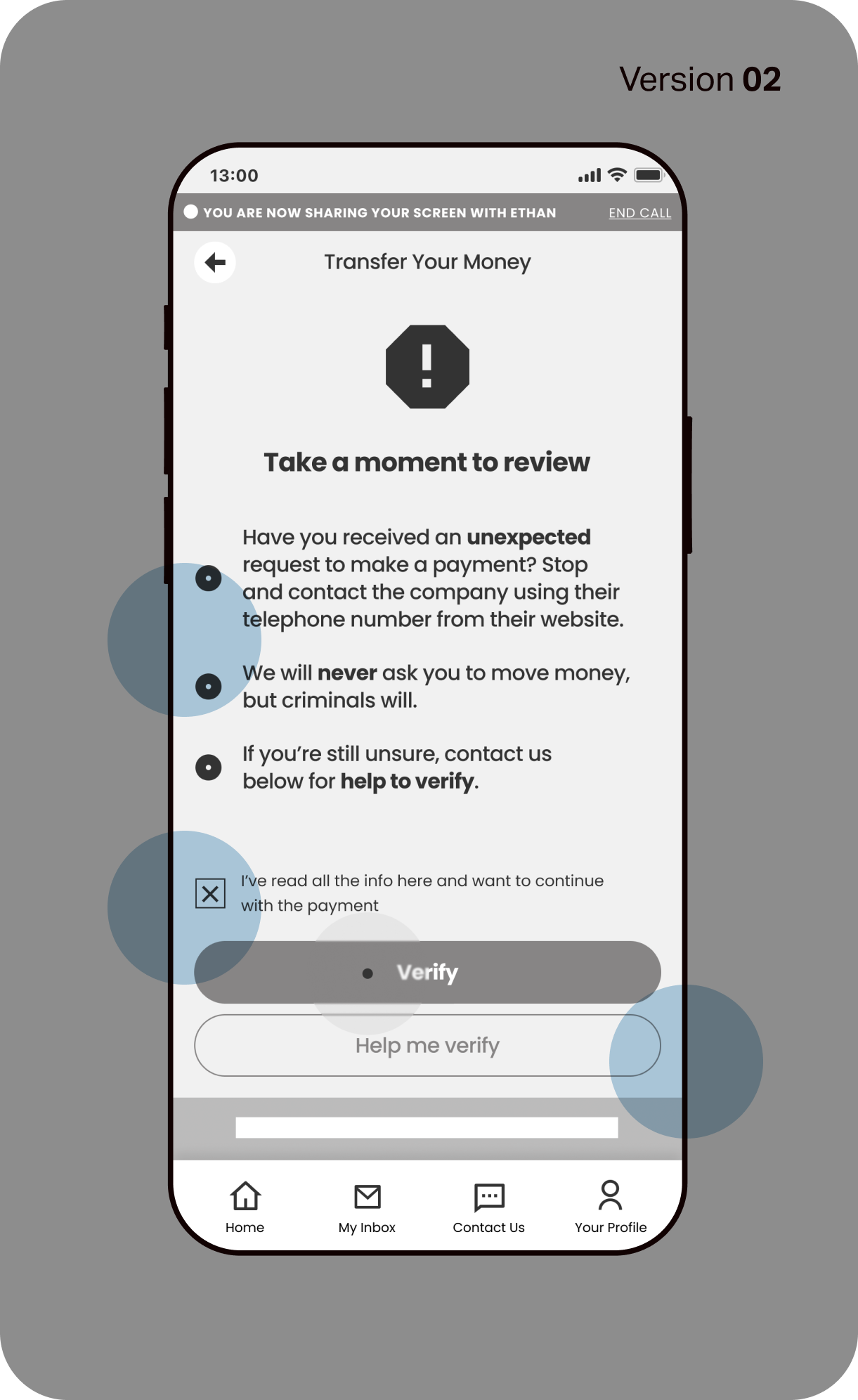
05. Scam Warning Screen
Instead of appearing at the end of a transaction, a call-out to review scam activity now appears as a full-page.
It asks for the user to take their time to review before confirming the transfer, and can only be activated once the user tick a box to acknowledge that they have read and understood the notice.
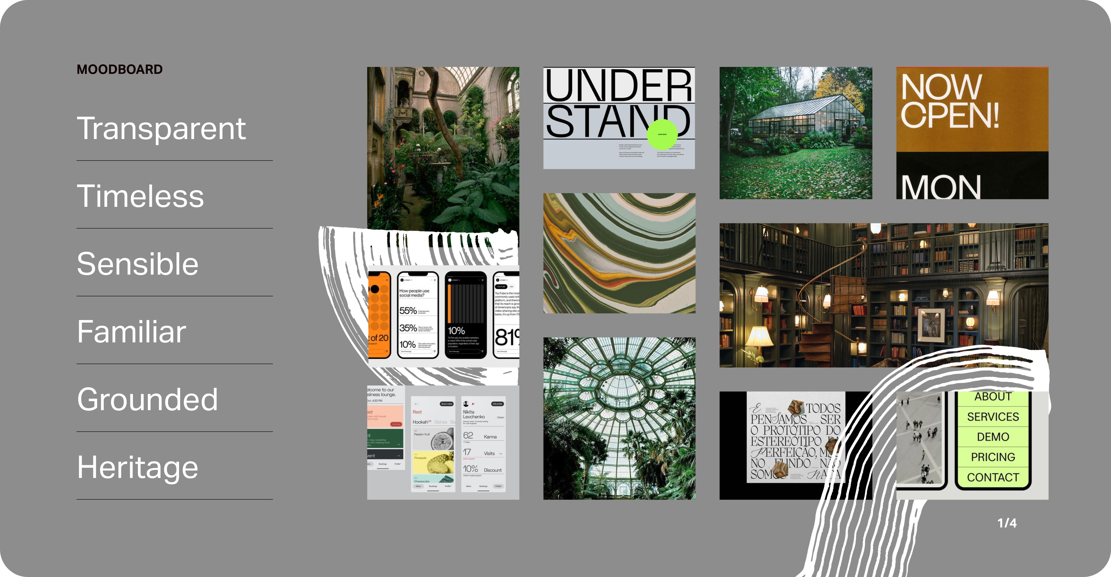
Branding Discovery
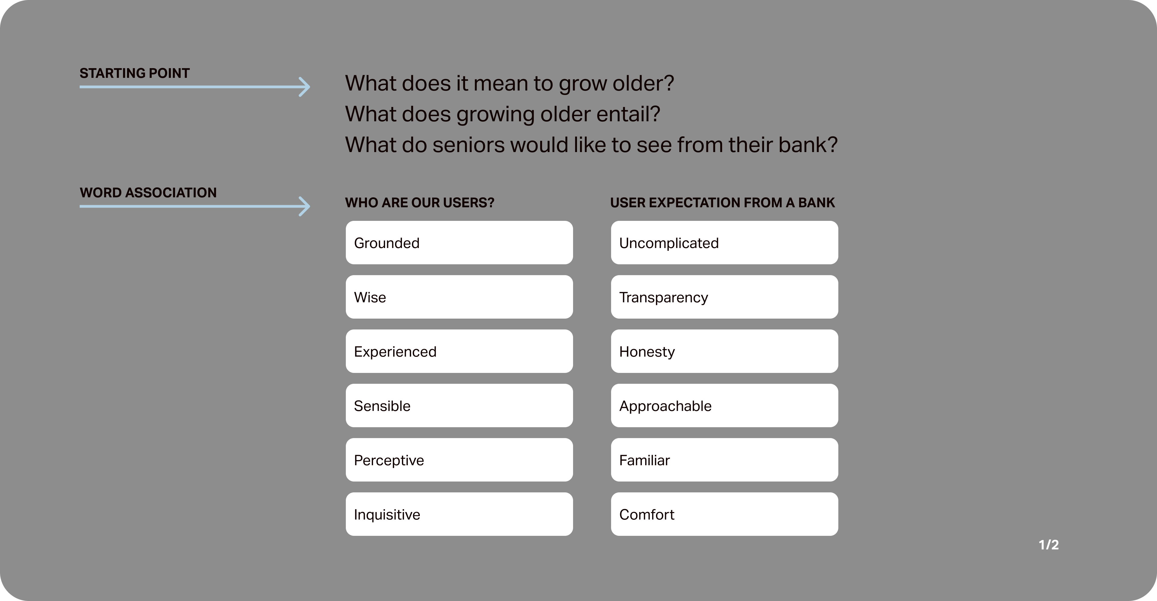
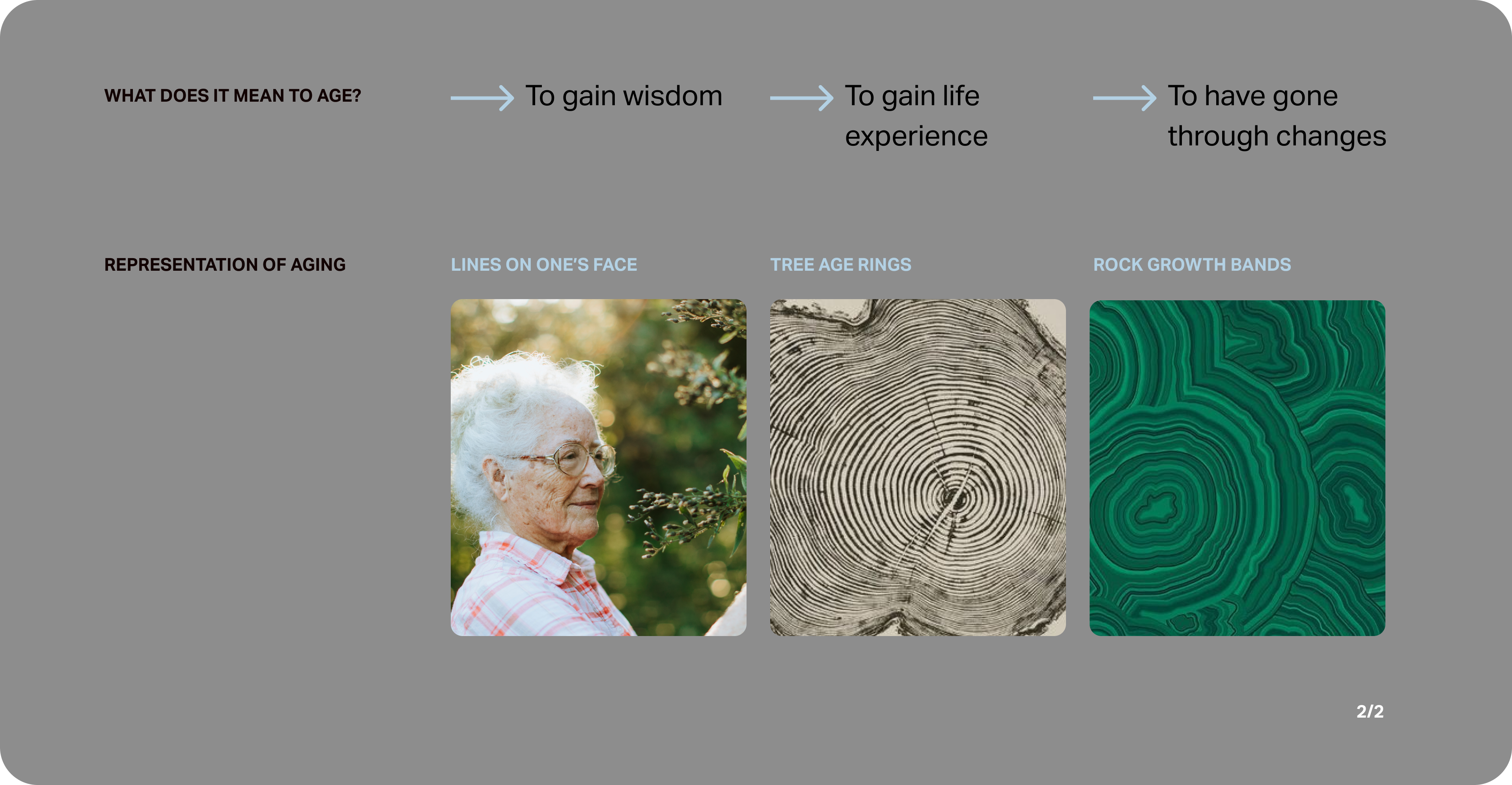
Coming into this project, I had a clear vision that I'd like to explore different ways to represent ageing without falling into the usual gimmicks.
I started with word association exercises to what I believe the app stands for. Word association helps distil the essence of the brand, its values and to understand its place in society.
It also jumpstarts the creation of the brand’s core values, which will guide the brand to organically grow in the future.
Brand Development
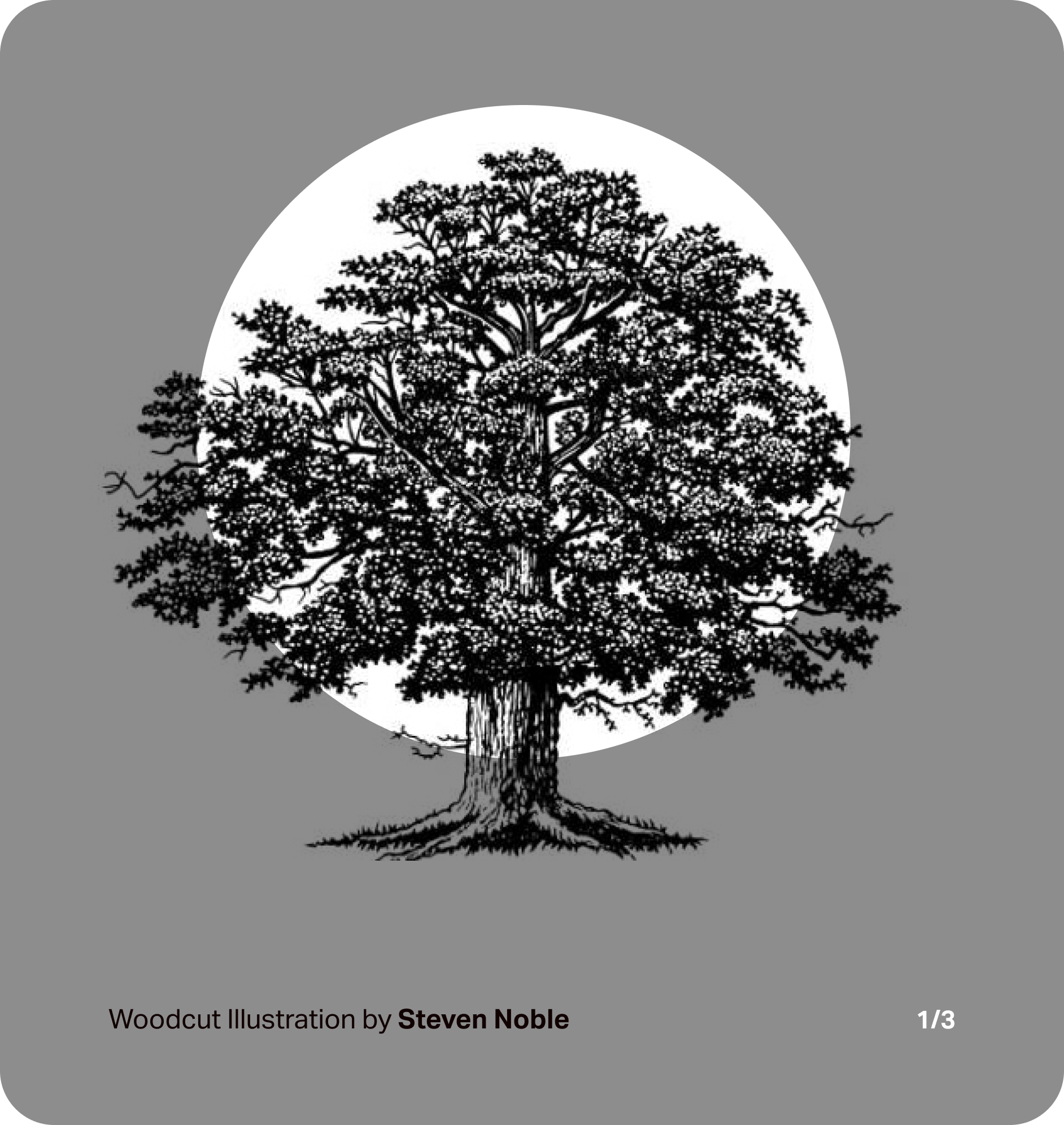
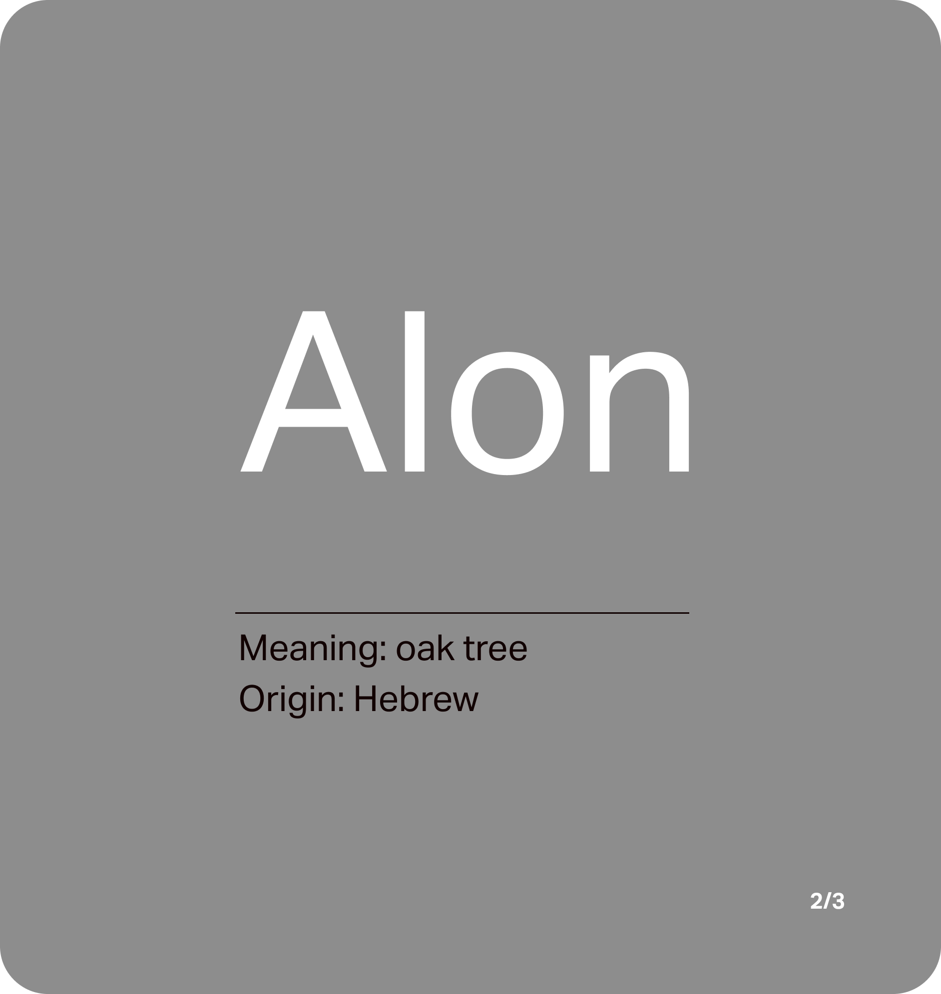
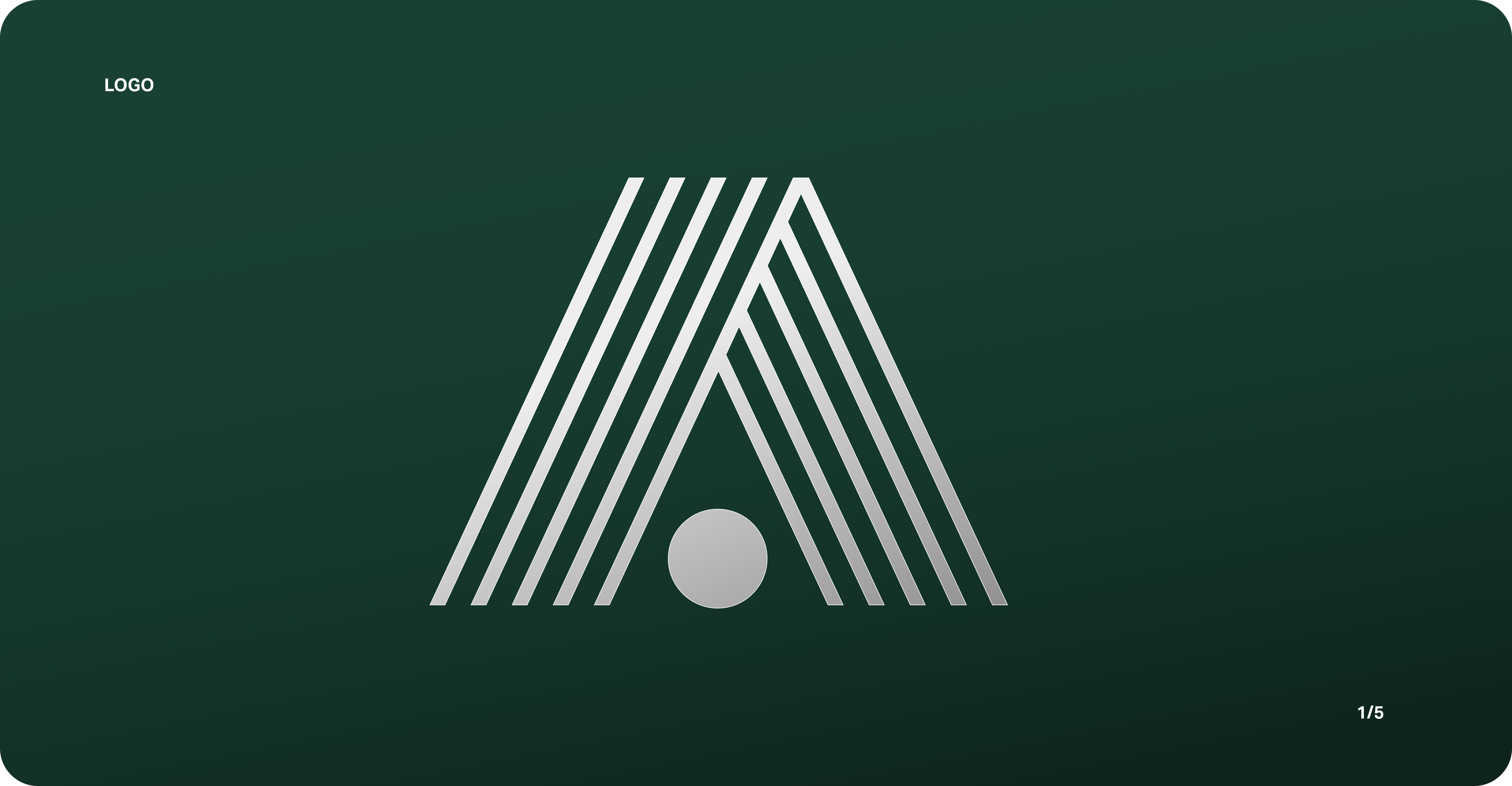
And that brings us to the mighty oak tree. Or, Alon in Hebrew.
From Viking longship to Japanese drums, oak tree long represent strength, stability and heritage.
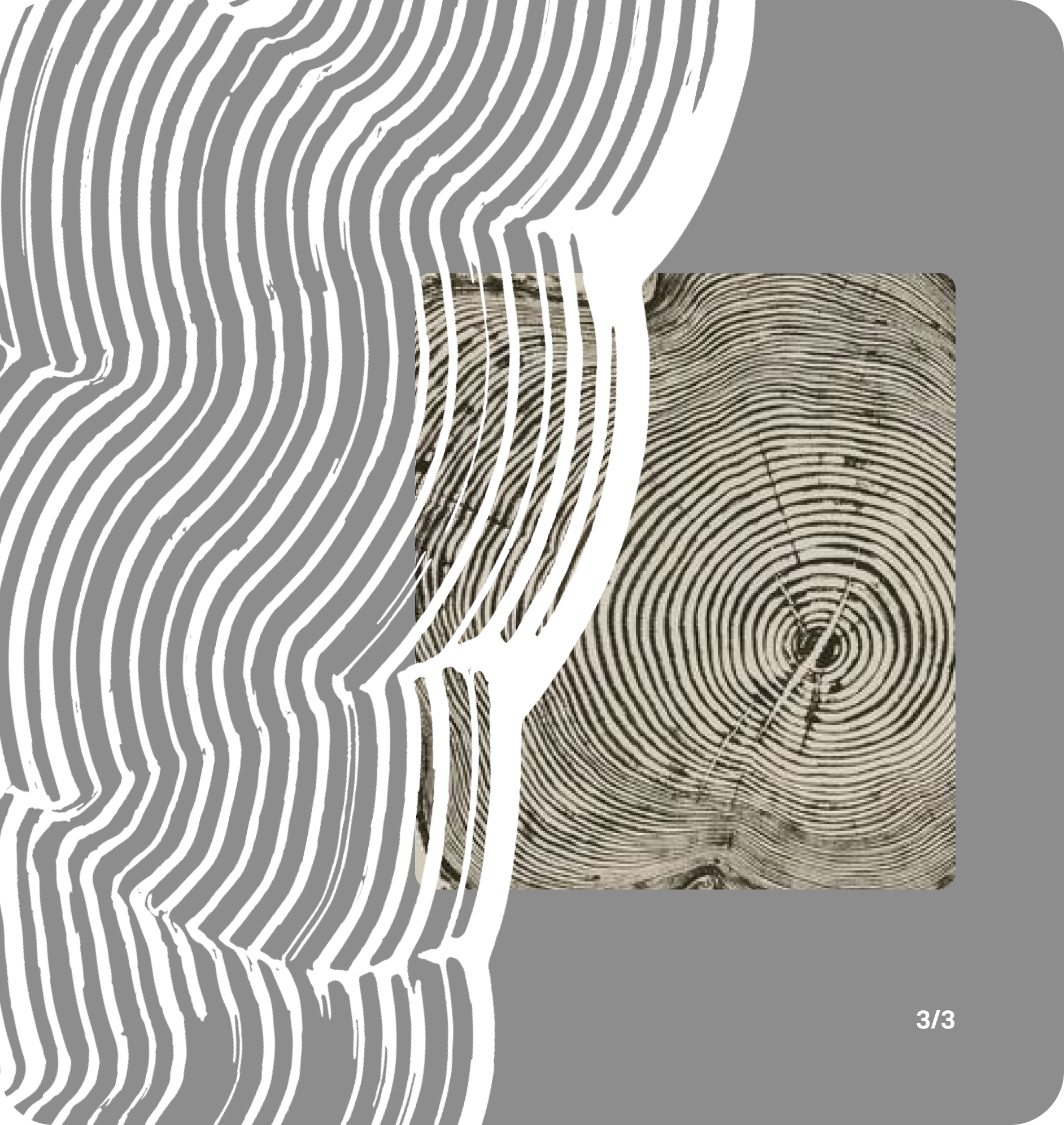
The theme of lines to represent 'ageing' is also continued with dynamic brushstrokes as patterns to bring screens to life.
Alon Brand Development
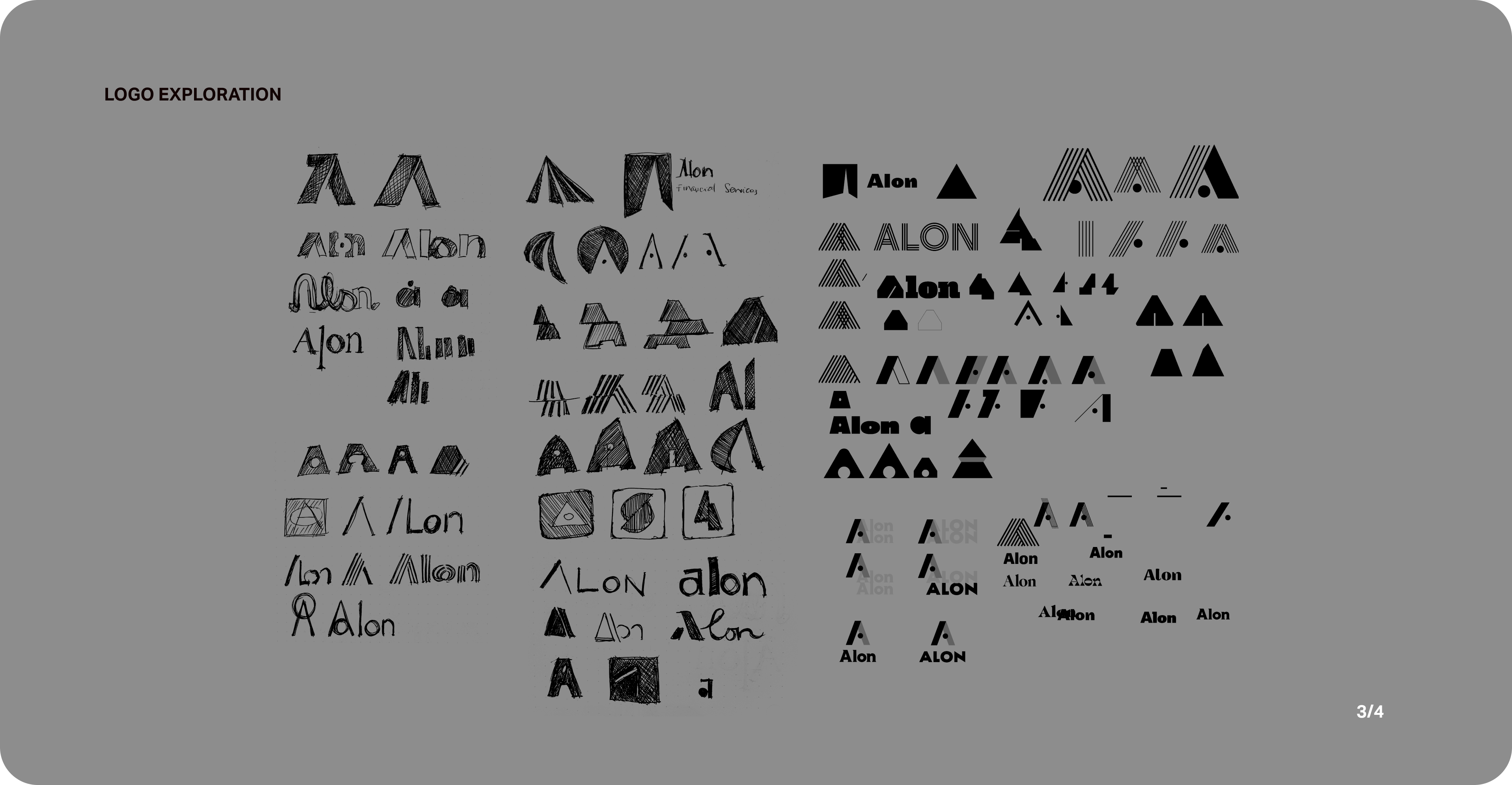
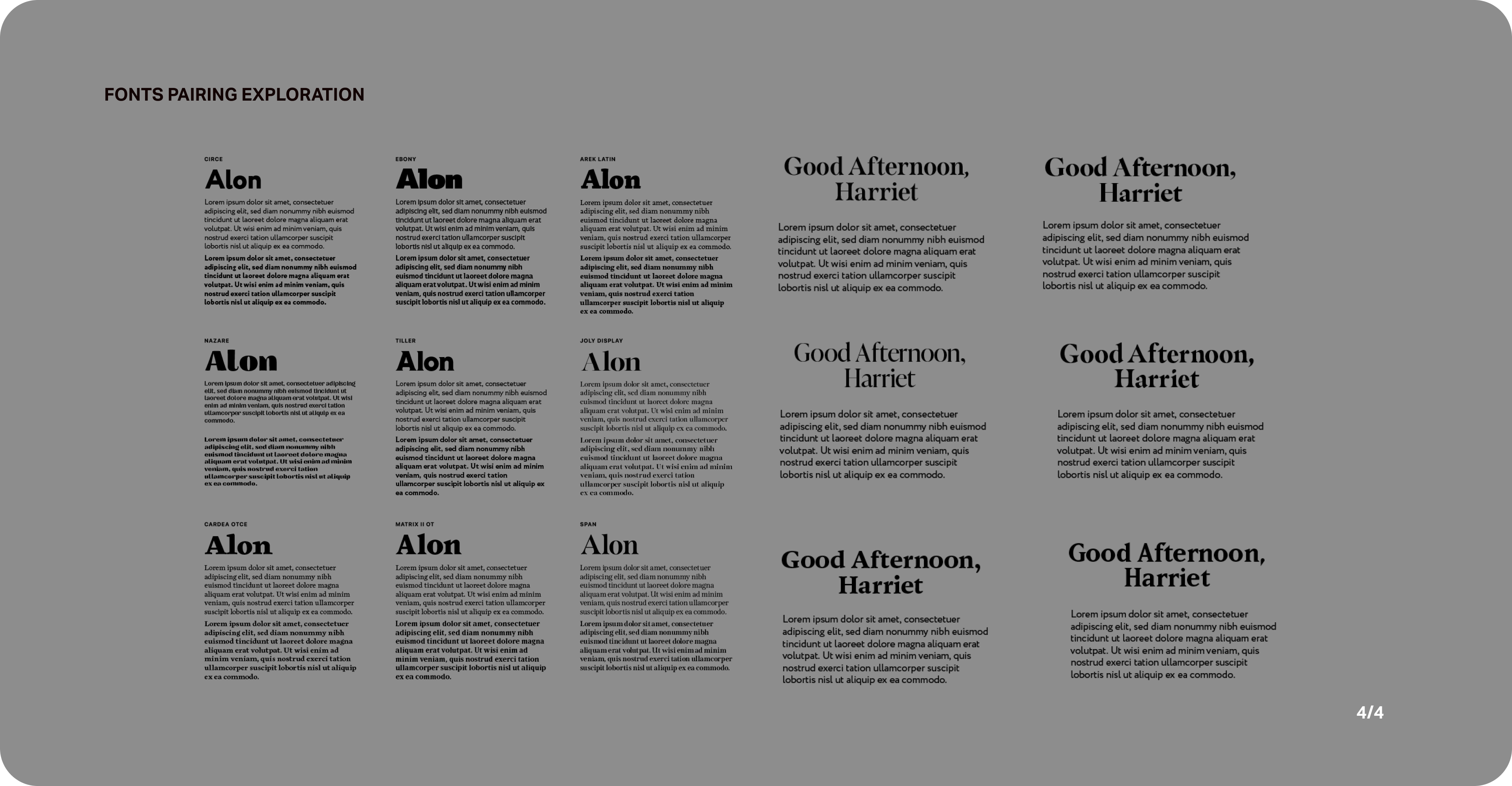
Following the brand discovery, I continue to develop the brand by building a moodboard, exploring wordmarks, logo and fonts pairing.

Deliver
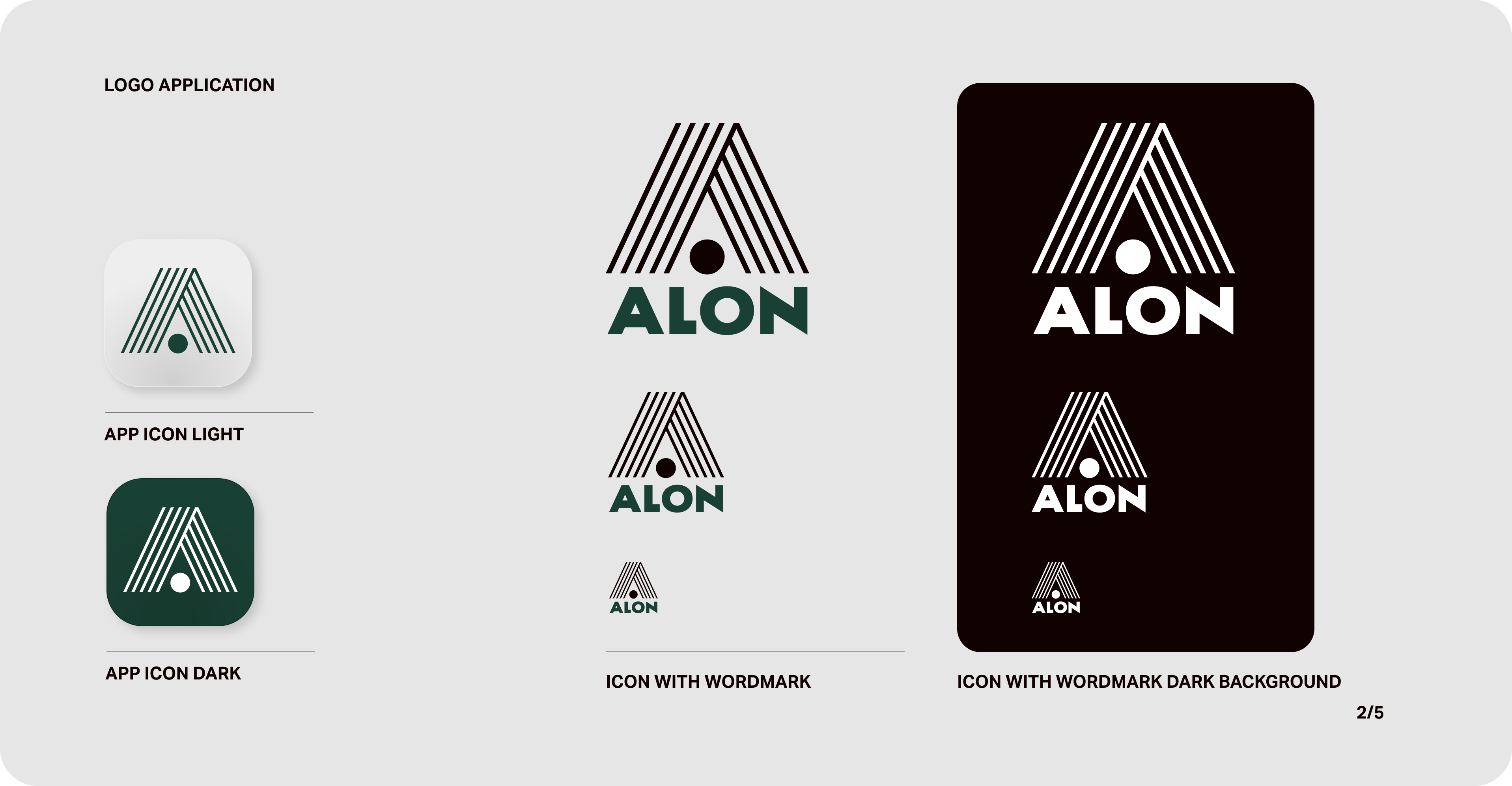
Alon Branding
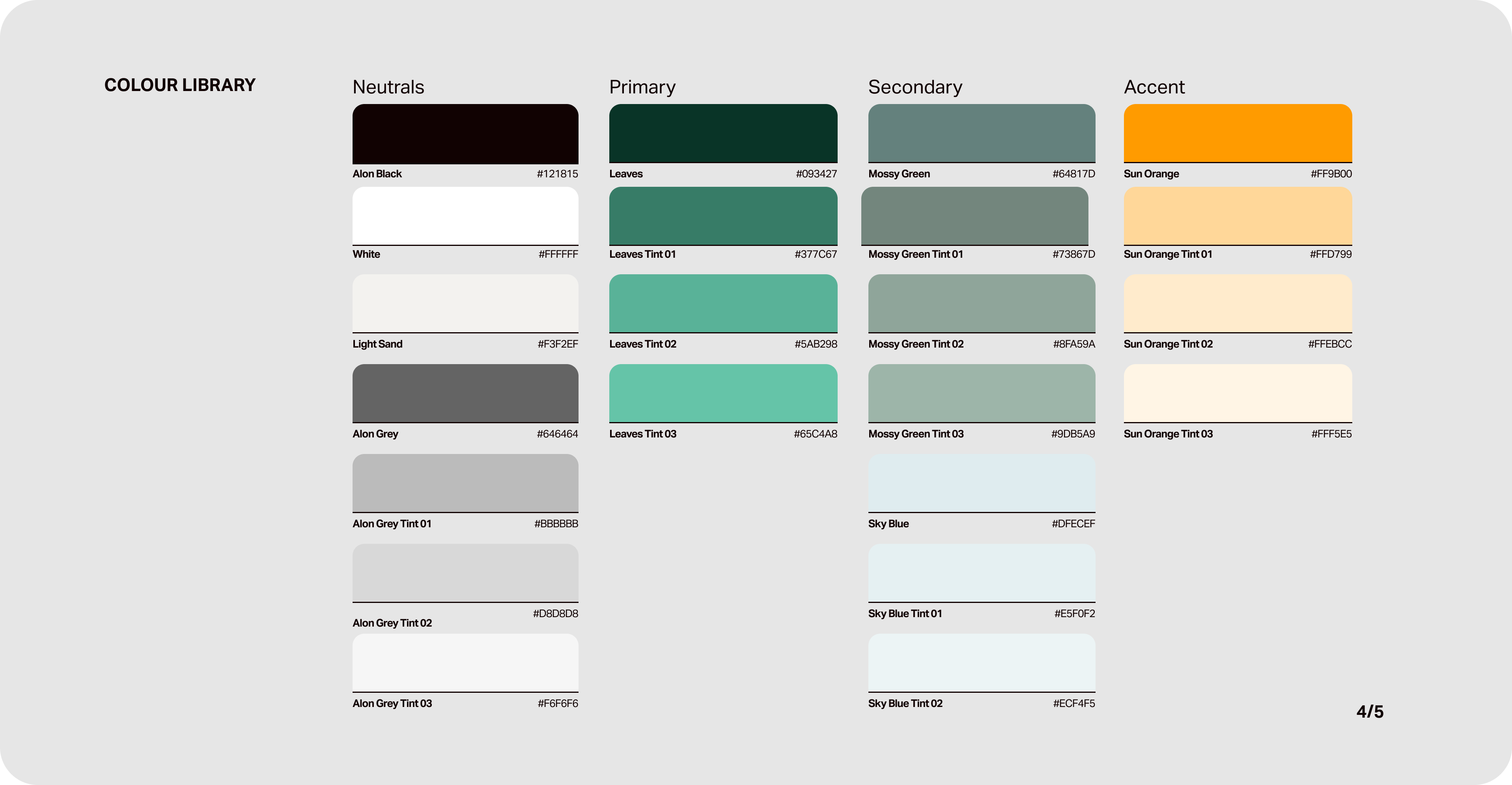
Following tree age rings pattern, the logo follows the same visual and the colour palette takes inspiration from nature. From the green leaves, sunny bright sky to the soft sand.
High Fidelity Prototype
Having established the visual branding, I proceeded to inject the mid-fi prototype with the branding to bring the platform to life.
Feature Highlights
The following are a few features that are specific to Alon banking to accommodate seniors’ preference and needs.
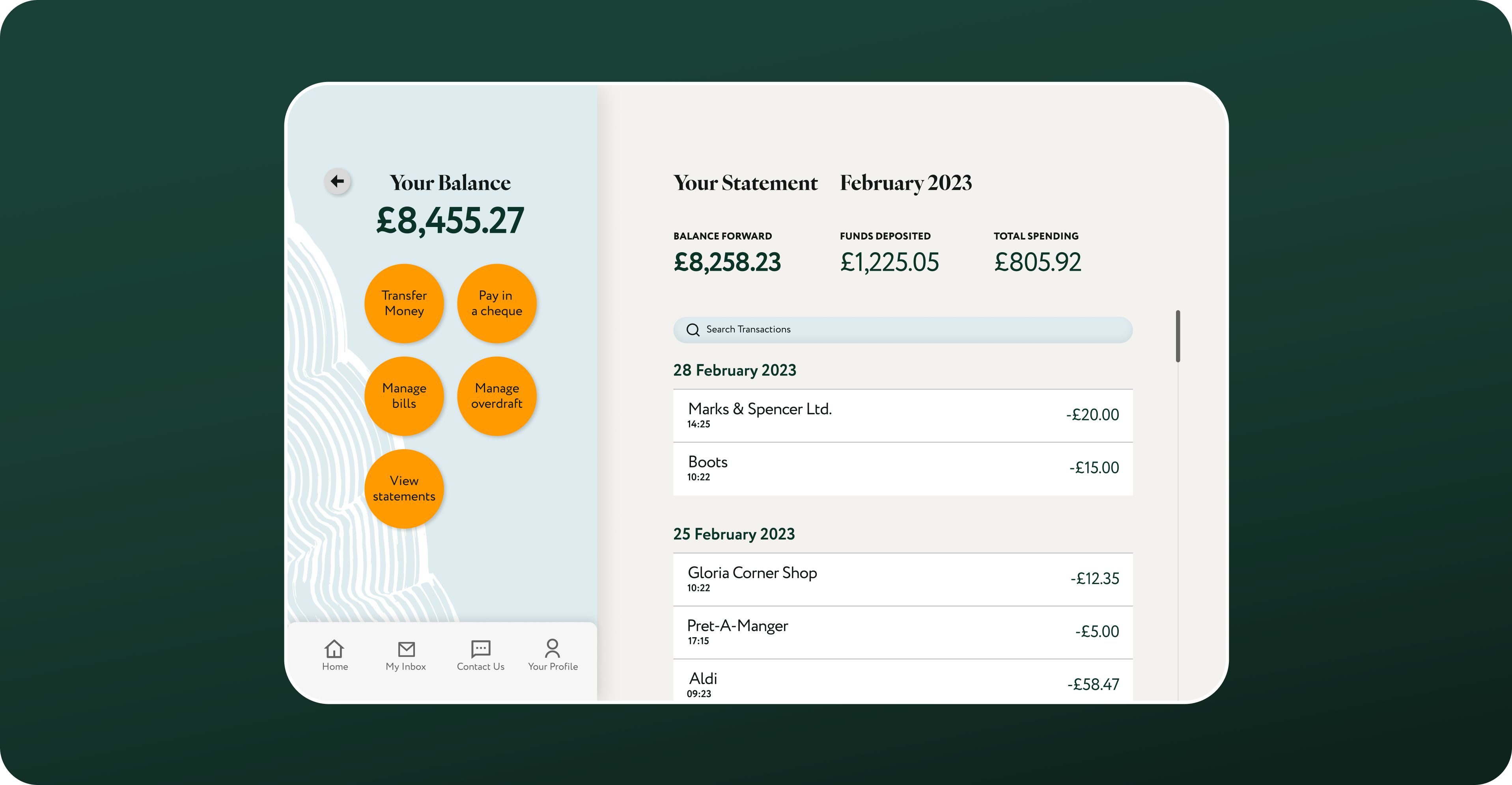
01. Accessible Buttons
To address users’ main concern of fear of making a mistake, I've designed a legible and high-contrast buttons. This provides a clear journey map to users as well as prevent accidental slips.
Each transaction has also been filed according to purchase date for easy reference.
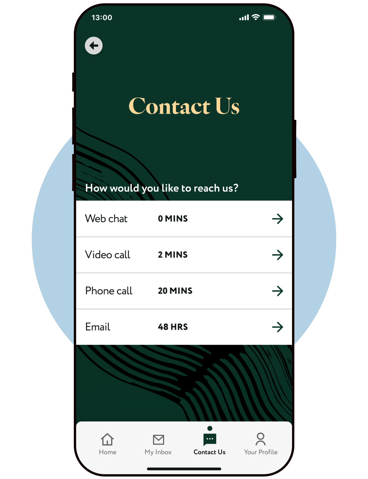
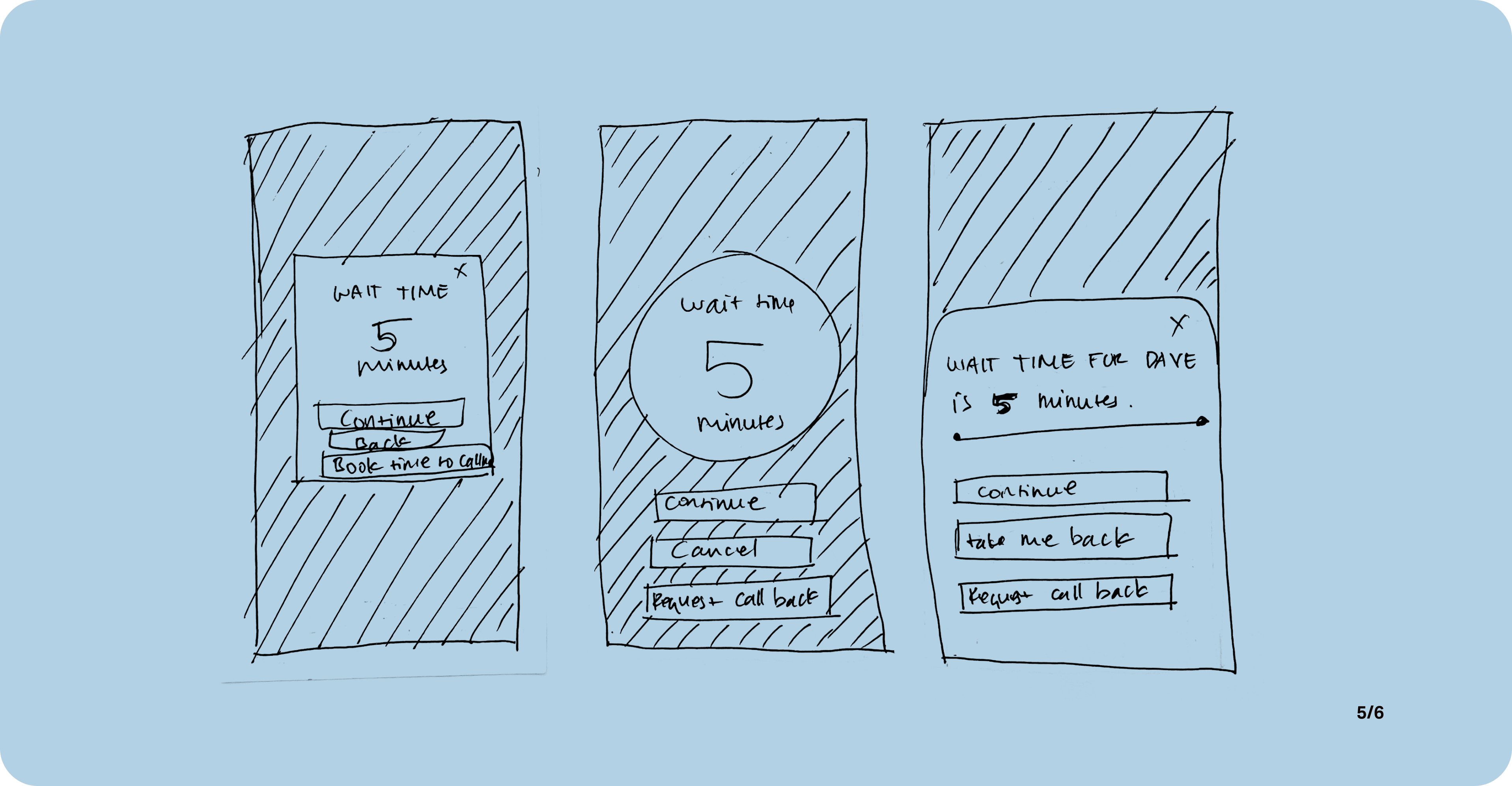
02. Contact wait times
On top of having contact options, users will be able to view wait time and have more freedom to suit their preference.
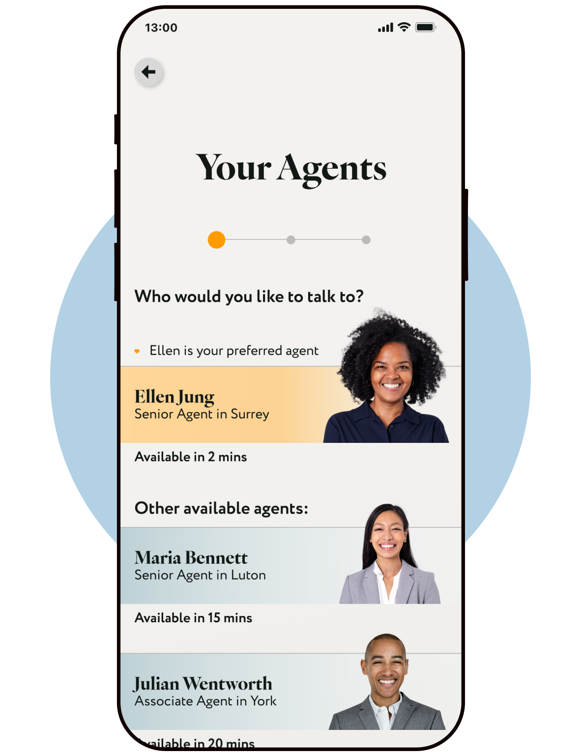
03. Preferred Agent
Users will be able to save a preferred agent, allowing them to build a relationship and see a sympathetic face in time of need.
All available agents also have profile pictures, for a more human approach.
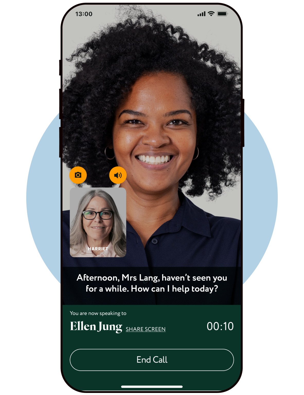
04. Accessible Video Call
On a video call option, users will have the option to follow conversation along with the aid of closed-caption.
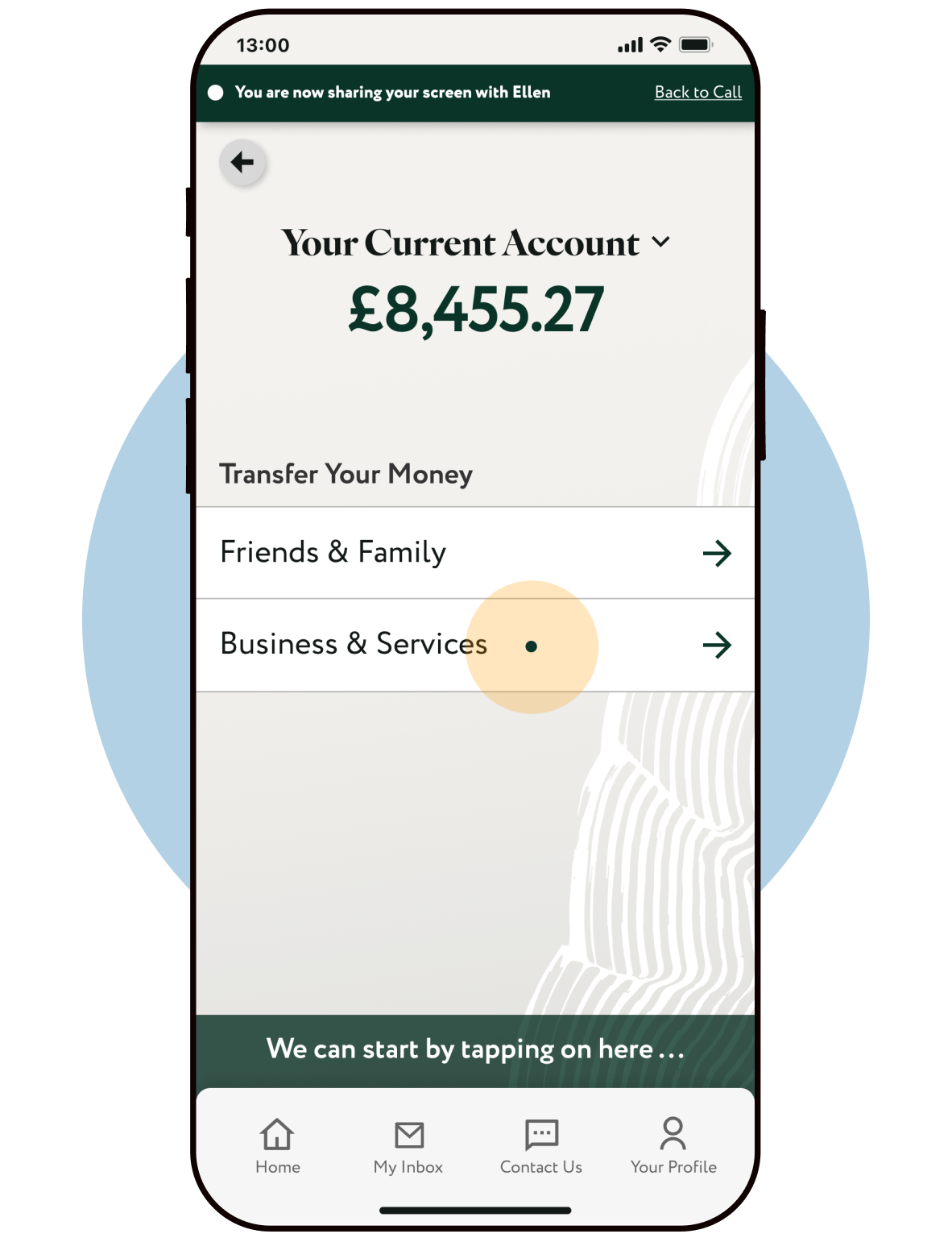
05. Screen Sharing
Users will be able to share their screen with an agent, so that they can be walked-through just like at a bank branch. Agent utilise a pulsing pointer to guide users, however they will not be able to make a decision for them.
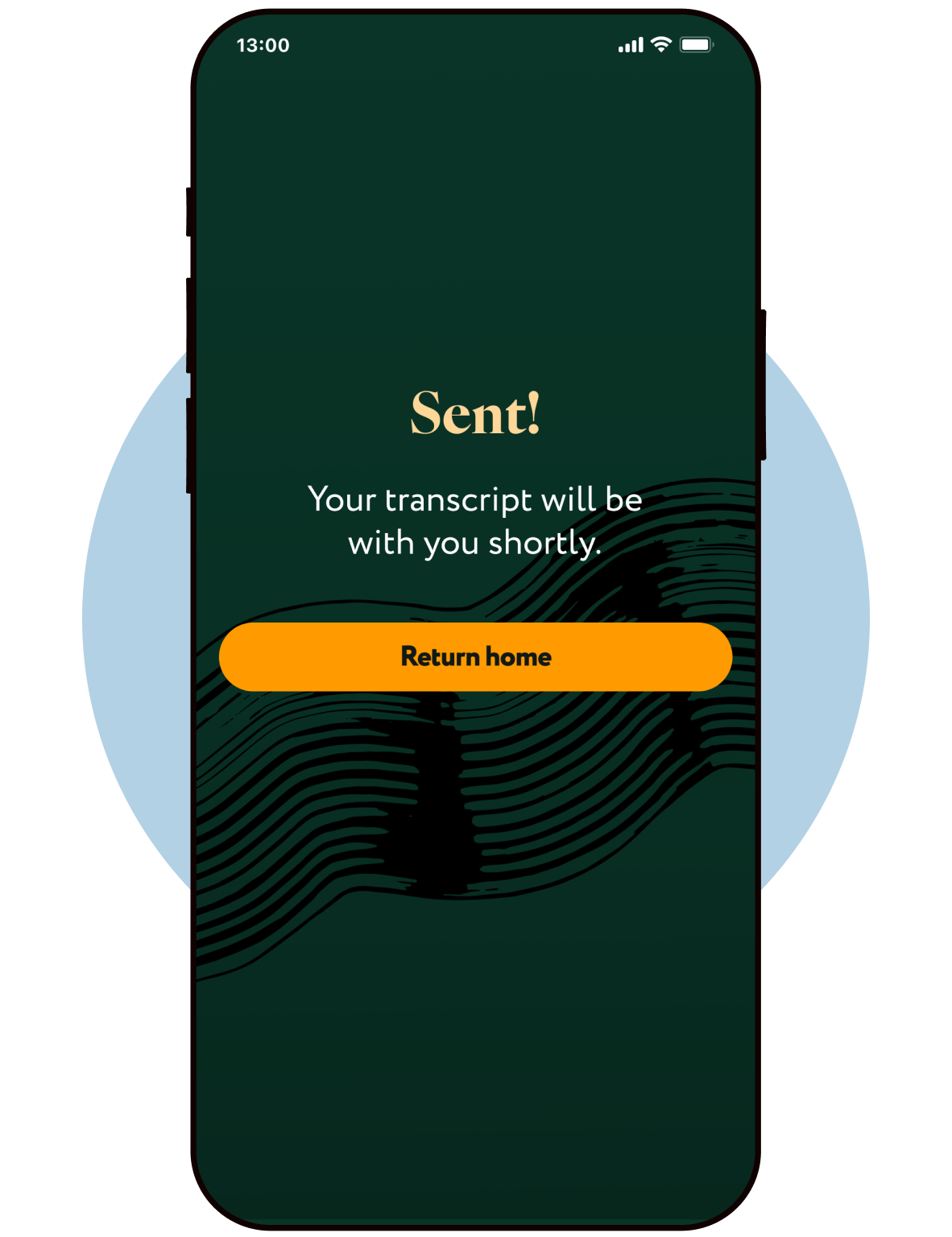
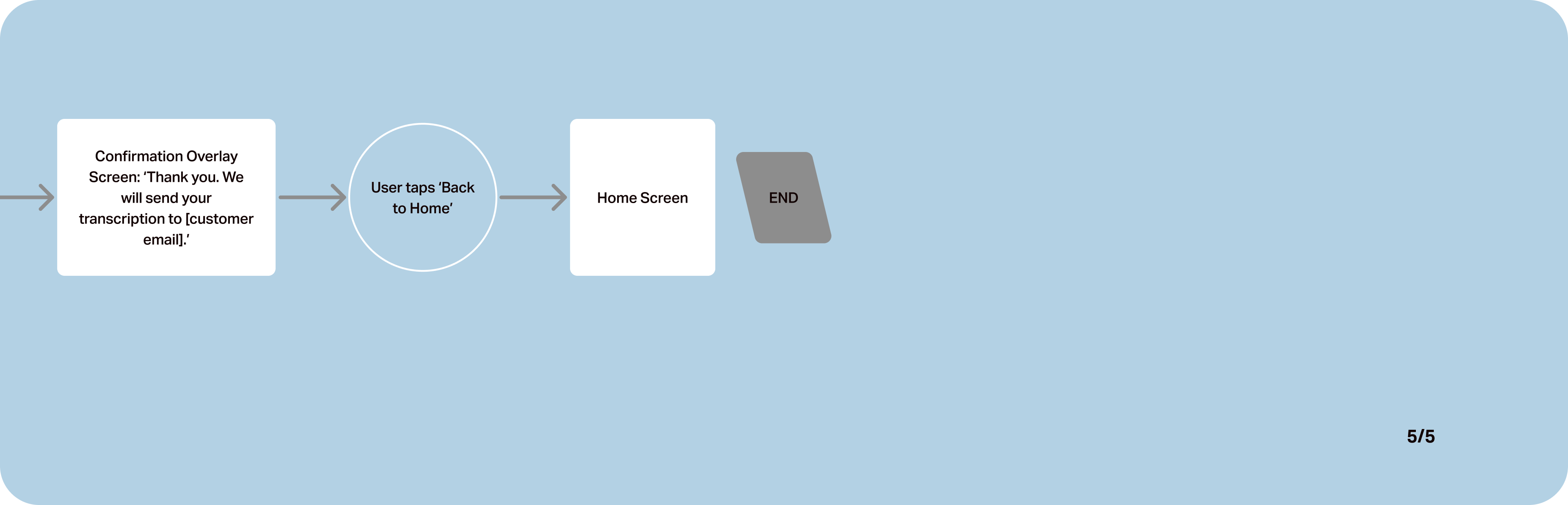
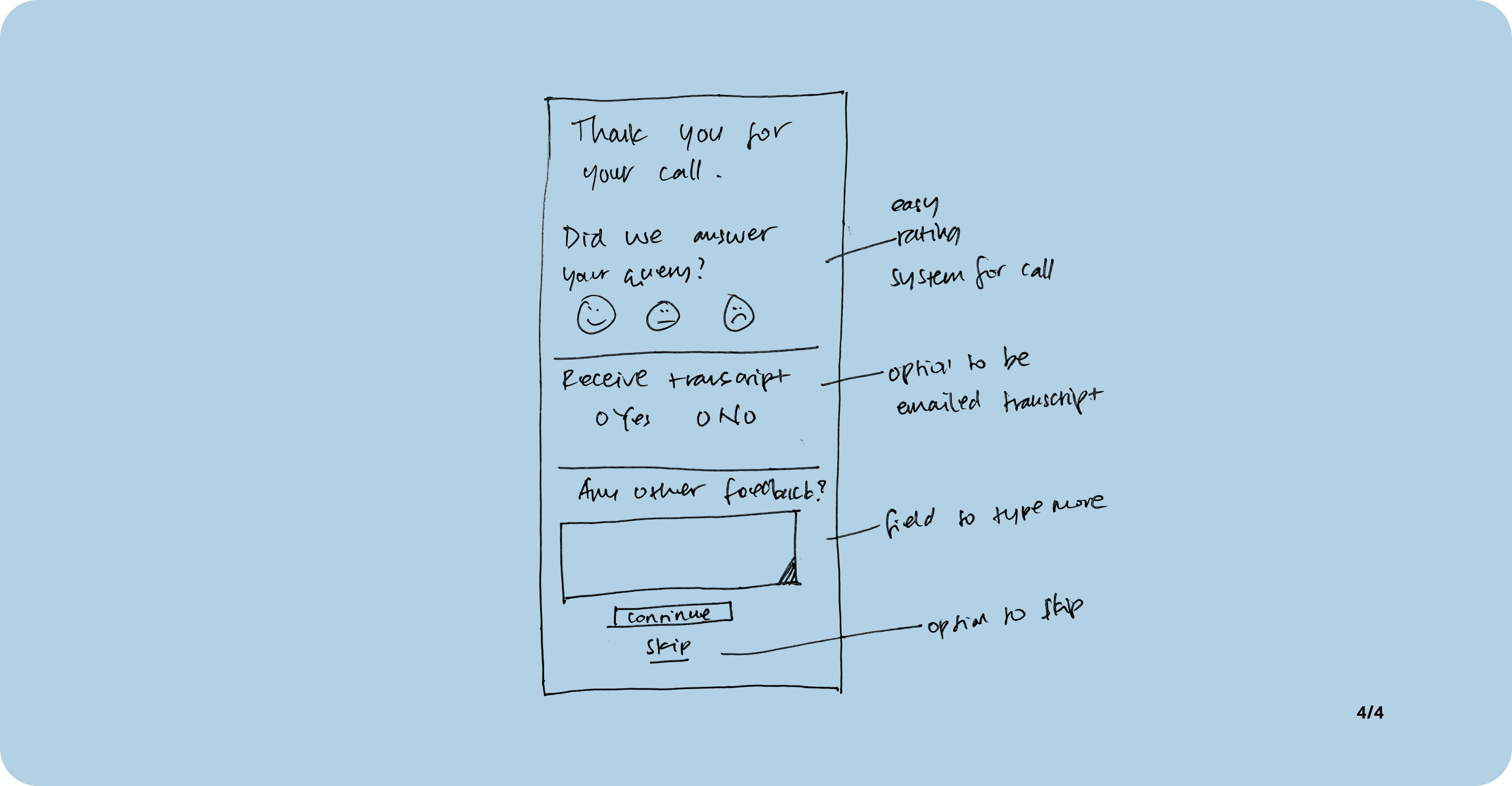
06. Transcript
At the end of the call, users will have the option to receive a transcript of their call. This will act as an educational tool that users can review next time they're in need of an assistance.
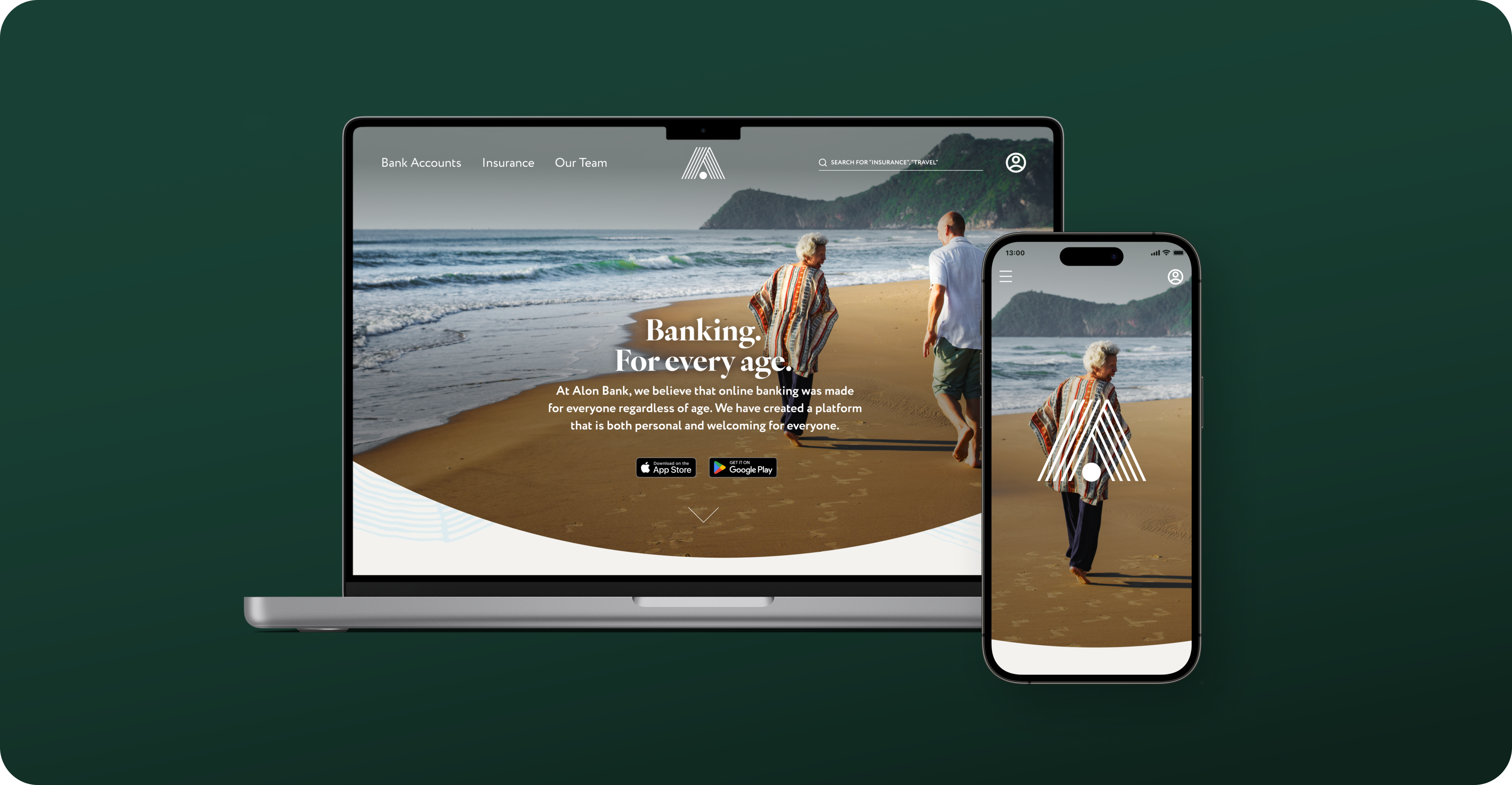
Responsive Marketing Website
To showcase the app features and cast a wider net to connect with my target audience, I've created a marketing website for both desktop and mobile platforms
Multi Platform Design
For further enhancement, I'd like to develop the app for tablet platform, as the majority of target users already own and use tablets on a daily basis.
With the bigger screen, users will be able to view statements and compare transactions with more ease.
Future Considerations
I'd like to conduct further usability test with a more diverse user group. The test group I had access to, comes from a similar socio-economic background and having known each other, their banking habits do naturally influence each other. I would like to test on different users from different walk of life and experience with digital platforms.
Further exploration on multi-platform design is essential. There are other features that could be made available on different platforms that will enhance users experience
Continually update the app with different features based on user feedback. I'd like to hear how different users adapt features and what other features they would like to see based on their changing needs.
Key Learnings
My main learning on this project was how diverse my target users are. It was enlightening to see my assumptions validated or proved wrong.
It was a pleasure to learn to embrace the process more than the end solution. There were times when I felt off-balance and unsure how to proceed, but in letting the research guide my solution, I was able to recalibrate and get a better focus.
It's been very insightful to have accessibility lead the design decisions. It's often easy to forget about accessibility, however having an accessible app allows a more inclusive and more group of people to utilise the app.